조직 선택
Use Heatmaps in Salesforce Maps to Visualize Record Density.
게시 일자: May 21, 2026
상세 설명
Heat map (or heatmap) in Salesforce Maps is for data visualization on the map that displays the two-dimensional magnitude of a phenomenon as a color. The color variance may be due to hue or intensity, simple visual indicators of how the phenomenon is clustered, or differs across space.
솔루션
Prerequisites:
Steps:
1. Select the Marker icon to open the Marker styles.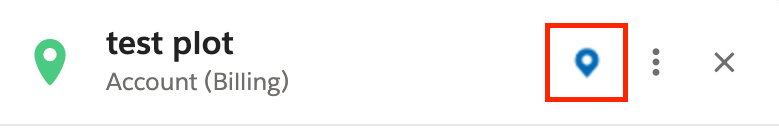
2. Select Render Heatmap. You may also want to disable the Markers by selecting Render Markers. This allows you to view only the Heatmap.
3. Your Heatmap should render.
4. You can quickly customize how your Heatmap will appear using Heatmap Options (Optional)
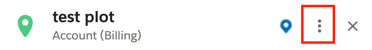
5. Click on the three vertical dots and click Edit to view more detailed Heatmap display options. (Optional)
6. Select the Heatmap Options tab.
- Radius: The radius of influence for each data point, in pixels. Our recommended value for the radius is 15.
- Opacity: The opacity of the Heatmap, expressed as a percentage between 0 and 100%. Our recommended value for opacity is 80%.
- Maximum Intensity: The maximum intensity of the Heatmap. By default, Heatmap colors are dynamically scaled according to the greatest concentration of points at any particular pixel on the map. This property allows you to specify a fixed maximum. Setting the maximum intensity can be helpful when your dataset contains a few outliers with unusually high intensity. Out recommended value for max intensity is 5, unless you assign a weighted value. If you assign a weighted quantitative value, change the max intensity to 90% of the maximum value of the field you choose. For example, if you choose Annual Revenue as your weighted value, and the maximum annual revenue value in your org is 1,000,000, then set the max intensity to 900,000. If you do not make this change, your Heatmap will plot poorly (below). See the weighted value section for more information about the weighted value.
- Fade heat map with zoom: Specifies whether Heatmaps dissipate on zoom. When dissipating is unchecked the radius of influence increases with zoom level to ensure that the color intensity is preserved at any given geographic location.
- Weighted Value: The weighted value option will display a dropdown list of fields on the object you are enabling a Heatmap for. You can choose any value to assign a weight in your Heatmap. By default, the Heatmap will depict the number of records in a location. Some other interesting options include the annual revenue or the opportunity value of the records in a location. By default, higher-density areas will be colored red, and lower-density areas will be colored black. You can very easily manipulate these colors by clicking on the color you which to change and choosing a different color.
- Color Gradient: The color gradient of the Heatmap. The color gradient of the Heatmap is specified as an array of CSS color strings. All CSS3 colors — including RGBA — are supported except for extended named colors and HSL(A) values.
Knowledge 기사 번호
000381397
이 기사를 통해 문제를 해결했습니까?
개선을 위한 의견을 보내주세요.