Velg en organisasjon
Quip-Charts in Spreadsheets
Publiseringsdato: Feb 11, 2024
Beskrivelse
Learn how to create charts within spreadsheets.
Løsning
- Choose a chart type
- Customize the chart’s title, colors, and labels
- Drag the chart to any location in the document or spreadsheet
Edit a Chart
Double-click a chart to open the Chart Editor on the right side of the page. You can use the Chart Editor to customize how your chart looks, which data it's using, and how that data is interpreted. You can also open the Chart Editor by clicking the floating menu above the chart and selecting Edit Chart.Under the Data tab, you can see and adjust how the data is treated:
- Range: Specify which cells you want to include in the chart.
- X-Axis: Specify the cell range for the chart’s X-axis.(dual axis is not possible by design.)
- Y-Axis (Bubble charts only): Specify the cell range for the chart’s Y-axis. (dual axis is not possible by design.)
- Series: Add additional cell ranges to the chart as data series.
- Sizes (Bubble charts only): Specify the cell range for the bubble sizes.
- Switch rows and columns: Change the axis on which rows and columns are plotted.
- Use first row as headers: Use column titles as chart labels (and leave them out of the data itself).
- Use first column as labels: Use row titles as chart labels (and leave them out of the data itself).
Under the Customize tab, you can see or change the chart type, add a chart title, and change the chart’s appearance:
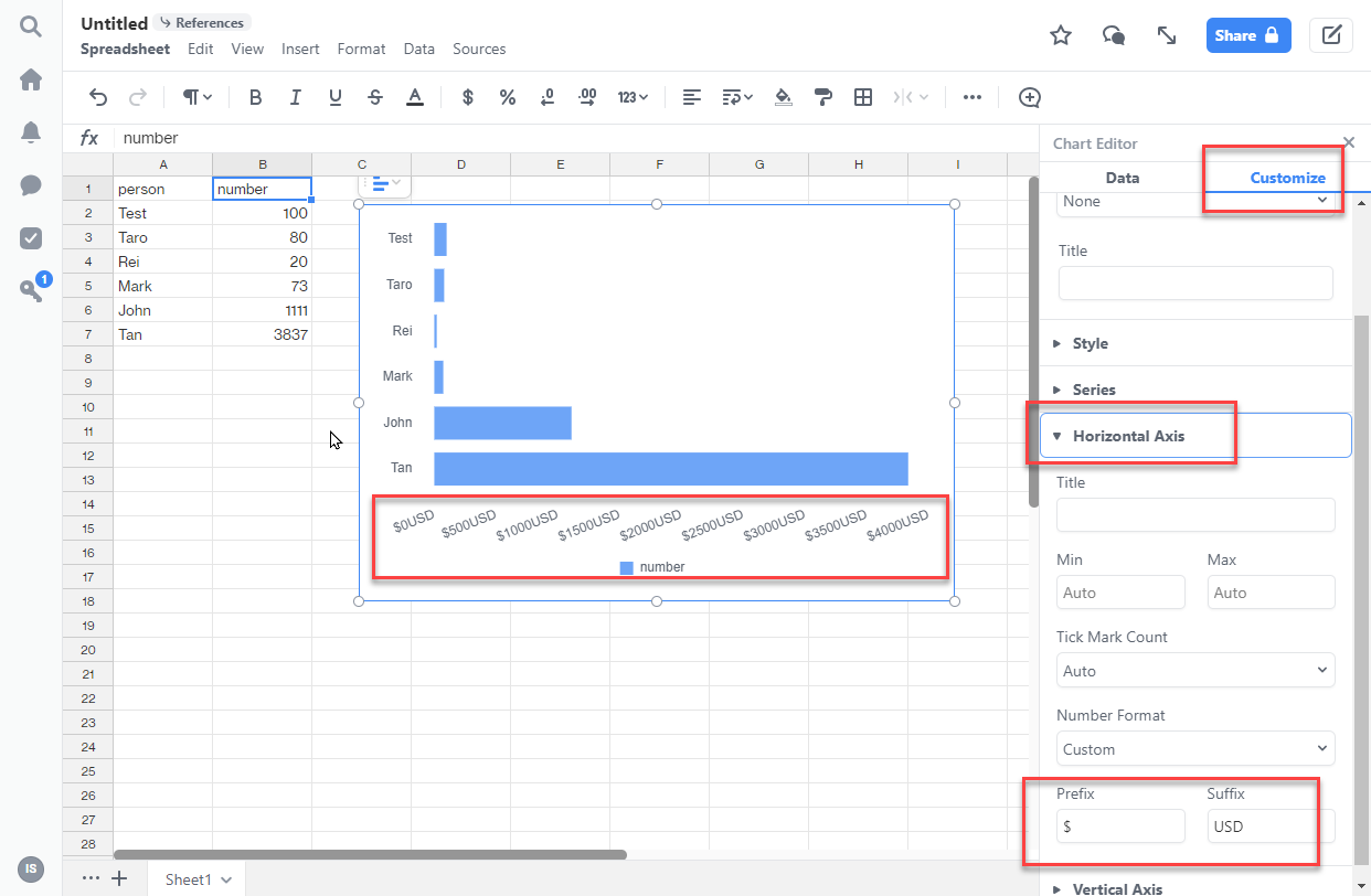
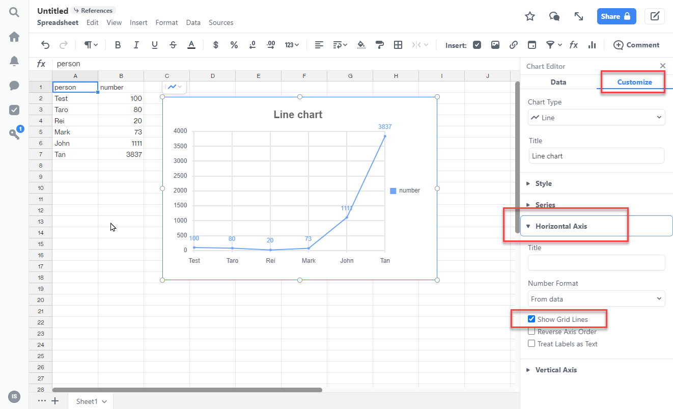
Example of customizing horizontal axis label is shown below.
Column charts
- Stacking: You can choose whether to stack data series in the chart.
- Style: You can change the position of the chart legend, or hide it entirely. You can also select the colors for the chart’s background and border.
- Series: You can apply data labels to show values directly in the chart, and set the labels’ position and color.
- Horizontal Axis: You can give the axis a title, change the number formatting, and reverse the axis order.
- Vertical Axis: You can give the axis a title, adjust its scale, set the number of tick marks shown, and change the number formatting.
Bar charts
- Stacking: You can choose whether to stack data series in the chart.
- Style: You can change the position of the chart legend, or hide it entirely. You can also select the colors for the chart’s background and border.
- Series: You can apply data labels to show values directly in the chart, and set the labels’ position and color.
- Horizontal Axis: You can give the axis a title, adjust its scale, set the number of tick marks shown, and change the number formatting.
- Vertical Axis: You can give the axis a title, change the number formatting, and reverse the axis order.
Line charts
- Style: You can change the position of the chart legend, or hide it entirely. You can also select the colors for the chart’s background and border.
- Series: You can apply data labels to show values directly in the chart, and set the labels’ position and color.
- Horizontal Axis: You can give the axis a title, change the number formatting, toggle the display of grid lines, reverse the axis order, and treat data labels as text.
- Vertical Axis: You can give the axis a title, adjust its scale, set the number of tick marks shown, change the number formatting, and toggle the display of grid lines.
Area charts
- Stacking: You can choose whether to stack data series in the chart.
- Style: You can change the position of the chart legend, or hide it entirely. You can also select the colors for the chart’s background and border.
- Horizontal Axis: You can give the axis a title, change the number formatting, toggle the display of grid lines, reverse the axis order, and treat data labels as text.
- Vertical Axis: You can give the axis a title, adjust its scale, set the number of tick marks shown, change the number formatting, and toggle the display of grid lines.
Combo charts
- Style: You can change the position of the chart legend, or hide it entirely. You can also select the colors for the chart’s background and border.
- Series: You can select a different chart type for each data series. You can apply data labels to show values directly in the chart, and set the labels’ position and color.
- Horizontal Axis: You can give the axis a title, change the number formatting, toggle the display of grid lines, and reverse the axis order.
- Vertical Axis: You can give the axis a title, adjust its scale, set the number of tick marks shown, change the number formatting, and toggle the display of grid lines.
Pie charts
- Style: You can change the position of the chart legend, or hide it entirely. You can also select the colors for the chart’s background and border.
Donut charts
- Style: You can change the position of the chart legend, or hide it entirely. You can also select the colors for the chart’s background and border.
Scatter charts
- Style: You can change the position of the chart legend, or hide it entirely. You can also select the colors for the chart’s background and border.
- Series: You can apply data labels to show values directly in the chart, and set the labels’ position and color.
- Horizontal Axis: You can give the axis a title, change the number formatting, toggle the display of grid lines, reverse the axis order, and treat data labels as text.
- Vertical Axis: You can give the axis a title, adjust its scale, set the number of tick marks shown, change the number formatting, and toggle the display of grid lines.
Bubble charts
- Style: You can change the position of the chart legend, or hide it entirely. You can also select the colors for the chart’s background and border.
- Horizontal Axis: You can give the axis a title, adjust its scale, set the number of tick marks shown, change the number formatting, and reverse the axis order.
- Vertical Axis: You can give the axis a title, adjust its scale, set the number of tick marks shown, and change the number formatting.
Sample Chart Data
To visualize each chart type, copy a chart type’s sample data and paste it into a Quip spreadsheet or document. Click the Chart icon at the top of the page and select the corresponding chart type.
Column charts, Stacked Column charts, Bar charts, and Stacked Bar charts
Team | Game 1 Score | Game 2 Score | Game 3 Score |
A | 3 | 2 | 4 |
B | 1 | 3 | 2 |
C | 2 | 5 | 5 |
100% Stacked Column and 100% Stacked Bar charts
Team | Game 1 Score | Game 2 Score | Game 3 Score |
A | 30% | 10% | 60% |
B | 20% | 30% | 15% |
C | 50% | 60% | 25% |
Bar charts and Stacked Bar charts
Rep | Q1 Sales | Q2 Sales | Q3 Sales |
Brian | $10,000 | $25,000 | $53,000 |
Cameron | $45,000 | $60,000 | $36,000 |
Sally | $37,000 | $50,000 | $78,000 |
Line charts
Quarter | Sales |
Q1 | $25,000 |
Q2 | $60,000 |
Q3 | $50,000 |
Q4 | $80,000 |
Area charts
Date | Expenses | Income |
| 8/9/2021 | $500 | $2,500 |
| 8/23/2021 | $340 | $1,900 |
| 9/6/2021 | $600 | $3,300 |
| 9/20/2021 | $100 | $2,400 |
| 10/4/2021 | $150 | $2,600 |
Stacked Area charts
Date | House Expenses | Food Expenses |
| 8/9/2021 | $500 | $140 |
| 8/23/2021 | $340 | $60 |
| 9/6/2021 | $600 | $50 |
| 9/20/2021 | $100 | $100 |
| 10/4/2021 | $150 | $230 |
Combo charts
Year | Sales | Expenses |
| 1999 | $1,000,000 | $500,000 |
| 2000 | $1,200,000 | $360,000 |
| 2001 | $1,400,000 | $350,000 |
| 2002 | $1,600,000 | $480,000 |
| 2003 | $1,800,000 | $576,000 |
Pie charts
Expense | Amount |
Food | $500 |
Rent | $1,500 |
Utilities | $350 |
Transportation | $250 |
Savings | $500 |
Donut charts
Fruits | Quantity |
Apple | 10 |
Banana | 3 |
Pear | 6 |
Pineapple | 16 |
Kiwi | 9 |
Scatter charts
Temperature (F) | People at the beach |
| 70 | 578 |
| 85 | 675 |
| 90 | 650 |
| 67 | 120 |
| 100 | 899 |
Bubble charts
Country | Sales Reps | Sales | Region | Market Size |
USA | 5 | $5,500 | Americas | 3% |
Brazil | 14 | $12,200 | Americas | 12% |
Mexico | 20 | $60,000 | Americas | 33% |
Italy | 18 | $24,400 | Europe | 10% |
France | 22 | $32,000 | Europe | 42% |
Knowledge-artikkelnummer
000389445
Hjalp denne artikkelen med å løse problemet ditt?
La oss få vite det slik at vi kan forbedre!