
We’re thrilled to introduce you to a tighter, brighter, and bolder expression of the brand you love. As Salesforce continues to lead the next era of technology, we’ve refreshed how we show up and stand out in the agentic enterprise. It’s a shift that goes way beyond just meeting the moment, and defines it instead.
You’re in the right place to do standout work. Here you’ll find updated guidelines, toolkits, style principles, and more to help you build the brand that’s unmistakably Salesforce.
For our partners and agencies
Since this portal is public, everyone has access to our core logo artwork and basic usage principles. Need more? Please contact your Salesforce marketing contact for credentials, content approval, and access to detailed guidelines, training, and assets.
The symbol of trust
Meet the hardest working representative of our brand. Our logo stands for the values, products, and experiences we deliver every day. Use it consistently to help keep our brand equity and identity strong.
Logo options
We have two main versions of our logo. Please use them in this specific order.
1. Cloud logo
Your main logo choice, our cloud logo is our iconic, most recognizable asset.
2. Horizontal logo
This version is designed for layouts where space or composition constraints limit the visibility of the cloud logo and the legibility of our name.
Logo specifications
These specs help our logo stay visible, balanced, and out of awkward situations. A little structure now saves a lot of headaches later.
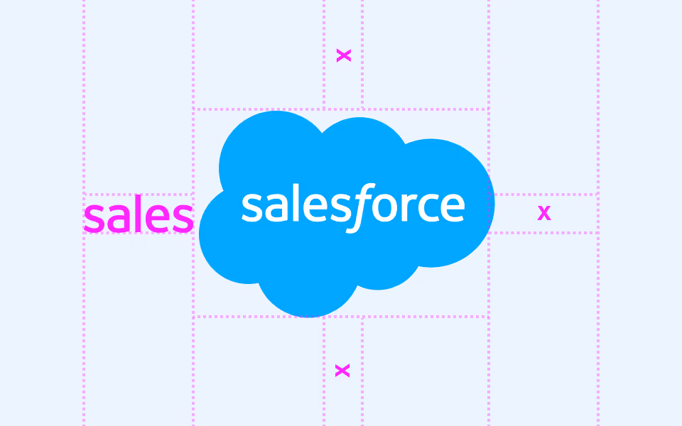
Clear space
Reserve clear space equal to the height and width of the “sales” on all sides.
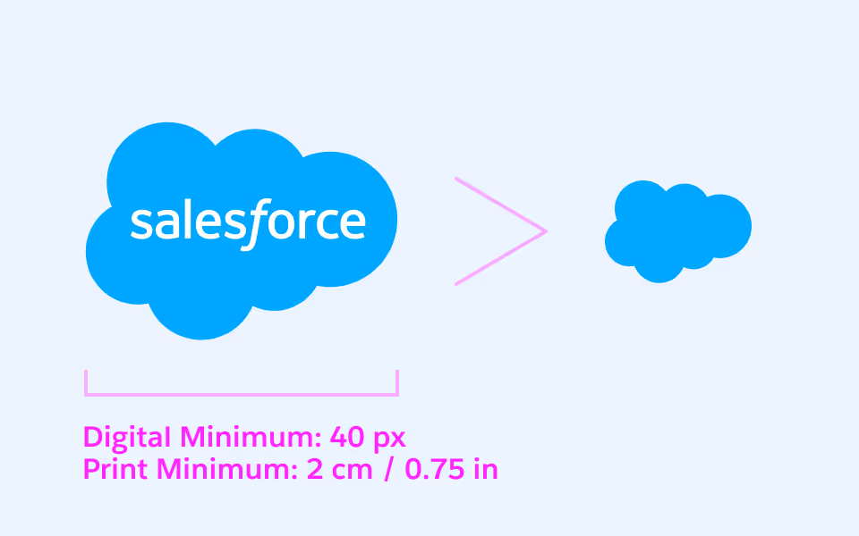
Minimum size
In digital, our Cloud Logo should be at least 40 pixels wide. In print, it should be at least 0.75 inches (2 centimeters) wide. Anything smaller than these dimensions requires our logo to be replaced with the cloud symbol alone, without the wordmark.
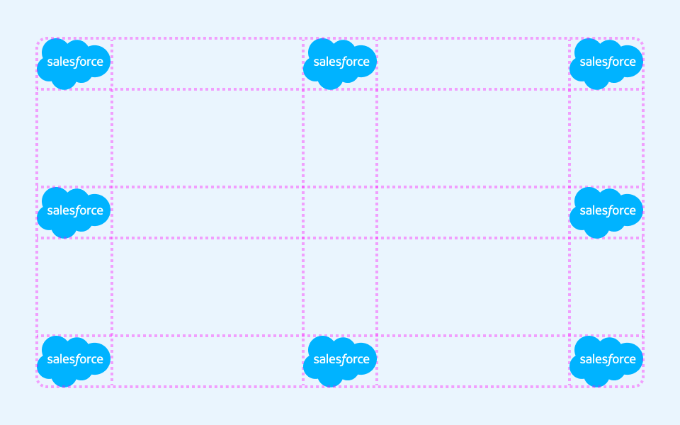
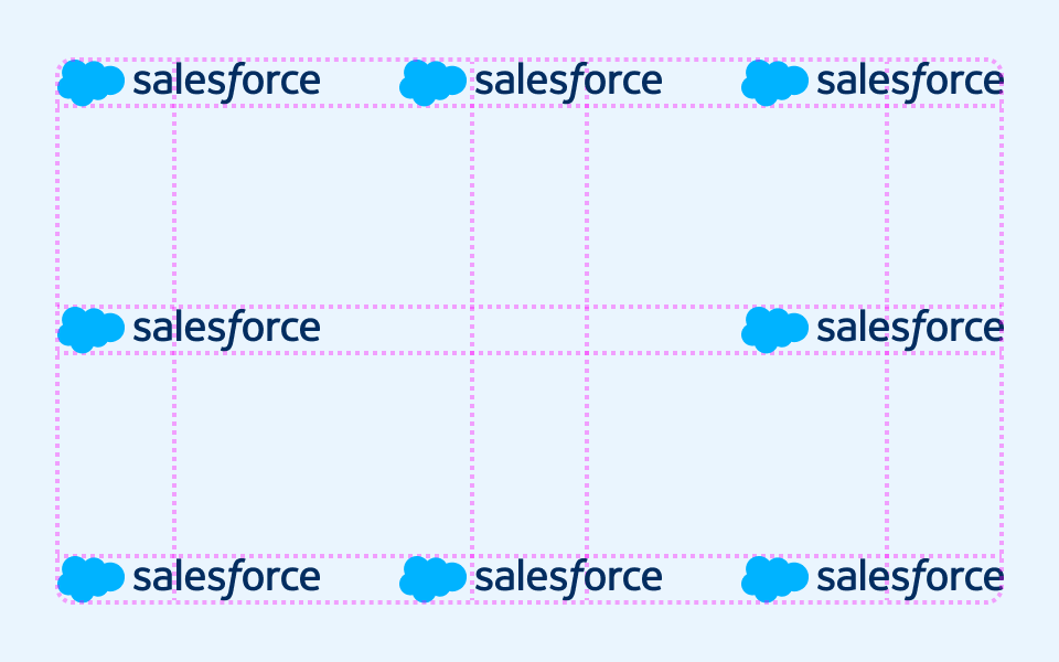
Placement
Our logo has eight approved placement options, shown in the diagram. Pick the position that best fits your layout and keeps the content easy to read. When in doubt, let the most important information lead and allow the logo to follow naturally.

Clear space
Reserve clear space equal to the height and width of the cloud shape on all sides.
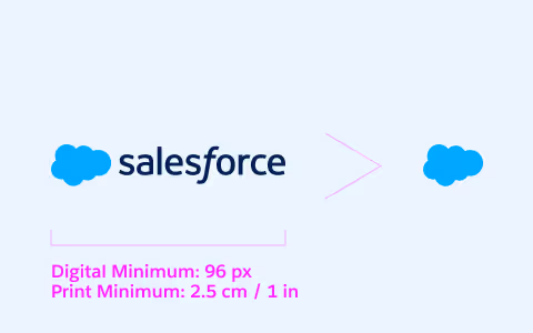
Minimum size
In digital, our logo should be at least 96 pixels wide. In print, it should be at least 1 inch (2.5 centimeters) wide. Anything smaller requires our logo to be replaced with the cloud symbol alone, without the wordmark.
Placement
Our logo has eight approved placement options, shown in the diagram. Pick the position that best fits your layout and keep the content easy to read. When in doubt, let the most important information lead and allow the logo to follow naturally.