Seleziona un'organizzazione
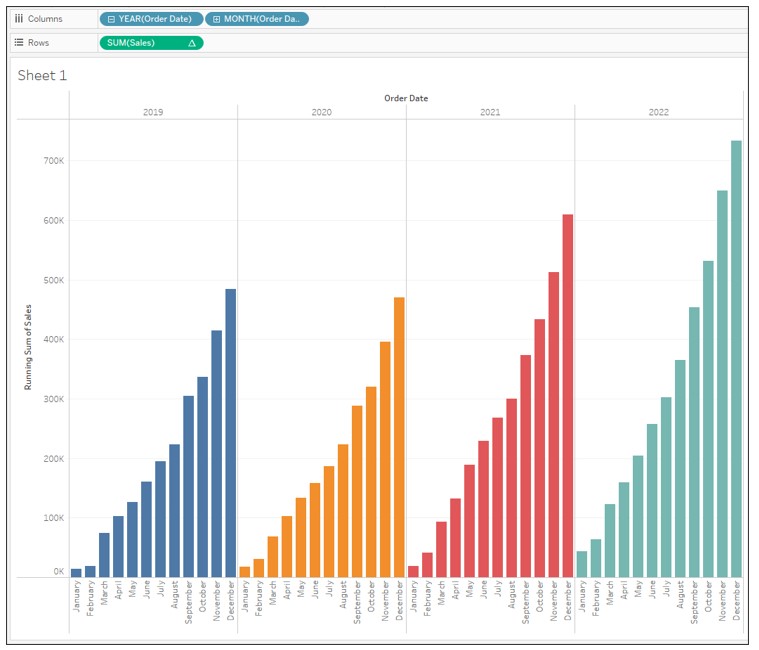
Display Cumulative Sales by Year as a Bar Graph
Data pubblicazione: Feb 25, 2025
Operazione
How to display the cumulative sales by year as a bar graph.
Fasi
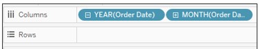
2. Drag Order Date to Columns and drill down by MONTH then remove QUARTER(Order Date) from Columns.
3. Drag Sales to Rows.
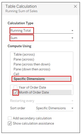
4. Right-click on Sales on Rows and select Add Table Calculation. Set the following:
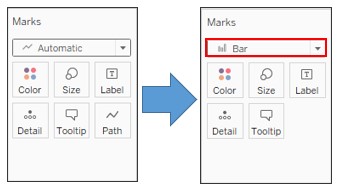
5. On the Marks card, change the graph type to Bar.
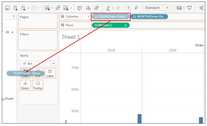
6. Press CTRL and drag YEAR(Order Date) on Columns to Color.
Numero articolo Knowledge
001458652
Questo articolo ha risolto il problema?
Facci sapere, così possiamo migliorare!