Valitse organisaatio
How to Hide Legend Measure for Missing Data in a Dual Axis Chart
Julkaisupäivä: Apr 21, 2026
Tehtävä
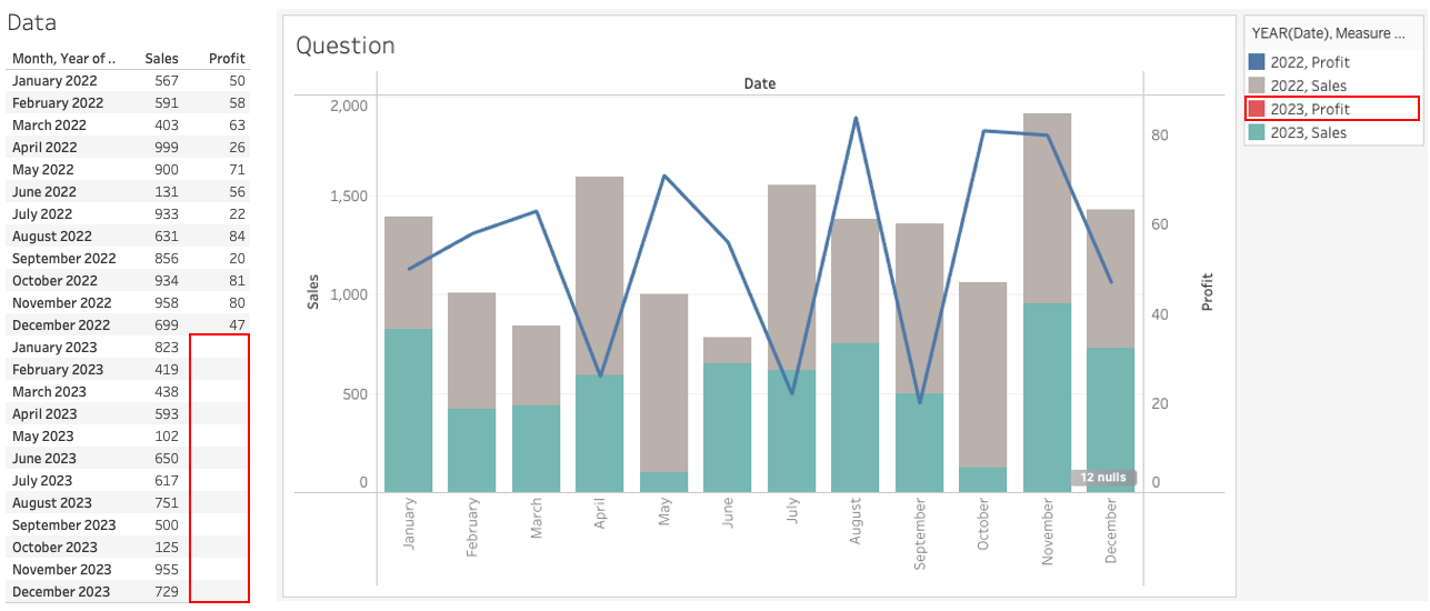
When data is missing as shown below, a color legend for the missing data is displayed when a dual axis chart is created. How do we hide the empty measure item from the legend?
Vaiheet
1. Add MONTH(Date) to Columns.
2. Add SUM(Sales) and SUM(Profit) to Rows.
3. Right-click SUM(Profit) in Rows shelf and select Dual Axis.
4. Open SUM(Sales) on the Marks card and change the mark type to Bar.
5. Create a calculated field and name it Color for Sales with the following formula:
IF NOT ISNULL([Sales]) THEN STR(YEAR([Date]))+" Sales" END6. Create a calculated field and name it Color for Profit with the following formula:
IF NOT ISNULL([Profit]) THEN STR(YEAR([Date]))+" Profit" END7. Open SUM(Sales) on the Marks card and add Color for Sales to Color.
8. Open SUM(Profit) on the Marks card and add Color for Profit to Color.
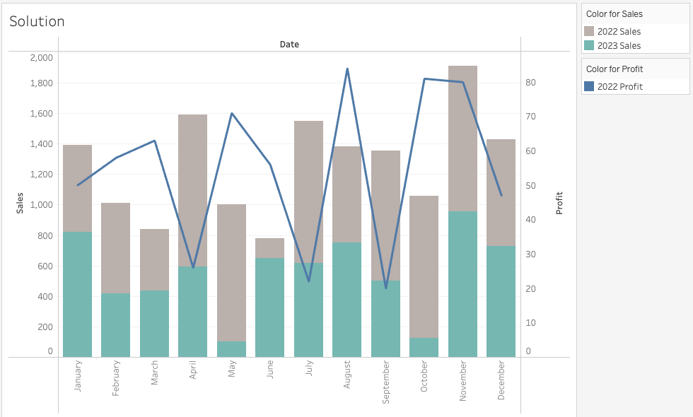
9. Right-click the Null literal in the Color for Profit legend and select Hide.
Knowledge-artikkelin numero
001468220
Ratkaisiko tämä artikkeli ongelmasi?
Anna palautetta, jotta voimme kehittyä!