Välj en organisation
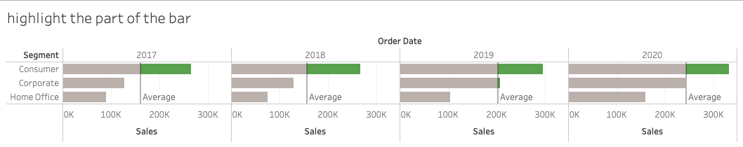
How to highlight the part of the bars which exceeds the average reference line
Publiceringsdatum: Apr 21, 2025
Uppgift
How to highlight the part of the bars which exceeds the average reference line?
For example, highlight the part of sales value that exceeds the average sales over segment for every year.
Steg
1. Drag "Order Date", "Sales" to the columns shelf, and "Segment" to the rows shelf. Add an Average Reference Line via Analytics->Average Line->Pane
2. Create a calculated field "Over Average" with the function:
If SUM([Sales]) > window_avg(SUM([Sales]))
THEN window_avg(SUM([Sales]))
ELSE NULL
END
3. Drag the "Over Average"field to the mark card->color, and right-click to change it from continuous to discrete
4. Drag the "Over Average"field to the Columns shelf, and right-click to select "dual-axis"
5. Right-click the "Over Average" header and select synchronizes axis, untick show header
6. Adjust the colors from the legend on the right side.
7. Filter out the "nulls" value by selecting "show data at default position".
8. Click the "Over Average" mark card->Label->untick show mark label if there are labels in the view
Knowledge-artikelnummer
001470551
Löste denna artikel ditt problem?
Berätta för oss vad vi kan förbättra!