組織を選択
Create a Double Pie Chart Showing the Breakdown
公開日: Apr 22, 2025
タスク
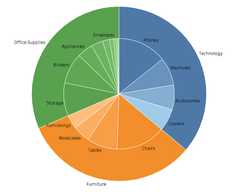
How can we create a double pie chart to display a breakdown of hierarchical data such as Category and Sub-Category?
ステップ
Follow along in the sample packaged workbook found in the Attachments section to review the steps below.
1.Create a calculated field and name it Dummy with the following formula:
02.Add SUM(Dummy) to Rows.
3.Change the Mark type to Pie.
4.Add Category to Color and Label.
5.Add SUM(Sales) to Angle.
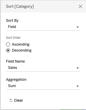
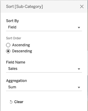
6.Right-click Category in Color and select Sort. Configure it as follows.
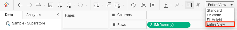
7.Select Entire View in the Toolbar.
8.Click Size in the Mark card and increase the size.
9.Add SUM(Dummy) to Rows.
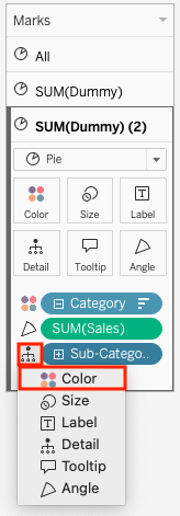
10.Open SUM(Dummy)(2) Mark card.
11.Delete Category from Label.
12.Add Sub-Category to Detail. Click the Detail icon and select Color.
13.Right-click Sub-Category in Color and select Sort. Configure it as follows.
14.Add Sub-Category to Label.
15.Click Size in the Mark card and decrease the size.
16.Right-click the second SUM(Dummy) in Rows and select Dual Axis.
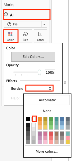
17.Open the All Mark card and configure color border as you like.
18.Right-click the first SUM(Dummy) in Rows and select Show Header.
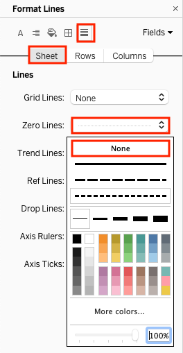
19.Right-click the blank space in the worksheet and select Format.
20.Change Zero Lines to None.
ナレッジ記事番号
002957967
この記事で問題は解決されましたか?
ご意見をお待ちしております。