Valitse organisaatio
How To Adjust Bar Spacing To Match A Desired Layout In Bar Charts
Julkaisupäivä: Sep 9, 2025
Tehtävä
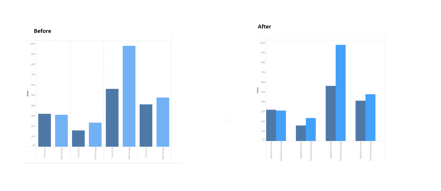
How to fine-tune bar spacing in Tableau, transforming the layout from Before to the target design shown in the image of After.
Vaiheet
This article walks through building a side-by-side bar chart in Tableau to compare monthly sales for specific product categories—Furniture and Technology. It covers creating category-specific calculated fields, customizing the layout with Measure Names and Values, and formatting the view for clarity and presentation.
1. Set Up the Worksheet
・ First, create a new worksheet.
・ Drag the Order Date dimension to the Columns shelf and select the discrete MONTH(Order Date) option.
2. Create Category-Specific Sales Fields
・ Create a calculated field for the Furniture category. Name it Sales(Furniture) and enter the following formula:
IF [Category] = "Furniture" THEN [Sales] END
・ Similarly, create another calculated field for the Technology category. Name it Sales(Technology) and use this formula:
IF [Category] = "Technology" THEN [Sales] END・Create a calculated field called Container and use this formula:
IF FALSE THEN 0 ELSE NULL END
3. Build the Initial View
・ Drag the Measure Values field to the Rows shelf.
・ In the Marks card, change the chart type from Automatic to Bar.
4. Filter the Displayed Measures
・ Right-click the Measure Values pill on the Rows shelf and select Edit Filter.
・ In the pop-up window, check the boxes for only the two measures just created: Sales(Furniture), Sales(Technology) and Container then click OK.
5. Adjust the Chart Layout
・ Drag the Measure Names field to the Columns shelf and place it to the right of the MONTH(Order Date) pill. This will arrange the bars side-by-side for each month.
6. Format and Refine the Chart
・ To distinguish between the categories, drag the Measure Names field onto Color in the Marks card.
・ Click the color legend to Edit Colors and assign your desired colors to each category (for example, two different shades of blue).
・ To simplify the axis labels, right-click the label under the Container , select Edit Alias, and rename it to a space " " .(This hides the empty placeholder but keeps the space it occupies, effectively separating the other bars.)
7. (Optional) Change the size of the bars.
・Click on the Size mark card and change the size of the bars in the chart by sliding on the size slider.
Please refer to "Sample.twbx" for more details.
Lisäresurssit
Create a Simple Calculation Field
Knowledge-artikkelin numero
005152916
Ratkaisiko tämä artikkeli ongelmasi?
Anna palautetta, jotta voimme kehittyä!