
You are here:
Analyze Student Success Data with the Tableau Accelerator
Visualize student and support staff data and make informed decisions by using the Student Success Hub Tableau Accelerator.
- Learn About the Student Success Hub Tableau Accelerator
The Student Success Hub Tableau Accelerator turns your data into actionable insights. See current Alert, Appointment, and other student data in a variety of formats that you can easily filter and customize. Use the dashboards to identify and act on trends around student needs and support staff workloads. - Understand the Data Model Requirements
The dashboards show data from these objects. - Connect Salesforce to Tableau
After you have a Tableau account, connect it to Student Success Hub to start with our ready-made dashboards. Connect using either Tableau Online or Tableau Desktop. - Explore the Dashboards
The Student Success Hub Tableau Accelerator includes four dashboards and a student list. - Best Practices for Using and Maintaining Tableau Dashboards
Understand how to make the most of Tableau dashboards.
Learn About the Student Success Hub Tableau Accelerator
The Student Success Hub Tableau Accelerator turns your data into actionable insights. See current Alert, Appointment, and other student data in a variety of formats that you can easily filter and customize. Use the dashboards to identify and act on trends around student needs and support staff workloads.
See Student Success Hub Tableau Accelerator.
Understand the Data Model Requirements
The dashboards show data from these objects.
-
Account with Academic Program
-
Alert
-
Appointment
-
Appointment Attendee
-
Case with Student Records
-
Contact
-
Course Connection
-
Course Offering
-
Program Enrollment
-
Term
-
User
-
Success Plan
The dashboards also use predefined case teams and case team roles.
These dashboards use a generic data model that easily fits the needs of most institutions. Here’s how the dashboard data is modeled and structured in Salesforce.
Term Enrollment
The dashboards use the Course Connection object to calculate enrollment for students (Contacts). Course Connections are associated with the Course Offering object, which has a lookup relationship to the Term object.
Purpose |
Object |
Field |
Related Object |
Relationship Field on Related Object |
|---|---|---|---|---|
Establish a relationship between students and courses. |
Contact |
Contact ID |
Course Connection |
Contact |
Establish a relationship between courses and Course Offerings, which are mapped to Terms. |
Course Connection |
Course Offering ID |
Course Offering |
Id |
Provide access to the names and dates for Terms. |
Course Offering |
Term |
Term |
Id |
Academic Program
The dashboards use the Program Enrollment object to provide additional filters such as Class Year and Program.
Purpose |
Object |
Field |
Related Object |
Relationship Field on Related Object |
|---|---|---|---|---|
Identify students who have Program Enrollment records. |
Contact |
Contact ID |
Program Enrollment |
Contact |
Pull the Program name related to Program Enrollment record. |
Program Enrollment |
Program |
Account |
Id |
Connect Salesforce to Tableau
After you have a Tableau account, connect it to Student Success Hub to start with our ready-made dashboards. Connect using either Tableau Online or Tableau Desktop.
If you're new to Tableau, purchase at least one Creator license to get started. You can also start a free 14-day trial.
Use Tableau Online
-
Go to Tableau Online and log in.
-
On the home page, click Accelerator Dashboards. If you don’t land on the home page, click Home, then click See All.
-
On the Starters page, set your Data Sources filter to Salesforce.
-
Click Student Success Hub Tableau Accelerator.
-
Click Sign in to Salesforce and log in.
Use Tableau Desktop
-
Download the Student Success Hub Tableau Accelerator from Tableau Exchange.
-
Open Tableau Desktop.
-
From the Tableau Desktop home page, click Open a Workbook.
-
In the Data menu, select each data source that you want to use, then select Edit Data Source.
-
Log in and select Allow to give access to your data.
Explore the Dashboards
The Student Success Hub Tableau Accelerator includes four dashboards and a student list.
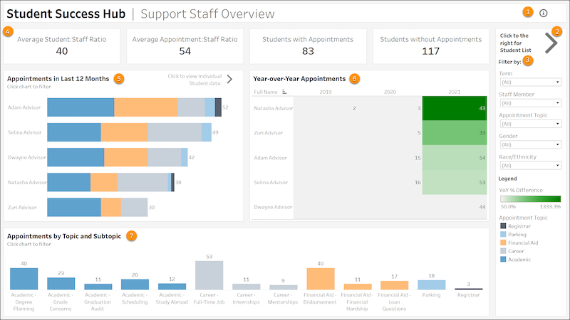
Support Staff Overview
Understand how support staff engage with students. To view this dashboard, select the Overview tab.
-
Hover over the icon to learn about the dashboard and how you can use it (1).
-
Click the icon to go to the Student List tab, which contains data at the student level for appointments, alerts, grade point average, and credits earned (2).
-
Filter data by Term, Staff Member, Appointment Topic, Gender, and Race/Ethnicity (3).
-
KPI tiles show the average number of students per staff member, average number of appointments per staff member, and the number of students with and without appointments (4). Hover over the tiles for additional information.
-
Review the total number of appointments over the last 12 months by staff member (5).
-
Compare appointment volumes year-over-year (6). Hover over values for additional information.
-
Evaluate appointment counts by topic and subtopic (7). Hover over values for additional information.
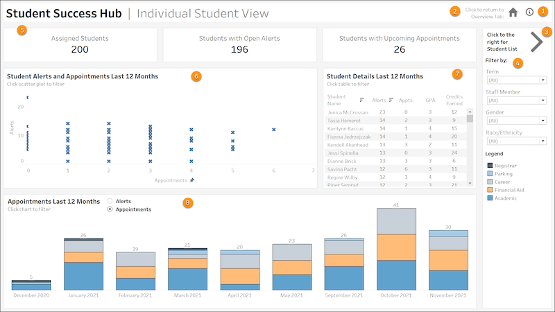
Individual Student View
See how support staff engage with individual students. To view this dashboard, select the Individual Student tab.
-
Hover over the icon to learn about the dashboard and how you can use it (1).
-
Click the icon to go to the Overview dashboard (2).
-
Click the arrow to go to the Student List tab, which contains data at the student level for appointments, alerts, grade point average, and credits earned (3).
-
Filter data by Term, Staff Member, Gender, and Race/Ethnicity (4).
-
KPI tiles show the number of students with an assigned case team member, with open alerts, and with upcoming appointments (5).
-
View the student alerts and appointments over the last 12 months as a scatter chart. The number of appointments is plotted along the x-axis and the number of alerts is plotted along the y-axis for individual students (6). Hover over values to see student names, the date that the most recent alert was created, and the date of the most recent appointment. Select one or more students to filter the other views.
-
Review key student data in the Student Details Last 12 Months report. The data includes students with alerts and appointments in the last 12 months, along with their GPA and credits earned (7).
-
View the student appointments or alerts over the last 12 months in a graphic chart (8). Hover over columns for additional information.
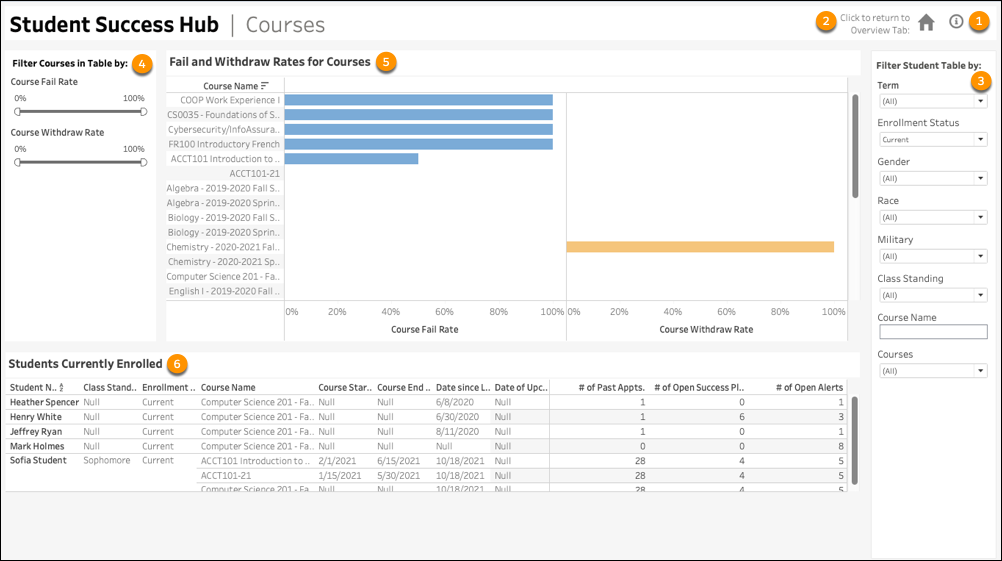
Courses
See how your courses are performing with course metrics at your fingertips. To view this dashboard, select the Courses tab.
-
Hover over the icon to learn about the dashboard and how you can use it (1).
-
Click the icon to go to the Overview dashboard (2).
-
Filter data by Term, Enrollment Status, Gender, Race, Military Service, Class Standing, Course Name, or Courses (3).
-
Filter the Fail and Withdraw Rates for Course report by Course Fail Rate percentage and Course Withdraw Rate percentage. (4).
-
Review the course failure and course withdrawal rates for individual courses in a graphic report. Click a course name to filter the report for a single course (5).
-
Review student success data on the Students Currently Enrolled report. This report provides the following data ordered by student name (by default): Class Standing, Enrollment, Course Name, Course Start Date, Course End Date, Date Since Last Appointment, Date of Upcoming Appointment, # of Past Appointments, # of Open Success Plans, and # of Open Alerts. Hover over the data for more information or to filter the report by your selection (6).
Retention Indicators
Get an in-depth understanding of your institution’s student retention with detailed retention indicators. To view this dashboard, select the Retention Indicators tab.

-
Hover over the icon to learn about the dashboard and how you can use it (1).
-
Click the icon to go to the Overview dashboard (2).
-
Click the arrow to go to the Student List (3).
-
Filter data by Term, Staff Member, Gender, Race, Military Service, Student Name, # of Open Alerts, # of Open Success Plans, # of Past Appointments, and # of Future Appointments (4).
-
KPI tiles show the percentage of Students with Unresolved Alerts, percentage of Students with Open Success Plans, and the percentage of Students with No Appointment in Last 12 Months (5).
-
Review the number of students enrolled by term (6).
-
Evaluate a student’s retention indicators over the last 12 months. Retention Indicator metrics include: # of Open Alerts, # of Open Success Plans, # of Past Appts., and # of Upcoming Appts for each student (7).
Student List
Track students' academic performance and support engagement. To view this list, select the Student List tab.

-
Hover over the icon to learn about the dashboard and how you can use it (1).
-
Click the icon to go to the Overview dashboard (2).
-
Click the arrow to go to the Individual Student dashboard (3).
-
Filter data by Term, Staff Member, Gender, Race/Ethnicity, Student Name, Days Since Last Appt., Credits Earned, and GPA (4).
-
KPI tiles show the number of students with an assigned case team member, with open alerts, and with upcoming appointments (5).
-
Evaluate students' academic performance and support engagement (6).
Best Practices for Using and Maintaining Tableau Dashboards
Understand how to make the most of Tableau dashboards.
-
Keep dashboards fresh with current data from Student Success Hub. For more information, see Keep Data Fresh in Tableau Help.
-
Customize dashboards with formatting to enhance analysis and presentation. You can also remove filters that aren't relevant and add your own. For more information, see Format Your Work in Tableau Help.
-
Export Tableau data to various image file types for use in presentations or other communications.
-
If you need help, log a support case with Tableau.