Use a line chart when you have one important grouping representing an ordered set of data
and one or more values to show.
Required Editions
Available in: Quip desktop app, Quip iOS mobile app, and Quip
on web
Data Options for Line Charts
To customize data in line charts, open the Chart Editor, and click the
Customize tab.
Style: Change the position of the chart legend, or hide it entirely. Select the colors for
the chart’s background and border.
Series: Apply data labels to show values directly in the chart, and set the labels’ position
and color.
Horizontal Axis: Give the axis a title, change the number formatting, display grid lines,
reverse the axis order, and treat data labels as text.
Vertical Axis: Give the axis a title, adjust its scale, set the number of tick marks shown,
change the number formatting, and display grid lines.
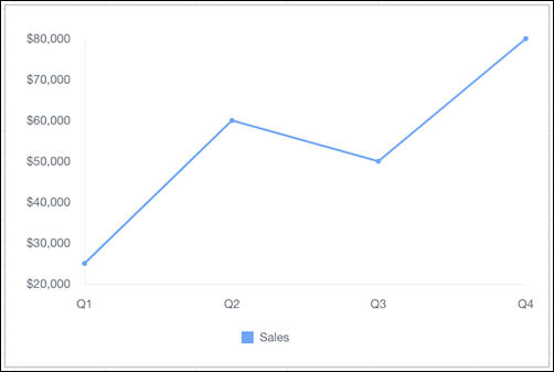
Sample Data for Line Charts
Quarter
Sales
Q1
$25,000
Q2
$60,000
Q3
$50,000
Q4
$80,000
Did this article solve your issue?
Let us know so we can improve!
Loading
Salesforce Help | Article
Cookie Consent Manager
General Information
Required Cookies
Functional Cookies
Advertising Cookies
General Information
We use three kinds of cookies on our websites: required, functional, and advertising. You can choose whether functional and advertising cookies apply. Click on the different cookie categories to find out more about each category and to change the default settings.
Privacy Statement
Required Cookies
Always Active
Required cookies are necessary for basic website functionality. Some examples include: session cookies needed to transmit the website, authentication cookies, and security cookies.
Functional Cookies
Functional cookies enhance functions, performance, and services on the website. Some examples include: cookies used to analyze site traffic, cookies used for market research, and cookies used to display advertising that is not directed to a particular individual.
Advertising Cookies
Advertising cookies track activity across websites in order to understand a viewer’s interests, and direct them specific marketing. Some examples include: cookies used for remarketing, or interest-based advertising.