
Standard Lightning Page Components
Standard components are Lightning components built by Salesforce. Several standard components are available when creating Lightning pages.
Required Editions
| Lightning App Builder available in: both Salesforce Classic and Lightning Experience |
| Lightning Home and utility bar pages available in: Lightning Experience |
| Lightning app and record pages available in: both the Salesforce mobile app and Lightning Experience |
| Email application pane pages available in: both Salesforce Classic and Lightning Experience |
Available in: Group, Essentials, Professional, Enterprise, Performance, Unlimited, and Developer Editions |
Some standard components have required properties that you must configure for the component to work on the page. When you add a component to a Lightning page in the Lightning App Builder, its required properties are marked with an asterisk.
A Lightning page region can contain up to 100 components.
If you have a page to be used in the Salesforce mobile app, use only the Lightning components that the mobile app supports.
Accordion
Use the Accordion component to organize your components into collapsible sections. You can put multiple components in each section and customize the section name. You can have up to 25 sections, but we recommend no more than 10.
The Accordion component is supported for record and Home pages.
Actions & Recommendations
Give your users a to-do list in the Actions & Recommendations component. Show a variety of steps, including screen flows, field service mobile flows, quick actions, and recommendations from your Next Best Action strategies. When a user opens a flow in a console app, it starts in a subtab. In a navigation app, it starts in a window. You can add this component to supported object pages in Lightning Experience.
For more information, see Lightning Flow for Service and the Actions & Recommendations Component.
Activities
Display the timeline of the activities of the record. This component appears only if the Default Activities View is set to Activity Timeline. The component can contain Create a Record quick actions that point to the Event and Task objects. It contains Log A Call and Send Email actions for each of your org’s accounts, contacts, contracts, leads, opportunities, and activity-enabled custom object records.
For more information, see Activities View and Actions in Lightning Experience.
After Conversation Work (Beta)
Display a countdown after a customer conversation ends. During the After Conversation Work (ACW) countdown period, support agents can complete closing tasks like sending follow-up emails, updating a case, or finalizing their notes. Agents can exit the countdown early by closing the call record or let it run its course. When the time runs out, the agent is considered available to help the next customer whether they’ve closed the call record.
After Conversation Work is available only for Voice Call channels. To learn more, see Configure After Conversation Work (Beta).
App Launcher
The App Launcher displays a user’s available Salesforce apps and the connected apps the administrator has configured. Users navigate between apps using the App Launcher.
This component is supported in API version 35.0 and later.
Contact Salesforce to enable the App Launcher component for the Lightning App Builder in your organization.
Blank Space
Use this component to help align fields in field sections on Lightning record pages that use Dynamic Forms. Find this component under the Fields tab in the component palette.
You can use a blank space on its own to separate fields vertically inside a field section. To further enhance the alignment of your field section content, you can also use a blank space in conjunction with the field section property Align fields horizontally.
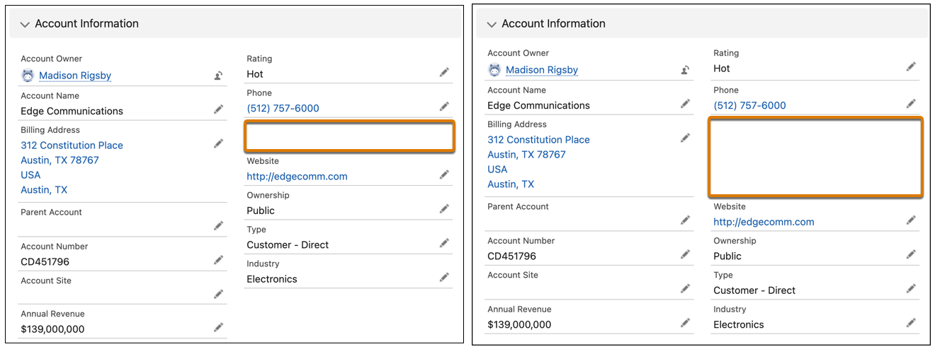
For example, these two versions of the same field section contain account fields, with a blank space added below the Phone field. The left image shows the normal behavior without the Align fields horizontally checkbox selected. The blank space appears with a single row height.
On the right, the horizontal alignment setting was selected, causing the Website field to stay aligned horizontally with Parent Account instead of collapsing upward. The blank space height is now expanded to align with the row height of its neighbor, Billing Address.
A blank space component is considered a field and counts against the limit of 100 fields per region. It doesn’t count against the component page limit.
Blank spaces aren't supported in the Dynamic Highlights Panel component.
Call Recording Player
Use this component to listen to audio recordings of calls. The Call Recording Player component is available only for the Voice Call object. This component is available in the Lightning App Builder in orgs where Service Cloud Voice is turned on. To view and use this component, users need the Contact Center Agent permission set.
Because the Call Recording Player doesn't have an alternative text-based transcript, we recommend adding the Conversation Body component underneath the Call Recording Player to support accessibility.
Chatter
As of API version 38.0, the Feed component has been renamed Chatter in the Lightning App Builder. Use it to place a publisher and feed combo on a record page.
Chatter Feed
Use the Chatter Feed component to place a feed anywhere on a record page. The feed gives you a way to view posts, comments, and questions. Its attribute, Feed Type, takes one of these values.
- Bookmarked—Shows a feed of all items the current user has bookmarked
- What I Follow—Shows a feed of all items the current user has followed
- To Me—Shows a feed of all items where the current user is mentioned
No coding is required to join a feed to a publisher. The connection is made automatically with the publisher and any feed on the page. The Chatter Feed component is available in API version 38.0 and later.
Chatter Publisher
Use the Chatter Publisher component to place a feed publisher anywhere on a record page. The publisher gives you a way to post, poll, or ask a question in a feed. Its attribute, Type, has the default value Global. Use the value Record when you want to associate the publisher with an object's feed. Then posts that are created with the publisher are associated with the record rather than the global Chatter feed. Use the Chatter Publisher component with the Chatter Feed component to get a full feed experience. No coding is required to join a publisher to a feed. The connection is made automatically with the publisher and any feed on the page. The Chatter Publisher component is available in API version 38.0 and later.
Conversation Body
Use this component to let agents view call transcripts in Service Cloud Voice. The Conversation Body component is available only for the Voice Call object. Transcripts are generated in real time during the call and the complete transcript is stored on the call record. As the call progresses, the transcript is generated and displayed in the component. Configure transcription data streams in Amazon Web Services to generate call transcripts. To view and use this component, users need the Contact Center Agent permission set.
CRM Analytics Collection
The CRM Analytics Collection component enables you to insert and display collections of curated dashboards and lenses to your Lightning pages. The component intuitively displays collections in a concise panel so users can view relevant insights in the place where they work.
Available in API version 54.0 and later. Users must have access to the selected collection used within the component.
LWC CRM Analytics Dashboard
The LWC CRM Analytics Dashboard component surfaces an entire dashboard right where people work. The dashboard is interactive and works seamlessly in Lightning Experience pages and LWR sites. Users can refresh a dashboard, apply filters, and click chart segments to drill into filtered reports.
A dashboard needs space to display charts and tables. If an embedded dashboard is placed in too small a space, a collapsed version is displayed. Users can click View Dashboard to expand a collapsed dashboard.
Available in API version 60.0 and later. Private dashboards aren’t available.
For more information, see Embed CRM Analytics Dashboards in Lightning Pages.
CRM Analytics Dashboard
The CRM Analytics Dashboard Aura component surfaces an entire dashboard right where people work. The dashboard is fully interactive. Users can refresh a dashboard, apply filters, and click chart segments to drill into filtered reports.
A dashboard needs space to display charts and tables. If an embedded dashboard is placed into too small a space, then a collapsed version is displayed. Users can click View Dashboard to expand a collapsed dashboard.
Available in API version 41.0 and later. Private dashboards aren’t available.
For more information, see Embed CRM Analytics Dashboards in Lightning Pages.
Dynamic Actions Bar (Pilot)
With this component you can add action buttons anywhere on your Lightning record and app pages. Add, delete, and change the order of actions in the Dynamic Actions Bar. You can also control the visibility of the component and of individual actions in the component based on record field, permission, or user.
To set the visibility of individual actions in the Dynamic Actions Bar component at runtime:
- In the Dynamic Actions Bar properties pane, click an action name to open the Action dialog.
- Under Set Action Visibility in the Action dialog, click Add Filter.
- To control action visibility for a record field, select Record Field. To control action visibility for a record, permission, or user, select Advanced.
- For Record Field, click the Field name field and then select a field from the dropdown list. For Advanced, select a field type and then select a field.
- Select an operator and enter a value, then click Done.
Keep these considerations in mind when using the Dynamic Actions Bar component.
- This component is supported only for Lightning Experience desktop on record and app pages.
- The Dynamic Actions Bar supports all standard and custom global actions.
- This component is supported as a source for Dynamic Interactions on app pages only. See Dynamic Interactions in the Lightning App Builder.
- Email quick action and
FeedItem.MobileSmartActionsactions aren’t supported for the Dynamic Actions Bar. - If no actions are supported for the current object, a message appears in the Lightning App Builder properties pane.
Dynamic Highlights Panel
Dynamic Related List–Single
Use this component to add or upgrade a single related list on your Lightning page and customize it directly in the Lightning App Builder instead of in the page layout editor. In the component properties, choose the list’s fields and sort order, apply filters, add actions, and give the list a descriptive name. To see the most relevant records, set up two or more related lists with different filters on the same object.
The Dynamic Related List–Single component is available for custom objects and for Salesforce record home objects that are enabled for LWC. The Dynamic Related List–Single component isn’t available for external objects. If you don’t see Dynamic Related List–Single in the list of standard components, it’s not currently available for the object associated with the record page. You can use this component in record pages only.
Keep these considerations in mind when using the Dynamic Related List–Single component.
- Only the Related List–Single component can be upgraded to the Dynamic Related List–Single component. If you don’t see the option to upgrade, Dynamic Related List–Single isn’t supported for the object associated with the record page or for the related list selected in the properties pane.
- You can add standard actions, custom buttons, and Create a Record and Update a Record quick actions on dynamic related lists. Quick actions are available as mass actions on the related list.
- Custom actions aren’t supported on dynamic related lists.
- In the Lightning App Builder, the dynamic related list preview shows a maximum of six records. Depending on permissions, the number of records that users see in the related list on the Lightning page doesn’t always match the number of records in the list preview.
- The sort order that you define is the related list’s initial sort behavior. If a user sorts the list on a different field or in a different order, their sort order overrides yours. The next time the user views the related list, they see the records in the order they selected.
- Only the List and Tile related list types are available for dynamic related lists. To display more than four fields in a dynamic related list, use the List type in a main region.
- To filter on a currency field in a dynamic related list, enter only numbers and an optional decimal point. For multiple currencies, the filter uses the default currency, even if you enter a currency symbol. For example, your default currency is in euros but you enter the filter Price greater than or equal $15000. The related list shows records with prices greater than or equal to €15,000.
- Dynamic related lists support most relative date filters so you can filter on Date and DateTime fields using human-speech-inspired syntax. These relative date filters aren’t supported: n DAYS AGO, n WEEKS AGO, n MONTHS AGO, n QUARTERS AGO, n YEARS AGO, n FISCAL QUARTERS AGO, n FISCAL YEARS AGO.
- Related list results are truncated at 2,000 records, so a filter set that returns over 2,000 records spends extra time querying records it can’t display. To improve your list’s performance, filter it to return a maximum of 2,000 records.
- When users go to a dynamic related list from a bookmark or shared URL, if they haven’t viewed the list before, they’re redirected to the record detail page. To see the entire list, they can click View All again.
- In Salesforce Console apps, a new subtab opens every time a user clicks View All on a dynamic related list. If a user clicks View All more than once, multiple subtabs open.
- The URL associated with the View All page is dynamically generated and is supported only on the record home page. Don’t embed the View All URL in a custom component.
- Related list avatars aren't displayed on cards in the Dynamic Related List–Single component when viewed on mobile devices.
Einstein Field Recommendations
The Einstein Field Recommendations component recommends values for picklist, checkbox, and lookup fields on cases. It’s used in Einstein Case Classification and Einstein Case Wrap-Up and is available only if you enabled one or both of those features. Einstein’s field value recommendations are based on data from recently closed cases. The component has two types: Case Classification and Case Wrap-Up.
To learn more about using this component with Einstein Case Classification, see Display Recommendations in the Service Console.
Available in API version 49.0 and later.
Einstein GPT Sales Emails
If Sales Emails and Gmail or Outlook integrations are enabled, the Einstein GPT Sales Emails component appears on the default email application pane. The component can be added to custom email application pane layouts. To learn more about using Sales Emails in Outlook and Gmail, see Understand How Einstein Generative AI Creates Sales Emails.
Einstein Next Best Action
The Einstein Next Best Action component displays suggested recommendations and actions on a record page. Use strategies to apply your org’s business rules to display context-specific suggestions to users.
Einstein Predictions
The Einstein Predictions component displays predictions and recommendations on a Lightning record page for a standard or custom object. See Add Einstein Predictions to a Lightning Page.
Einstein Replies
The Einstein Replies component recommends stock replies that support agents can insert into chat and messaging sessions. It’s used in Einstein Reply Recommendations and is available only if that feature is enabled. The replies that Einstein recommends are based on past closed chats. See Einstein Reply Recommendations.
If Einstein Reply Recommendations is enabled, this component appears automatically on the Chat and Messaging console tabs for any users with the View and Act on Einstein Reply Recommendations user permission.
Available in API version 49.0 and later.
Flow Orchestration Work Guide
The Flow Orchestration Work Guide component displays orchestration work items on a Lightning record page. Use this component to ensure that users can see work items assigned to them from orchestration runs. To learn more about Flow Orchestration see Flow Orchestration.
Forecasts Header
The Forecasts Header component contains key page-level actions and selections for a forecasts page, such as selecting the forecast type to show and the forecast period. We recommend that each forecasts page include a Forecasts Header component so that viewers can select their preferences and a forecast type. Those selections allow other forecasts components on the page to work correctly. Selections made in this component on a forecasts page determine what data is shown in other forecast-related components on the page.
This component is supported for Forecasts pages.
Forecasts Opportunity List
The Forecasts Opportunity List works in conjunction with the Forecasts Header and Forecasts Summary components and shows the opportunities that contribute to a selected forecast line in the summary.
This component is supported for Forecasts pages.
Forecasts Summary
The Forecasts Summary is the main part of any forecast page and shows the actual forecast numbers based on the selections made in the Forecasts Header on the page. The summary is where sales leaders can view forecasting data, make forecast adjustments, and update quotas. Pieces contained in the summary are configurable in Forecasts Settings in Setup.
This component is supported for Forecasts pages and works best in a wide region of the page.
If Einstein Forecasting is enabled, the summary also includes AI-powered intelligence to improve forecasting accuracy and predictions.
Grid
Use the Grid component to divide a document section into multiple columns. You can customize the layout by adding columns, defining specific column widths, and adjusting the padding between them. Grid acts as a structural container, when you apply conditional visibility rules to it, the rules apply to the grid and all components nested within it.
The Grid component is available only in environments where the Field Service (FSL) and Revenue Cloud license are enabled.
For more information on Revenue Cloud license, see Functional Area and Feature Availability in Revenue Cloud Licenses.
Highlights Panel
The Highlights Panel component displays key record fields along with page-level actions. The fields that appear in the highlights panel come from the compact layout assigned to the object. The actions in the highlights panel come from the Salesforce Mobile and Lightning Experience Actions section of the page layout. Record highlights show up to the first 7 fields on desktop and up to the first 10 fields in the Salesforce mobile app.
To streamline your highlights panel by not showing the second row of information and reducing the size of the first row, select the Show as collapsed (desktop only) checkbox. To show fewer action buttons, reduce the number using the Number of Visible Action Buttons (desktop only) attribute.
To display the highlights horizontally or vertically (desktop only), drag the Highlights Panel component into a region with the horizontal or vertical dimensions you want. The highlights panel adjusts to fit the region’s space. For example, if you drag it into a narrow column, the highlights display vertically. If you drag it to a full-page width column, the highlights display horizontally.
When a field with an image larger than 50x50 pixels is placed as the first field in the Highlights Panel, the image is cropped. In any other position, the image appears as expected. If the image is in a formula field, you can get around this issue by setting the height and width values of the image in the formula to 50 pixels each. For more information, see IMAGE in Salesforce Help.
If you configure a highlights panel with a formula field that contains an image, the first time the image renders on the page, its width is set to a smaller value. After navigating away and coming back to the page, updating the record, or performing an action on the page, the highlights panel renders the field’s image the correct size. To avoid this behavior, set the size of the image in the formula field.
List View
The List View component points to a list view and displays the first few records from that view. It supports all public and shared list views that are associated with standard and custom objects, except:
- Activity
- ContentVersion (Files)
- Recently Viewed
- User
- UserProfile
In addition to the Recently Viewed list view, some standard objects include another list view with a similar name that shows the same records. The name of this view includes the name of the object, for example, Recently Viewed Accounts. The List View component supports these list views.
Keep these considerations in mind when using the List View component.
- By default, a List View component displays the first three records in the list, but you can set it to show a maximum of 30.
- You can’t give a List View component a custom name. The component’s name is derived from the name of the list view filter you select when you configure the component.
- In the Lightning App Builder, the Object dropdown list for this component displays only those objects that have list views associated with them.
- Adding too many List View components can cause page performance issues. Use them sparingly.
Order Product Summaries by Recipient
Use the Order Product Summaries by Recipient component to display order product details on an Order Summary record page. This component is available in Salesforce Order Management.
The Order Product Summaries by Recipient component displays information about the order delivery group summaries associated with the order summary, including the order product summaries associated with them.
The Order Product Summaries related list on the OrderDeliveryGroup object page layout defines the displayed order product summary fields. To modify the columns in this component on the order summary details page, edit the related list on the Order Delivery Group page layout, not on the Order Summary page layout.
You can create a custom filter to control which order delivery group summary records are displayed.
Order Summary Totals
Use the Order Summary Totals component to display order financial totals on an Order Summary record page. This component is available in Salesforce Order Management.
You can customize the panel title and which values to display.
Phone
Use this component to give agents easy access to the Service Cloud Voice softphone call controls so they can mute, hold, and end calls. This component is displayed when an agent accepts a call and is hidden when the call ends. The Phone component is available for the Account, Case, Contact, and Voice Call objects and for custom objects. To view and use this component, users need the Contact Center Agent permission set.
Quip Document
Use the Quip Document component to embed Quip documents directly in records. Set up any Quip document as a template so that your users can quickly create documents on Salesforce records.
When you set up the Quip Document component in Lightning App Builder, you can choose different modes.
- Allow different documents on each record. Let users attach different documents to different records, or create and embed new documents from scratch. Admins can programmatically attach preselected documents to different records.
- Use the same document for every record. Choose an existing document to embed in each record associated with a given object.
- Use a template to create documents for each record. Specify a template where users can create and embed documents on a per-record basis. You can use any Quip document as a template. You can set up the template to add record data to documents.
- Use different templates for different records. Specify different templates for different records on the same object. This option requires you to programmatically pre-populate the component field with the URLs of different templates rather than manually choosing a single template URL.
Rebate Types Panel
Use the Rebate Types Panel component to select and apply eligible rebate types and incentives to a mapped object. This component is supported in API version 52.0 and later.
Rebate Types Tab
The Rebate Types component is used in combination with the Rebate Types Panel component to view and modify the benefit tiers associated with the applied rebate types and incentives. This component is supported in API version 52.0 and later.
Recent Items
The Recent Items component displays a list of the most recently used items. The default number of displayed items is three, but you can set it to show a maximum of 30. In the Lightning App Builder, you can specify which objects’ records appear in the recent items list.
The Recent Items component supports these objects, based on the specified properties:
- All custom objects.
- All standard objects for which both of these conditions are true:
- A compact layout is defined for the object.
- The object is tracked in the most recently used objects list.
Note The object isn’t supported for this component if it meets both of these criteria but isn’t in the list of available objects when you configure the component. Although they appear in the available objects list, the Task, Report, KnowledgeArticle, and Article objects aren’t supported for this component.If an object is tracked in the most recently used objects list, one or both of the LastViewedDate or LastReferencedDate fields are present.
Record Detail
The Record Detail component displays fields and sections from the page layout associated with the object. When users view the Lightning record page, they see different fields and sections based on their profile and page layout assignments.
You can’t add, remove, or move the fields and sections when you’re viewing the component in the Lightning App Builder. You can only make field and section changes on the page layout.
Related List–Single
Use the Related List–Single component to include a single related list for a record in your Lightning page. You can show a related list for the record associated with your page, or you can show information for the parent record. Make sure that the page layout for your users includes the related list that you want to use. If you’re using a parent record, update the parent record’s page layout. Using a parent record is optional.
To customize how the list appears, update the list type. The Basic List type displays only the first four fields of a related list. With the Enhanced List type, you can show up to 10 fields and show or hide actions, and users can resize and sort columns, perform mass actions, and wrap text.
This component is supported in API version 39.0 and later. You can use it in record pages only.
Keep these considerations in mind when using the Related List–Single component.
- The action bar always appears on enhanced related lists that are in a narrow sidebar region on the record page.
- In the Related List field in the properties pane, you can see all of the related lists that are available for all of an object’s record types. For example, in orgs with Person Accounts enabled, you can see all of the related lists for both the Account and Person Account record types. If the same related list exists on more than one record type, you see duplicates when you select a list.
- Duplicated Related List–Single components of the same relationship share preferences, like column widths, text wrapping and clipping, and sort order. For example, if you add two Related List–Single components and select Cases as the Related List on each component, then changes to the preferences for one of the components affect both components. A Related List–Single component and a Dynamic Related List–Single component of the same relationship don’t share preferences.
Related List Quick Links
The Related List Quick Links component displays a set of links. Users can hover over the links to see all the related list columns without opening the View All page. Header actions, mass actions, row actions, and text wrapping are all available on the hover pane.
The component displays two rows of related list links in large or medium page regions, and six rows in small regions. Users can view the remaining related list links by clicking Show All, which expands the component. When a user hovers over a related list quick link, it displays the first 10 items in the related list.
The content of this component is based on the set of related lists on the object's page layout plus the user’s preferences. Users can customize the order of the quick links. They can also exclude the ones they don't want in their personal settings. To exclude, in the Quick Find box, enter Customize My Pages, then select Customize My Pages, and then click the object.
The Open Activities and Activity History related lists aren't supported for this component. You can use this component in record pages only.
Related Lists
Use the Related Lists component to include all related lists for a record in your Lightning page. Make sure that the page layout for your users includes the related lists that you want to use.
To customize how the lists appear, update the list type. The Basic List type displays only the first four fields of a related list. With the Enhanced List type, you can show up to 10 fields and show or hide actions, and users can resize and sort columns, perform mass actions, and wrap text. The action bar always appears on enhanced related lists that are in a narrow sidebar region on the record page.
You can use this component in record pages only.
Related Record
Use the Related Record component to display the details of a related record, including the details of a parent record, in your Lightning page. This component provides your users with built-in record creation, inline edit, and the ability to unlink a record and link a new one. This functionality is possible because the component uses actions.
This component is supported in API version 39.0 and later. You can use it only in record pages.
Keep these considerations in mind when using the Related Record component.
- To use the component, an object must have an associated quick action to update the records. Some lookup fields have default actions. If no actions are available for your lookup, follow the links in the Lightning App Builder property editor to create the actions.
- To change the displayed fields for the Related Record component, configure different lookup fields, and customize the associated action in Setup. If you don’t see the action or can’t modify it, create one. Also, make sure that the lookup field to the related object is included on the page layout of the main object. Otherwise the component can’t be refreshed.
- To let users look up two levels of record relationships, specify the first-level lookup and then the second-level lookup. You must specify a first-level lookup before you can add a second-level lookup.
- To let users look up polymorphic fields, select a polymorphic lookup field type on the first-level lookup or on the second-level lookup.
- To use the Parent Case, Asset, and Case Source lookup fields on cases, change the field-level security to visible instead of hidden. Otherwise, your users see an error.
- Users without Read access to the value of a lookup field see an error.
- Person account records that display in contact Related Record components are read only.
- Cases are linked to default accounts that can’t be removed (unlinked) from the component unless the contact is also removed at the same time.
- The Related Record component typically uses quick action metadata to determine which fields to show. Before Spring ‘24, read-only users saw a compact layout of fields, but now they see the same layout as other users when they view the component.
Report Chart
Use the Report Chart component to include a chart from a report in your Lightning page. If you leave the component’s Label field blank, the component’s label is derived from the report’s label.
The chart refreshes if its report data is more than 1 day old. In the component properties, you can choose to display a refresh button to enable users to refresh the chart. Saving the report’s definitions also updates the chart data in the component.
Setting a filter on the report chart data is supported only for record pages. If you set a filter option, the Report Chart component displays only that filtered data to users.
This component is supported in API version 32.0 and later. It doesn’t work with reports in the My Personal Custom Reports folder. Report Chart components that refer to reports in the Unfiled Public Reports folder aren’t deployable when you include them in a package.
Rich Text
Use the Rich Text component to add text and simple HTML markup to your Lightning page.
The Rich Text component uses Quill as its text editor. Keep these considerations in mind when using the text editor.
- Quill wraps each line of text with
<p> </p>tags. The tags can increase the number of characters in the rich text API value when you save the text. If you get a maximum-length warning, break up the text into two Rich Text components. - In Quill, the default color for text is gray in the editor, but the text renders black in the output.
- Selecting text using keyboard shortcuts, such as with Cmd+A, and then typing something new resets the formatting of the existing text.
You can include up to 4,000 characters in the Rich Text component. This component is supported in API version 32.0 and later.
Salesforce Surveys
The Salesforce Surveys component adds an active survey to your Lightning page, so you can collect data from your users while they work on Salesforce records. This component is supported in API version 42.0 and later.
Send Email Later – Pending List
The Send Email Later – Pending List component shows the list of scheduled emails. From this list, your users can see pending emails, cancel an email, edit its scheduled time, or edit its content.
Tabs
Use the Tabs component to add tabs to a region of your Lightning page. Choose from a set of standard tabs or create custom tabs to enhance record and Home pages for your Lightning Experience users. The Tabs component is supported only for Lightning Experience record and Home pages.
You can place up to 100 tabs in a Tabs component. This component is supported in API version 36.0 and later.
Social Accounts and Contacts must be enabled for your organization before you can add the Twitter component to a Lightning page.
Visualforce Page
Use the Visualforce Page component to include a Visualforce page in your Lightning page.
If you leave the component’s Label field blank, the label is taken from the Visualforce page that you assign to it.
If you leave the Height field blank, the Visualforce page’s height defaults to 300 pixels when it is displayed in the Salesforce mobile app.
This component is supported in API version 32.0 and later.
To appear in the Salesforce mobile app or Lightning Experience, the Visualforce page must have the Available for Salesforce mobile apps and Lightning pages option selected. This option is available for pages that are set to API version 27.0 and later.
Voice Status
Use the Voice Status component to include tests in your Lightning page that help service agents check whether their workspaces are ready for Service Cloud Voice. When agents click Run Test from the Voice Status component, their browser and microphone statuses are verified. Additionally, agents using Service Cloud Voice with Amazon Connect run the Amazon Connect Endpoint Test Utility to verify their connection. If verification fails, messages instruct agents how to debug their Voice setup to connect successfully. This component is supported in API version 57.0 and later.