
You are here:
Scatter Charts
Use scatter charts to show meaningful information using one or two groups of report data plus summaries.
Required Editions
| Available in: Salesforce Classic and Lightning Experience |
| Available in: Group, Professional, Enterprise, Performance, Unlimited, and Developer Editions |

For example, to see how stage duration correlates with the number of activities for opportunities, group your report by Opportunity Name and plot the scatter chart by the grouping. Then set X-Axis on the chart to Record Count and Y-Axis to Stage Duration. The chart will show a dot for each opportunity. You can tell at a glance if the stage duration is shorter for opportunities that have more activities.
Because a scatter chart shows data grouped by summarized values, you need at least one grouping in your report. Choose a report format that allows groupings, such as, summary, matrix, or joined. You also need at least one summarized field in the report to show data on the axes of the chart. Otherwise, the chart will show record count on the axes. Scatter charts automatically show data from the source report or you can manually choose what information to display for groupings and summaries.
| If your source report has | The X-axis automatically displays | The Y-axis automatically displays |
| No summary fields | Record count. | Record count. |
| One or more summary fields | First summary. |
|
This is a report on closed won opportunities grouped by account and opportunity owner. A scatter chart can reveal the potential for tapping into accounts with a higher annual revenue.
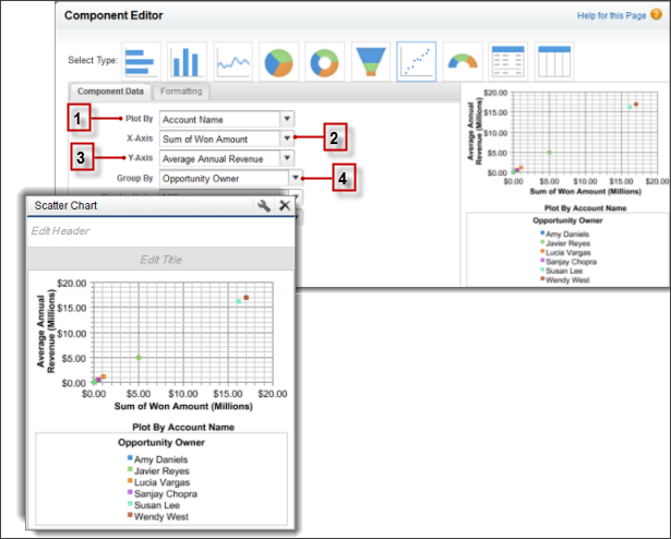
This chart builds on some key fields:
- Plot By automatically chooses the first report grouping. We manually chose the second grouping to show opportunities won by Account Name.
- X-axis shows record count when there are no summarized fields or autoselects the first summary field. Since summary is more useful, the chart shows Sum of Won Amount.
- Y-axis here shows a manually selected summary field, Average Annual Revenue.
- Group By is not set by default. Since the report has another grouping, the chart groups data further by the manually selected Opportunity Owner grouping. The colored dots in the chart and legend show this grouping.