
You are here:
Dynamic Gauge Charts in Lightning Experience Dashboards
A gauge chart shows how close you are to reaching a goal or target. The chart target is the maximum value in the chart. The chart measure is the current status or performance, as indicated by the pointer. The segment ranges green, yellow, and red correspond to excellent, fair, and poor performance.
Required Editions
| Available in: Lightning Experience |
| Available in: Essentials, Group (View Only), Professional, Enterprise, Performance, Unlimited, and Developer Editions |
| User Permissions Needed | |
|---|---|
| To create dashboards: | Run Reports AND Create and Customize Dashboards |
| To edit and delete dashboards that you created: | Run Reports AND Create and Customize Dashboards |
| To edit and delete dashboards that you created in public folders: | Edit My Dashboards |
| To edit and delete dashboards that you didn’t create in public folders: | Manage Dashboards in Public Folders |
| To create, edit, and delete dynamic dashboards: | Manage Dynamic Dashboards |
The dashboard builder supports two modes for creating gauge charts:
- In standard mode, you select a metric from the report (such as Sum of Amount) as the chart target, and then enter numeric values for the segment ranges.
- In dynamic mode, the chart target and chart measure are report measures and field values that respond dynamically to changes in business conditions and goals.
Before adding a dynamic dashboard gauge chart, make sure that your source report is set up for the data that you want to chart. Add the metric that you want to track, apply appropriate filters, and include at least one grouping.
Then set up these gauge properties in the dashboard’s Add Component window.
- Report metric: A metric that’s defined in the source report, such as Record Count or Sum of Amount.
- Field: The field value from a selected Salesforce object and record.
By default, the report metric is used as the chart measure (the pointer) and the field value is used as the chart target (the maximum value in the gauge).
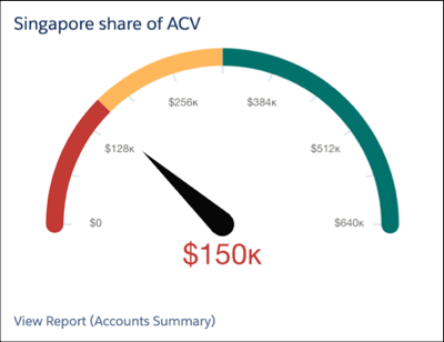
For example, the chart measure for this chart is the annual contract value (ACV) for a company’s Singapore subsidiary, $150k. The chart target is the ACV for the overall business, $640k. To be in the green, excellent range, the subsidiary must account for at least 50% of the company’s total ACV. The actual performance is now in the red zone, so the team in Singapore has work to do. Because the chart is dynamic, any improvements in the Singapore team’s performance are automatically reflected in the chart.
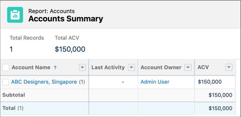
We created this chart using an Accounts report as the source. The report is grouped by Account Name with Sum of ACV added as a metric. The report is filtered to show only the Singapore subsidiary.
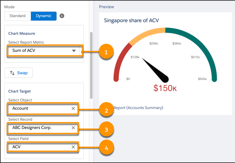
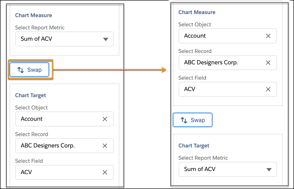
For the gauge chart setup, the chart measure is Sum of ACV (1). The chart target is the Account object (2), with the corporate account selected as the record (3) and ACV as the field (4).
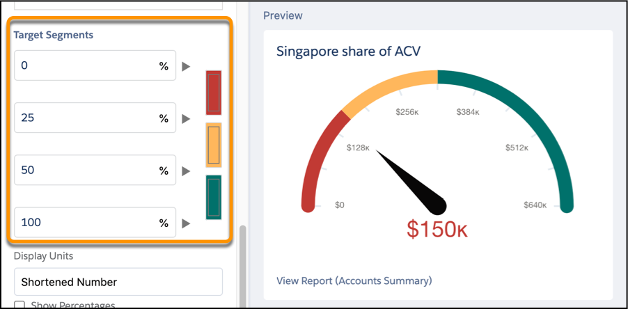
To complete the chart, we set the ranges for the red, yellow, and green segments as percentages of the target.
When the widget and dashboard are saved, everything’s set. As the ACV for the subsidiary and the overall business changes, the dashboard refreshes with the latest and greatest information.
Sometimes it makes more sense for the target to be a field value and the pointer value to be a report metric. No problem. To switch the chart target and chart measure settings, click Swap.
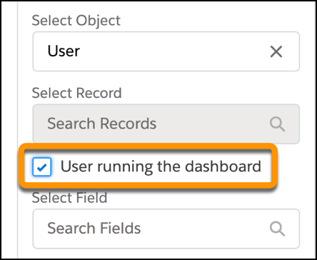
If you’re working with the User object, there’s even more flexibility. You can select a specific user, or you can source the data from the user who’s running the dashboard.
For successful dynamic gauge charts, keep these points in mind:
- Your source reports must be set up with the groupings, metrics, and filters that you want to reflect in the gauge charts.
- For standard gauge charts, the segment values are numbers. For a dynamic gauge chart, the segment values are percentages.