
You are here:
See How Forecast Amounts Have Changed
Let's build a historical report, in matrix format, of the amounts your team members have assigned to each forecast category. Changes in those amounts can reveal how accurately your team is forecasting.
Required Editions
| Available in: both Lightning Experience and Salesforce Classic |
| Available in: Essentials, Group, Essentials, Professional, Enterprise, Performance, Unlimited, and Developer Editions |
| Available in: Enhanced Folder Sharing |
| User Permissions Needed | |
|---|---|
| To create, edit, and delete reports in private folders: | Create and Customize Reports |
| To create, edit, and delete reports in public and private folders: | Report Builder OR Report Builder (Lightning Experience) |
For this example, assume you're about a month into the current fiscal quarter.
-
Create a forecast history report.
- On the Analytics tab, select Create | Report, or on the Reports tab, click New Report.
- Find a select the report type Forecasting Items with Historical Trending. Before you can select this report type, your org must have enabled Historical Trending for Forecasting Items. If you don’t see the report type listed, contact your administrator.
- Click Create.
-
In the Filters area, choose Show | All forecasting items, then set up your filters.
- For Date Field, choose End Date. For Range, choose Current FQ. The From and To date fields automatically get the beginning and end dates for the current quarter.
-
For Historical Date,
choose 3 Months Ago,
2 Months Ago, then
1 Month Ago from the dropdown
menu. Each date you select is added to the
field.
Filter for the historical data you want.
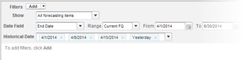
 Tip To move Yesterday to the right side of the field, delete it, and then add it again from the dropdown menu.
If you’re using multiple forecast types, add a filter for Forecasting Type: API Name to prevent duplicate values from appearing on the report.
-
Choose the data you want to monitor for historical changes. In
this case, we're interested in the category in which the
changes were made and how the forecast amount changed.
- In the Preview pane, change Tabular Format to Matrix Format.
- To create a row grouping, drag the Owner: Full Name field from the Field area to the Preview pane.
- Drag the Forecast Category field over to the right of Owner: Full Name to create another row grouping.
- Drag the Forecast Amount (Historical) field to the matrix area of the Preview pane, below the yellow bar. In the Summarize dialog, select Sum.
Select the fields that contain the data you want to track.
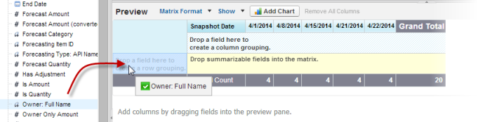 Columns appear for each of the historical dates you chose in the filters area that contain records.
 - The see what data you’ve gathered so far, click Run Report. Then click Customize to keep adjusting your filters and fields if necessary.
-
After you’ve defined the data you want to track, create
a chart to show it graphically.
- In the Preview area, click Add Chart and select the line chart icon.
- On the Chart Data tab, choose Sum of Forecast Amount (historical) for the Y-Axis and Snapshot Date for the X-Axis.
- For Group By, choose Forecast Category, and select Cumulative.
- Click OK, then click Run Report again.
- Click Save As. Choose a name and folder for the report and click Save.