
You are here:
Map Charts
Use a map if you have data with a geographical component. Maps can shade areas in proportion to mapped values, allowing for visual pop-out of high-value areas. You can find the map chart in the dashboard designer.
Data for map charts must contain geographical names corresponding to the geographical entities represented on the map. CRM Analytics map charts are not case-sensitive, but specific codes or names for geographical entities such as US states and world countries are expected.
For maps of the USA, each row of data must contain a single field identifying the state by its two-letter postal code (recommended) or its full common name. A row with data linked to the state of California, for example, must have an identifying field with "CA" or "California", but not "Calif".
For global maps, the identifying country names must follow ISO 3166-1 (alpha 3) three-letter code (recommended) or be spelled out using the country names set by CRM Analytics. A row with data linked to the United Kingdom, for example, must have an identifying field with "GBR" or "United Kingdom", but not "Great Britain".
Create a Map Chart
Use a map chart to analyze data across geographical regions.
For example, you can use color saturation in a map chart to indicate the number of opportunities in the pipeline for each country in which you do business.
-
In the lens, click
 and then select the Map chart
type.
and then select the Map chart
type.
-
Click
 and
choose the type of map in the Map Type field. For example, to analyze measures by
countries, choose World Countries.
and
choose the type of map in the Map Type field. For example, to analyze measures by
countries, choose World Countries.
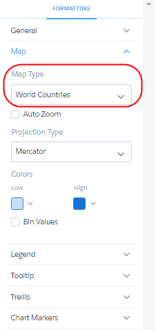
- In the Locations field, add the dataset field that contains the locations. For example, select Billing Country, which corresponds to the World Countries map type.
-
In the Color field, add the measure that determines the color of each region. For
example, select Count of Rows to show colors based on the number of
opportunities for each country.
By default, the map shows a color gradient based on two colors.
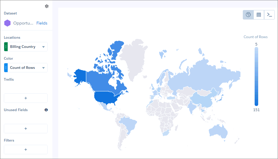
 Tip When it’s hard to tell the difference between gradients, use bins.
 -
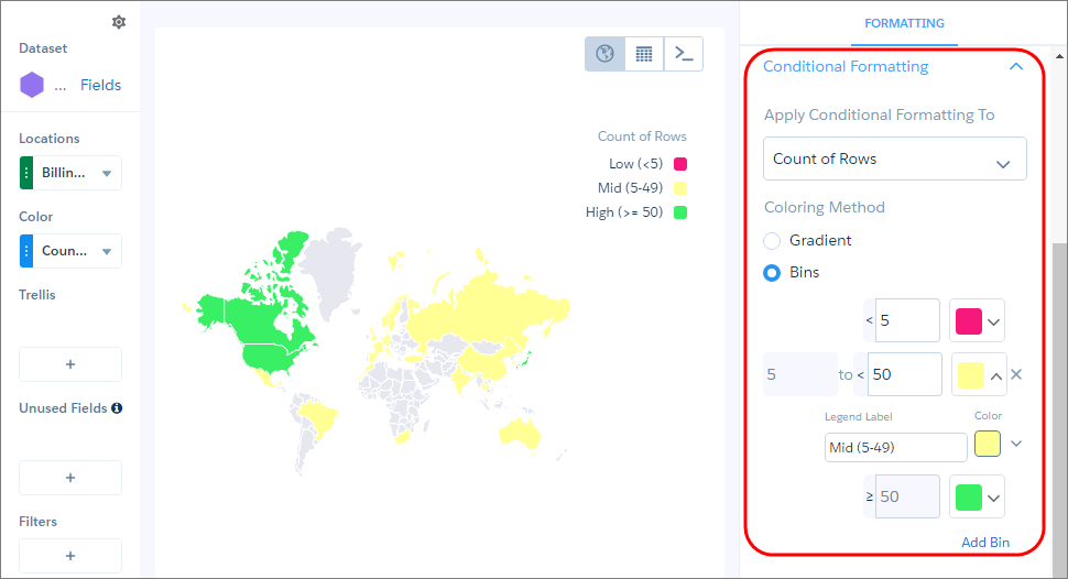
To bin values in high, medium, and low categories, select Bins
under Conditional Formatting, and choose the low and high value thresholds and the legend
labels and colors.
- To make more changes to the chart display, set the chart properties in the Formatting panel.
Country Codes and Names
For data to show up correctly in a map of countries, the data must identify countries using either the ISO 3166-1 (alpha 3) three-letter country codes (recommended) or the spelled-out country names set by CRM Analytics.
The following table lists the supported country name for each ISO 3166-1 (alpha 3) country code.
| Country Code | Country Name |
|---|---|
| AFG | Afghanistan |
| AGO | Angola |
| ALB | Albania |
| ARE | United Arab Emirates |
| ARG | Argentina |
| ARM | Armenia |
| ATF | French Southern and Antarctic Lands |
| AUS | Australia |
| AUT | Austria |
| AZE | Azerbaijan |
| BDI | Burundi |
| BEL | Belgium |
| BEN | Benin |
| BFA | Burkina Faso |
| BGD | Bangladesh |
| BGR | Bulgaria |
| BHR | Bahrain |
| BHS | The Bahamas |
| BIH | Bosnia and Herzegovina |
| BLR | Belarus |
| BLZ | Belize |
| BMU | Bermuda |
| BOL | Bolivia |
| BRA | Brazil |
| BRN | Brunei |
| BTN | Bhutan |
| BWA | Botswana |
| CAF | Central African Republic |
| CAN | Canada |
| CHE | Switzerland |
| CHL | Chile |
| CHN | China |
| CIV | Ivory Coast |
| CMR | Cameroon |
| COD | Democratic Republic of the Congo |
| COG | Republic of the Congo |
| COL | Colombia |
| CRI | Costa Rica |
| CS- | Kosovo |
| CUB | Cuba |
| CYP | Northern Cyprus |
| CYP | Cyprus |
| CZE | Czech Republic |
| DEU | Germany |
| DJI | Djibouti |
| DNK | Denmark |
| DOM | Dominican Republic |
| DZA | Algeria |
| ECU | Ecuador |
| EGY | Egypt |
| ERI | Eritrea |
| ESH | Western Sahara |
| ESP | Spain |
| EST | Estonia |
| ETH | Ethiopia |
| FIN | Finland |
| FJI | Fiji |
| FLK | Falkland Islands |
| FRA | France |
| FRO | Faeroe Is. |
| GAB | Gabon |
| GBR | United Kingdom |
| GEO | Georgia |
| GHA | Ghana |
| GIN | Guinea |
| GLP | Guadeloupe |
| GMB | Gambia |
| GNB | Guinea Bissau |
| GNQ | Equatorial Guinea |
| GRC | Greece |
| GRL | Greenland |
| GTM | Guatemala |
| GUF | French Guiana |
| GUY | Guyana |
| HKG | Hong Kong |
| HND | Honduras |
| HRV | Croatia |
| HTI | Haiti |
| HUN | Hungary |
| IDN | Indonesia |
| IND | India |
| IRL | Ireland |
| IRN | Iran |
| IRQ | Iraq |
| ISL | Iceland |
| ISR | Israel |
| ITA | Italy |
| JAM | Jamaica |
| JEY | Jersey |
| JOR | Jordan |
| JPN | Japan |
| KAZ | Kazakhstan |
| KEN | Kenya |
| KGZ | Kyrgyzstan |
| KHM | Cambodia |
| KOR | South Korea |
| KWT | Kuwait |
| LAO | Laos |
| LBN | Lebanon |
| LBR | Liberia |
| LBY | Libya |
| LKA | Sri Lanka |
| LSO | Lesotho |
| LTU | Lithuania |
| LUX | Luxembourg |
| LVA | Latvia |
| MAR | Morocco |
| MDA | Moldova |
| MDG | Madagascar |
| MEX | Mexico |
| MKD | Macedonia |
| MLI | Mali |
| MLT | Malta |
| MMR | Myanmar |
| MNE | Montenegro |
| MNG | Mongolia |
| MOZ | Mozambique |
| MRT | Mauritania |
| MUS | Mauritius |
| MWI | Malawi |
| MYS | Malaysia |
| NAM | Namibia |
| NCL | New Caledonia |
| NER | Niger |
| NGA | Nigeria |
| NIC | Nicaragua |
| NLD | Netherlands |
| NOR | Norway |
| NPL | Nepal |
| NZL | New Zealand |
| OMN | Oman |
| PAK | Pakistan |
| PAN | Panama |
| PER | Peru |
| PHL | Philippines |
| PNG | Papua New Guinea |
| POL | Poland |
| PRI | Puerto Rico |
| PRK | North Korea |
| PRT | Portugal |
| PRY | Paraguay |
| PSE | West Bank |
| QAT | Qatar |
| REU | Reunion |
| ROU | Romania |
| RUS | Russia |
| RWA | Rwanda |
| SAU | Saudi Arabia |
| SDN | Sudan |
| SEN | Senegal |
| SGP | Singapore |
| SLB | Solomon Islands |
| SLE | Sierra Leone |
| SLV | El Salvador |
| SOM | Somaliland |
| SOM | Somalia |
| SRB | Republic of Serbia |
| SSD | South Sudan |
| SUR | Suriname |
| SVK | Slovakia |
| SVN | Slovenia |
| SWE | Sweden |
| SWZ | Swaziland |
| SYR | Syria |
| TCD | Chad |
| TGO | Togo |
| THA | Thailand |
| TJK | Tajikistan |
| TKM | Turkmenistan |
| TLS | East Timor |
| TTO | Trinidad and Tobago |
| TUN | Tunisia |
| TUR | Türkiye |
| TWN | Taiwan |
| TZA | United Republic of Tanzania |
| UGA | Uganda |
| UKR | Ukraine |
| URY | Uruguay |
| USA | United States of America |
| UZB | Uzbekistan |
| VEN | Venezuela |
| VNM | Vietnam |
| VUT | Vanuatu |
| YEM | Yemen |
| ZAF | South Africa |
| ZMB | Zambia |
| ZWE | Zimbabwe |
Properties of Maps
The map chart is configured with the properties in the dashboard designer. These properties have equivalent JSON properties.
Configure Maps to Auto-Zoom on Selected Areas
When you select datapoints in a particular geographical area of your map chart, the data in that area is highlighted.
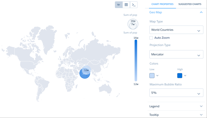
With auto-zoom, the map chart both highlights the data and zooms in the geographical area.
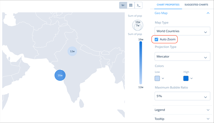
Any filtering that occurs on the visualized data can trigger auto-zoom, including faceting in dashboards, allowing you to create dynamic maps.
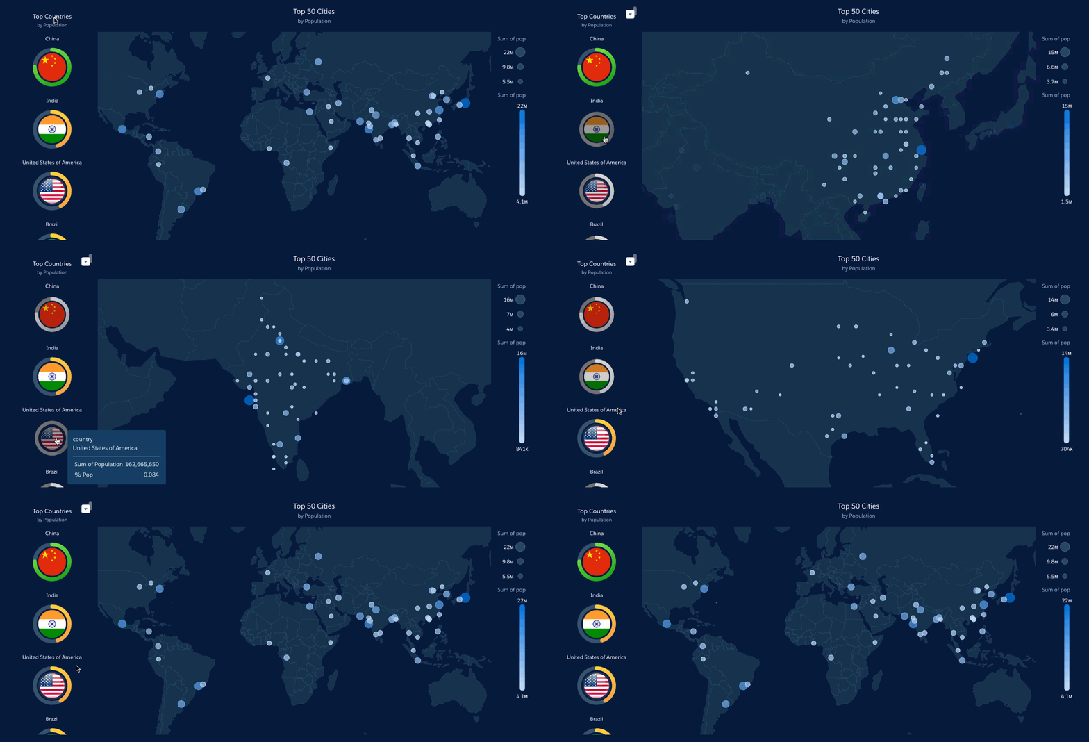
Set the Map Projection Type for Map Charts
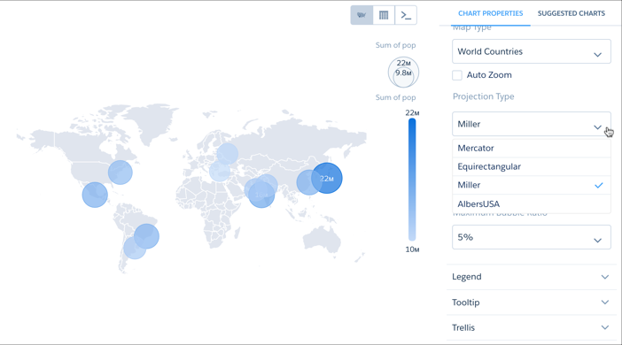
A map projection is a method for representing shapes from the curved surface of the Earth (or any other curved surface) using shapes on a flat surface. Some map projection types preserve the accuracy of shape outlines while sacrificing the correct representations of area sizes, while others preserve relative size but distort the outlines. You can apply the projection of your choice using the Projection Type menu.
JSON Representation Map Chart
This is an example map JSON with a United States map.
   {
     "visualizationType": "choropleth",
     "step": "step_newmap",
     "map": "US States",
     "legend": {
       "show": false,
       "inside": false,
       "showHeader": true,
       "position": "right-top"
     },
     "title": {
       "label": "",
       "subtitleLabel": "",
       "align": "center"
     },
     "theme": "wave",
     "lowColor": "#C5DBF7",
     "highColor": "#1674D9",
     "trellis": {
       "enable": false,
       "type": "x",
       "chartsPerLine": 4
     }
   }
Other available values for the map property are:
"World Countries", "Americas", "North America", "South America", "Central America", "Caribbean", "Europe", "Eastern Europe", "Northern Europe", "Southern Europe", "Western Europe", "Central Europe", "Scandanavia", "Asia", "South Asia", "South East Asia", "East Asia", "Australasia", "Africa", "East Africa", "Middle Africa", "North Africa", "Southern Africa", "Western Africa", "EMEA", "APAC".