
You are here:
Change the Theme Layout of Your Experience Cloud Site’s Pages
A theme layout defines the top-level regions of your page, such as the header and footer, navigation, search, and the user profile menu. A theme layout component categorizes the pages in your site that share a theme layout.
Required Editions
| Available in: both Salesforce Classic and Lightning Experience |
| Available in: Enterprise, Performance, Unlimited, and Developer Editions |
| User Permissions Needed | |
|---|---|
| To customize or publish an Experience Cloud site: |
|
A developer creates custom theme layout components in the Developer Console by
implementing the forceCommunity:themeLayout interface.
The developer can also add properties to a custom theme layout, which you can configure in the
Theme panel area in Experience Builder.
When the custom layout component is available, assign it to a theme layout to instantly
transform the pages that use that layout.
-
In Experience Builder, click
 on the left
sidebar and then click Theme.
on the left
sidebar and then click Theme.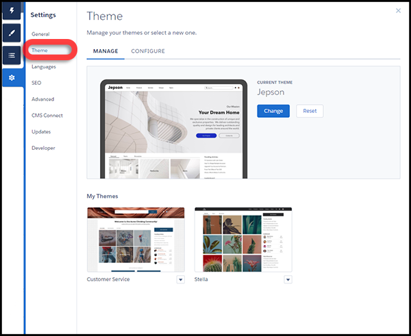
-
To view and configure your theme layouts, select
Configure.
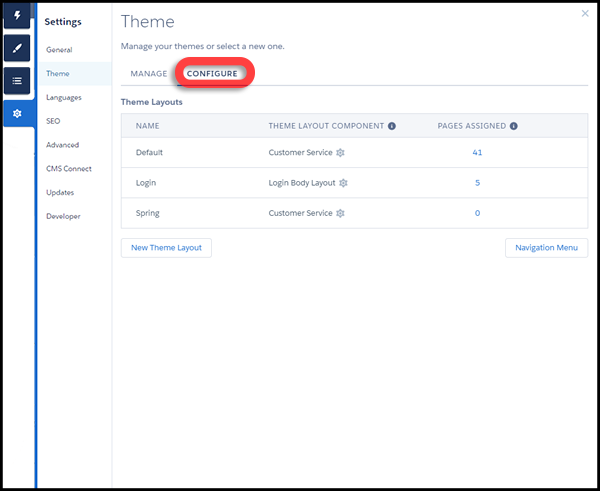
- If necessary, create a New Theme Layout.
-
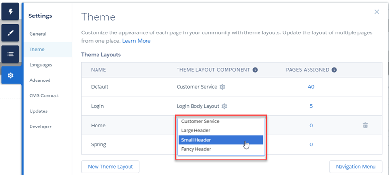
Select a theme layout component for the theme layout.
-
Update the theme layout’s settings, if available—properties vary depending on
how your developer configured the theme layout component.
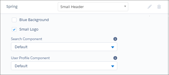 For example, the Default layout component in the Customer Service theme includes the following options for the header region.
- Hide the header region and navigation
- Hides the default site header on all site pages. The default site header includes the header image, search box, site menu, and user profile navigation menu. Select this option to replace the default header with a custom header.
- Hide notifications icon in site header
- Hides the notifications icon. Useful when you have a custom header or don’t use notifications.
- Search Component
- Replaces the default Search and Post component with a custom component, if available.
- User Profile Component
- Replaces the default Profile Header component with a custom version, if available.
- Set max page width
- Sets the maximum width of content across the page. The maximum width can be narrower than the overall display size of the header or footer.
However, the Default layout component for the Jepson theme has different options.
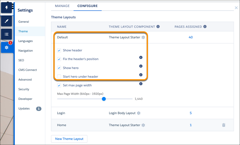
- Show header
- Displays or hides the header.
- Fix the header’s position
- Pins the header to the top of the scrolling area so that it remains visible while a customer is scrolling down through a long page. To see this working, publish and preview your site. The change doesn’t appear in Experience Builder.
- Show hero
- Displays or hides the theme’s hero image.
- Start hero under header
- Header visually overlaps the hero. We recommend using a transparent background for this header.
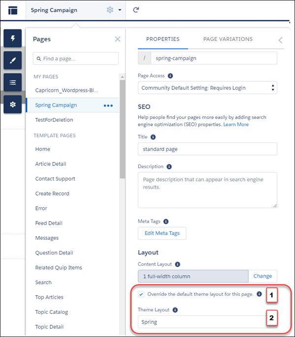
-
To apply the theme layout, select Override the default theme layout for this page (1).
Selecting this option shows the Theme Layout options. Then, choose the new layout
(2).