You are here:
Insurance Policy Lightning Web Components
Use the Insurance Policy Lightning web components to easily view and manage policies.
Insurance Policy Lightning Web Component
The Policy UI Lightning web component runs attribute rules and attribute value rules, and then shows the details, coverages, and insured items that are available for any given policy.
The Policy UI Lightning web component also works with the Salesforce Financial Services Cloud version of the Insurance Policy object.

Compact Policy History Timeline with Insurance History Lightning Web Component
You can configure the Insurance History Lightning web component (LWC) to display a timeline of policy activity in a single, chronological feed that's easy to scan and drill into. See essential activity at a glance and expand content like notes and emails to dive into more detail.
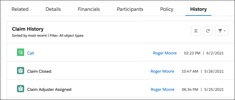
To learn more, see Configure History Timelines with Insurance History LWC.
You can also configure history timelines for quote and claim activity. Your org includes a DataPack for building a History tab for claims.
Action Lightning Web Component
Vlocity has included three Actions out of the box: the Issue Policy and Issue FSC Policy buttons on the Quote record type and the Modify Policy button on the Policy (Asset) and Insurance Policy (FSC) record types. These are examples of PubSub Actions.
You can also add custom Vlocity Actions to these Vlocity Cards layouts (ins-quote-actions contains the Issue Policy and Issue FSC Policy PubSub Actions and ins-asset-actions or ins-insurance-policy-actions contain the Modify Policy PubSub Action). To add custom actions, see Adding a Custom Action to an LWC Card.
Insurance Policy Commercial Lightning Web Component
Commercial policies can have complex product structures with multiple levels of insured items. Each insured item can have its own set of coverages and coverage terms. A commercial policy can have coverages and ratings on parent, child, and grandchild insured items.
The Insurance Policy Commercial Lightning web component is designed to help your users view complex policies and feature a side panel to view line item details. Buttons for common actions display prominently so your users can easily modify the policy or view the policy version history.
To make the Insurance Policy Commercial LWC available for your users, you must add it to the Insurance Policies page. Read Lightning App Builder to learn about adding custom components to your lightning pages.
This component supports multi-root policies. Multi-root policies consist of a parent policy that is linked to multiple child policies. Users can view all child policies on the same UI and navigate to the individual policies by clicking the view policy button.

To make these buttons available to your users, select the Show Actions and Show Modified Policy Button options on the Insurance Policy Commercial LWC in the Lightning App Builder. Read Create and Configure Lightning Experience Record Pages to learn how.
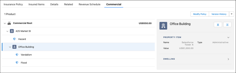
Click the arrow next to a line item to expand and view information about the coverage in the side panel.
On the Insurance Policy Commercial LWC, you can see: