You are here:
Insurance Policy Details Component
Show your Policyholder site users details about insured items associated with their policy with the Insurance Policy Details component.

Looking for the Policy Details Component designed for FSC? Read FSC Insurance Policy Details Component.
-
FlexCard: insPolicyItemsDetail_nds
-
LWC: cfInsPolicyItemsDetail_nds
-
Label: Insurance Policy Details Newport
Here's what the Insurance Policy Details component looks like when it's rendered in the Policyholder site:

-
Text label:
My Vehicles
-
Details about the insured item displayed in a custom Lightning web component.
Clicking the View more details link opens an extended view of the insured item details.
What Your Users Can Do on this Component
Policyholder Experience users can click the View more details link to see an expansive breakdown of the details relating to the insured item. Your users can also click on drivers or insured items associated with the policy in this expanded view. This opens a window containing the record details.
You can also set up an action that launches an OmniScript or a web page by
defining the attribute createNewAction in the Lightning web
component properties.
FlexCard Structure
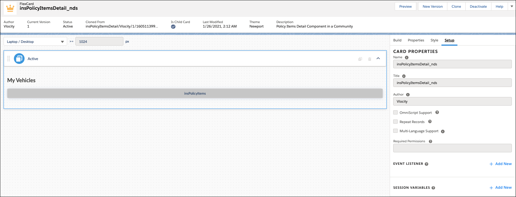
This FlexCard contains:
-
Text element that displays a label
-
The insPolicyItems custom Lightning web component
You can add, remove, and change any of these elements based on what you want your users to see. To learn how see Add Elements to a FlexCard. Other good topics to read to learn about how this FlexCard works include FlexCards Display Elements Reference, FlexCards Menu Properties, and FlexCards Action Properties.
Many of the elements of this card contain Custom CSS styles. You can make changes to these styles to create a different look and feel. To learn how to work with Custom CSS in FlexCards, see Apply Custom CSS to a FlexCard Element .