You are here:
Insurance Policy Overview Component
Show your Policyholder site users key information about their policy with the Insurance Policy Overview Component.
-
FlexCard: insPolicyOverview_nds
-
LWC: cfInsPolicyOverview_nds
-
Label: Insurance Policy Overview Newport
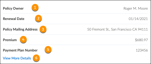
Here's what the Insurance Policy Overview component looks like when it's rendered in the Policyholder site:
-
Policy owner name
-
Policy renewal date
-
Policy mailing address
-
Total policy premium
-
Payment plan number
-
View more details button
More details display in the Insurance Policy List Flyout Component.
FlexCard Structure
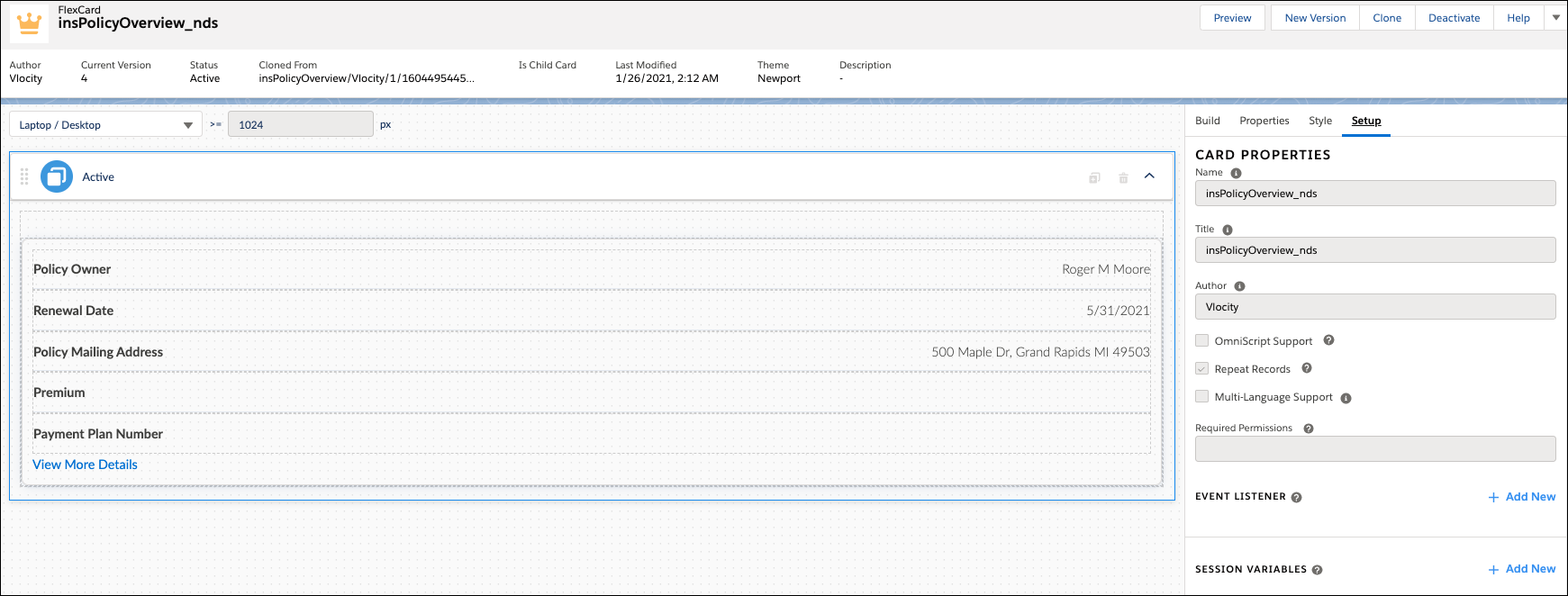
This FlexCard contains many elements, including:
-
Text elements that display labels we typed in.
-
Field elements whose output is selected from available fields returned from the data source.
-
Flyout action element that contains the insPolicyListFlyout_nds child card.
You can add, remove, and change any of these elements based on what you want your users to see. To learn how see Add Elements to a FlexCard. Other good topics to read to learn about how this FlexCard works include FlexCards Display Elements Reference, FlexCards Menu Properties, and FlexCards Action Properties.
Many of the elements of this card contain Custom CSS styles. You can make changes to these styles to create a different look and feel. To learn how to work with Custom CSS in FlexCards, see Apply Custom CSS to a FlexCard Element .