You are here:
Insurance Account Insurance Policy List Component
On this component, brokers can see a list plus key details about each policy attached to a specific account.

This component is designed to work for Vlocity Insurance implementations that use the Insurance Policy object in FSC.
If you're looking for a policy list component to use with policies stored on the Asset object (not on FSC), go to Insurance Account (Asset) Policy List Component.
-
FlexCard: insAccountInsurancePolicyList
-
LWC: cfInsAccountInsurancePolicyList
-
Label: Insurance Account Insurance Policy List
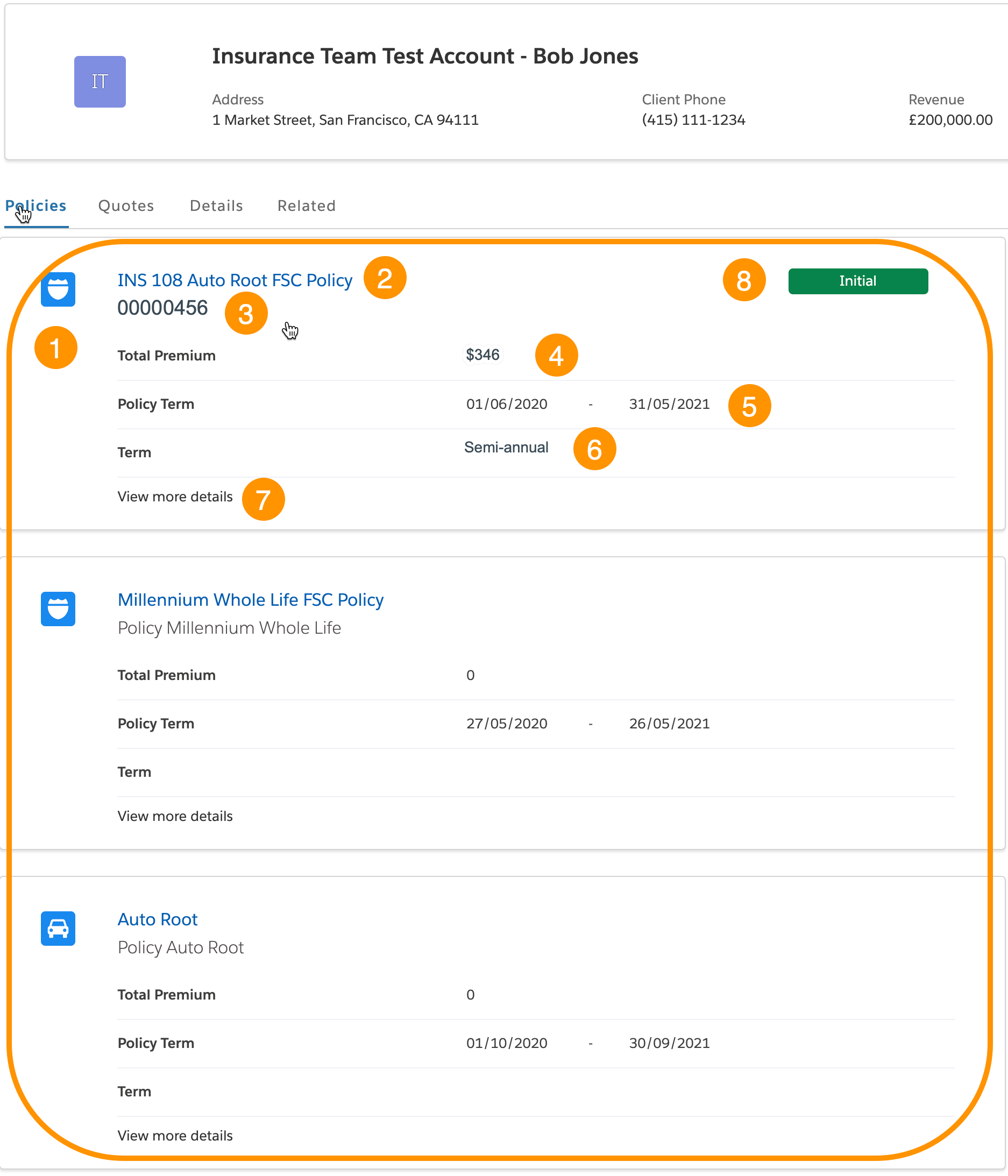
Here's what the Account Insurance Policy List component looks like when it's rendered in the Broker site:
-
Icon for the policy
-
Policy name link
A user can click this link to go to the Details page for this quote
-
Policy number
-
Total premium amount
This field is mapped to
GrossWrittenPremiumin the Omnistudio Data Mapper this component uses as a data source -
Policy Term
The effective date - expiration date of the policy
-
Term
The policy term
-
Link to a flyout that displays a breakdown of the premium, including the premium, taxes, and fees
-
Policy status
What Your Users Can Do on this Component
-
Click the name of the policy to go to the policy details page
-
Click the View Details link to see details about the premium and surcharges for this policy
What this Component Does
This component pulls information about all the policies connected to the specified account and displays each policy with supporting data in a list.
FlexCard Structure
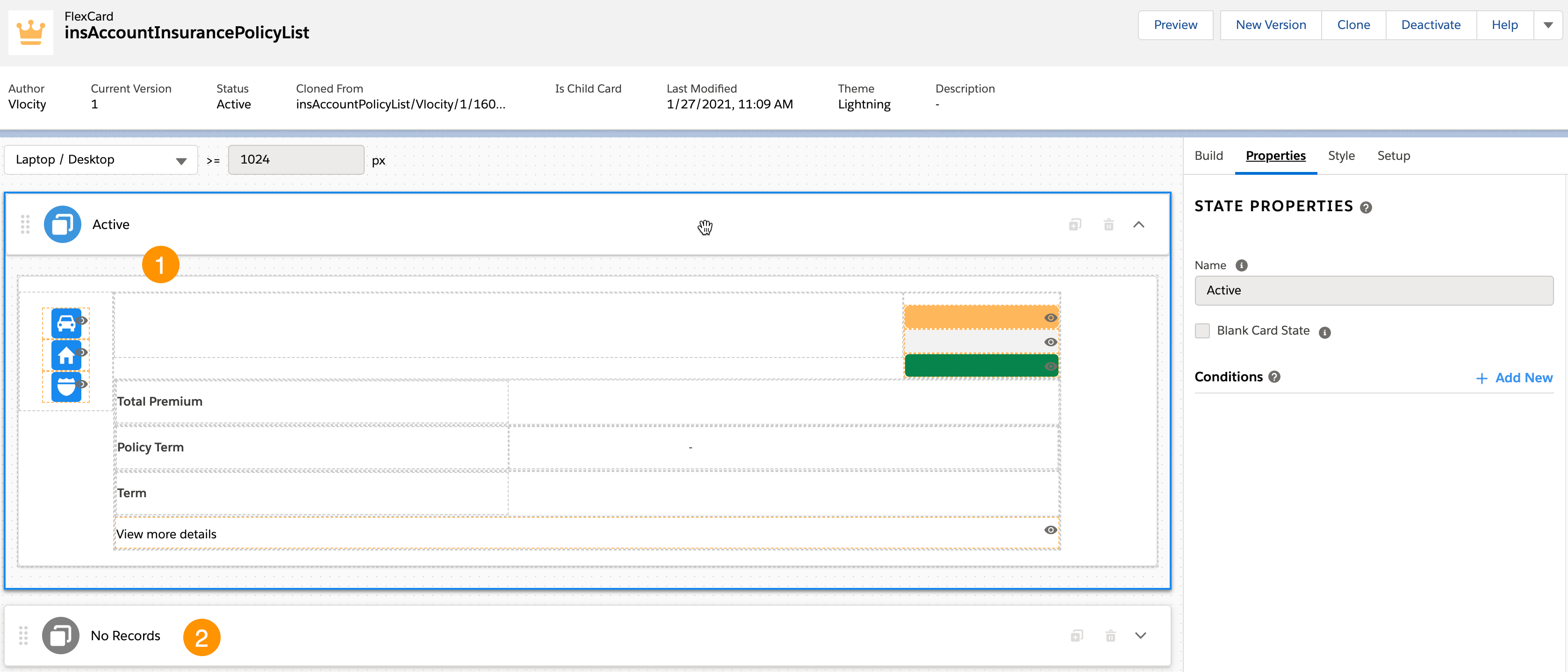
This FlexCard contains lots of elements, including:
-
Icon elements that display Salesforce SVG elements
-
Text elements that display labels we typed in directly
-
Text elements that have conditions set to pull and display text from the data source
-
Field elements that have Output set to pull and display data from the data source
-
Action element that calls the child card insAccountPolicyListFlyout
You can add, remove, and change any of these elements based on what you want your users to see. To learn how see Add Elements to a FlexCard. Other good topics to read to learn about how this FlexCard works include FlexCards Display Elements Reference, FlexCards Menu Properties, and FlexCards Action Properties.
Many of the elements of this card contain Custom CSS styles. You can make changes to these styles to create a different look and feel. To learn how to work with Custom CSS in FlexCards, see Apply Custom CSS to a FlexCard Element .
This card has two state elements:
-
Active element: Policies present for the specified account
When there's more than one policy attached to an account, an instance of this FlexCard structure is populated for each policy and the instances are displayed in a list.
-
Inactive element: No policy present for the specified account
To learn more about how to work with FlexCard states, read FlexCard States .
Data Sources Called by this Component
This component calls a Data Mapper named
InsGetAccountInsurancePolicyList.
This Data Mapper pulls information from each policy attached to the specified account. Elements in the FlexCard include conditions and outputs that get information from the Data Mapper and display it to the user.