You are here:
Insurance Articles Component
Show your Policyholder site users interesting and relevant articles to help keep them up-to-date on the latest news about your company with the Insurance Articles Component.
-
FlexCard: insArticles_nds
-
LWC: cfInsArticles_nds
-
Label: Insurance Articles Newport
Here's what the Insurance Articles component looks like when it's rendered in the Policyholder site:
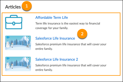
The parts of this component are:
-
Text label
Text: Articles
-
Articles Child component
Learn more about the Insurance Articles Child Component.
FlexCard Structure
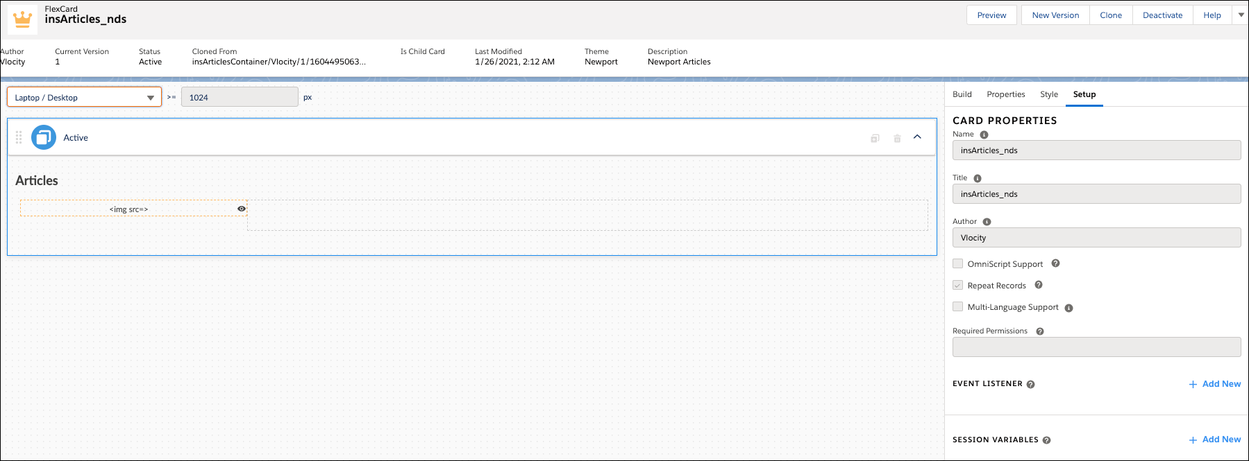
This FlexCard contains elements, including:
-
Text element that displays the label we typed in directly
-
Child FlexCard: insArticlesChild_nds
You can add, remove, and change any of these elements based on what you want your users to see. To learn how see Add Elements to a FlexCard. Other good topics to read to learn about how this FlexCard works include FlexCards Display Elements Reference, FlexCards Menu Properties, and FlexCards Action Properties.
Many of the elements of this card contain Custom CSS styles. You can make changes to these styles to create a different look and feel. To learn how to work with Custom CSS in FlexCards, see Apply Custom CSS to a FlexCard Element .
Customize this Component
To learn about how to customize this kind of component, see the Digital Experience Site Component Customization Overview
- Insurance Articles Child Component
Show your Policyholder site users articles that they might find helpful and interesting with the Insurance Articles Child component. It's a child component that sits inside of the Insurance Articles container component.