
You are here:
Card Container Component
The Card Container UI component defines a Basic, Chart, Highlight, List, or Summary card.
Required Editions
| Available in: Lightning Experience in Professional, Unlimited, and Enterprise Editions that have Consumer Goods Cloud enabled |
Component name: cardcontainer
Basic Card
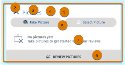
In the Card Container component, you can configure:
- Background color and transparency, border radius, and shadow (1)
- Expand or Collapse icon color (2)
- Title color (3)
- Additional info color (4)
- Action buttons: background color and transparency, label color, and icon color (5)
- Link buttons: background color and transparency, label color, and icon color (6)
- Text and icon color (7)
Summary Card
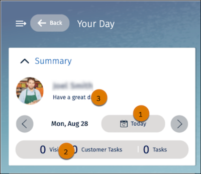
On a Summary card, you can customize the button fill color and transparency, border color and transparency, icon color, and label color (1); the button bar background color and transparency (2); and the text color (3).
The table lists the images that are available for the Card Container component.
| Image | Description |
|---|---|
| Icon_Card-Close.svg | Close icon that appears in the user or store cockpit card. |
| Icon_Card-open.svg | Open icon that appears in the user or store cockpit card. |
| Icon_Maximize.svg | Maximize icon that appears in the user or store cockpit card. |
| Ani_Ring.svg | Image that indicates that card data is loading. |
| Mobile.svg | Mobile icon in the customer card. |
| Landline.svg | Landline icon in the cockpit section. |
| Envelope.svg | Email icon in the cockpit section. |
| Icon_X.svg | Missing image in the cockpit section. |
Did this article solve your issue?
Let us know so we can improve!
