
You are here:
Card Container
The card container contains components such as an action bar, a link bar, and UI plug-ins.
Required Editions
| Available in: Lightning Experience in Performance, Unlimited, and Enterprise Editions that have Consumer Goods Cloud enabled. |
CardContainer is a UI element that holds the attributes, bindings, events, subelements, edit and access rights, and styling.
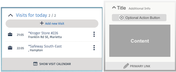
The user cockpit in the Consumer Goods offline mobile app is actually a collection of cards and each card holds relevant information. You can customize the cockpit layout to add custom cards and also customize the individual cards as required by business.
The CardContainer root contains the unique name of the control and is required. Some child nodes for CardContainer controls are:
- ActionBar
- LinkBar
- Events
- UIPlugIn
- CardList
Here’s a sample code for a CardContainer control:
<CardContainer name="CardContainer2" loadPriority="1">
   <Bindings>
      <Binding type="Visible" target="Visible" call="ProcessContext::boCard1.isCardVisible"/>
      <Binding target="IsReadyToLoad" type="Text" binding="ProcessContext::boCard1.dataLoaded2" bindingMode="ONE_WAY"  />
   </Bindings>
       <Events>
              <LoadContainerData event = "loadContainer2Data"/>
       </Events>
       <UIPlugin name="FWCardTwoUiPlugin">
   <Bindings>
   </Bindings>
        <Events />
           </UIPlugin>
 </CardContainer>
The width of a card container element depends on the area available on the screen and the number of columns to be displayed.
The width and height of the card container element is calculated using the formula:
- Column width in percentage = 100/number of columns
- Height = Sum of the heights of its children
- CockpitMap Control
Define a CockpitMap in the UI contract to display maps in a card container. - CardEventSubscription Control
The CardEventSubscription control facilitates a card to subscribe to an event, such as the onDateChange event, which refreshes the card data automatically when data changes. - Synchronization Transparency
Use the SyncCardContainer control to view the latest synchronization status from the cockpit without having to navigate to the dashboard. You can also trigger a synchronization from within the cockpit with this control. This control is optional, and you can add it during customization. - Sync Card Container
Use the SyncCardContainer control to initiate the synchronization process manually from within the cockpit without navigating to the dashboard. - CockpitSections Control
Define a CockpitMap in the UI contract to add maps in CardContainer. Use the CockpitSections control to replace the primitive UIPlugins with the Framework controls. You can use the CockpitSections control as a snippet or a tag in the CardContainer control and the GoogleMapDetails element. - Store Cockpit Section
The CockpitSections control in the Consumer Goods Cloud offline mobile app framework defines cards in the cockpit. You can use the control in a CardContainer control or GoogleMapDetails element.
