
You are here:
Model Cockpits in the UI Contract
Use the card area pattern card in a UI contract of cockpits to model cockpits. The card area arranges the card containers by dividing the available area into columns. Use the card area pattern with the Card Container control.
Required Editions
| Available in: Lightning Experience in Performance, Unlimited, and Enterprise Editions that have Consumer Goods Cloud enabled. |
The card area arranges the card containers by dividing the available area into columns. Use CardContainer in area pattern. Card container is a collection of UI elements.
These attributes are available for CardContainer controls:
- ShowCardContainerHeader
- loadPriority
- name
The child nodes for CardContainer controls are:
- ActionBar
- LinkBar
- Events
- UiPlugin
- CockpitList
A CardContainer control supports a UI plugin within a UI plugin.
Cockpit Navigation
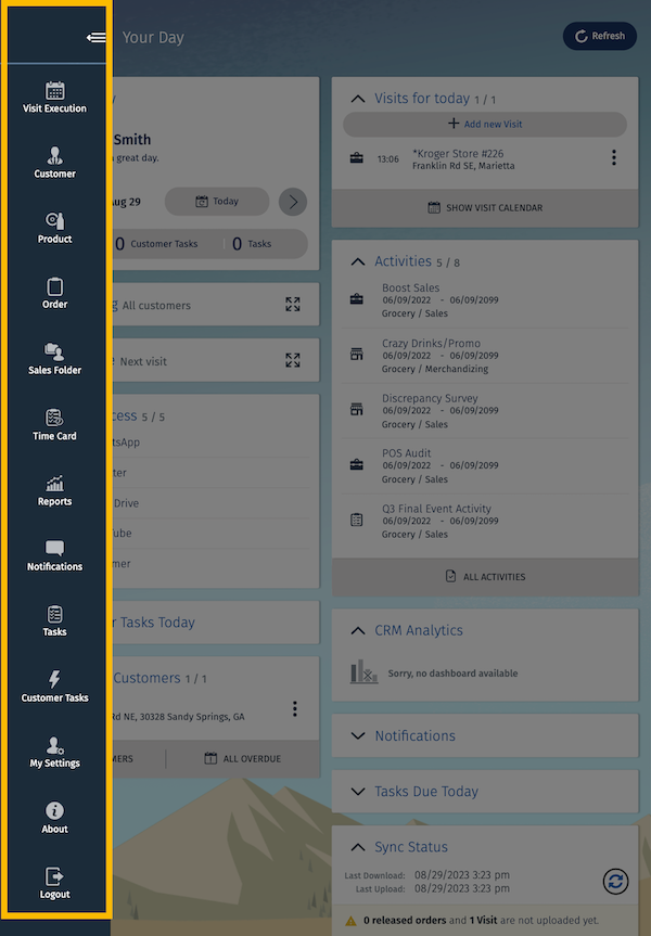
The NavigationMenuContainer control in the Cockpit UI contract enables you to place all the menu items in the menu bar that you want to offer as quick links to the user. The NavigationMenuContainer UI control within a UI contract shows a navigation area in the CardContainer element. It’s designed only for Cockpit screens and is available as an optional element in the UI contract.
To hide or disable the NavigationMenuContainer entries, use the Visible and Editable access
controls. The NavigationMenuContainer appears as a hamburger icon  . You can click the icon to navigate to menu options from the landing page.
A combination of both navigation options and Cockpit menu is not allowed while modeling cockpits. However, if a cockpit is modeled in such a way, the ProcessNavigation takes precedence over the Cockpit menu. The Cockpit menu is ignored.
NavigationMenuContainer
The NavigationMenuContainer UI control within a UI contract shows a navigation area in the CardContainer element. The NavigationMenuContainer UI control is used in the CardContainer element.
In the NavigationMenuContainer UI control, the name attribute is required. The NavigationMenuContainer UI control has these sub-elements.
- Bindings
The Bindings element consists of the Resource and Binding elements. This table lists the targets that the Resource element supports in the NavigationMenuContainer UI control.
Target Description Type Content Required Image Refers to the image that’s shown. Image Any image Yes Text Refers to the text that’s shown. Text Any string resource or string No - Events
The NavigationMenuContainer UI control supports the ButtonPressedEvent event. This event is triggered when you tap a list item.
Sample code for NavigationMenuContainer:
<NavigationMenuContainer name="CockpitMenu">
          <NavigationMenuItem name="StartOfDayMenuItem">
            <Bindings>
              <Resource target="Image" type="Image" id="TruckStart" />
              <Resource target="Title" type="Label" id="startOfDayLabelId" defaultLabel="Start of Day" />
              <Binding type="Visible" target="Visible" call="ProcessContext::CardController.getCockpitMenuVisibility">
                <Parameters>
                  <Input name="token" type="Literal" value="StartOfDayMenu" />
                </Parameters>
              </Binding>
            </Bindings>
            <Events>
              <ButtonPressedEvent event="executeStartOfDay" />
            </Events>
            <VisibilityRoles allRoles="false">
              <Role name="TourUser" />
            </VisibilityRoles>
          </NavigationMenuItem>
<!-- Details skipped for brevity-->