
You are here:
EnhancedDecisionList Component
The EnhancedDescisionList UI component shows a decision list.
Required Editions
| Available in: Lightning Experience in Professional, Unlimited, and Enterprise Editions that have Consumer Goods Cloud enabled |
Component name: enhanceddecisionlist
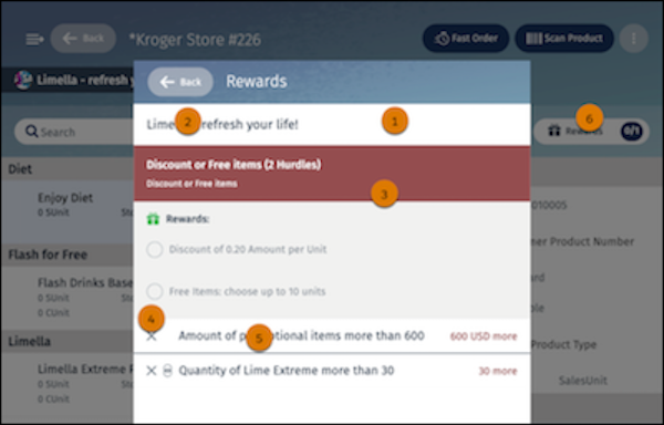
In the EnhancedDecisionList component, you can configure:
- Modal background color and transparency (1)
- Title background color and transparency (2)
- Background color (3)
- Icon image and color (4)
- Font color for all fonts, including the disabled state (4)
- Secondary toolbar button background color and transparency, border color, label color, icon color and image, indicator background color, border color, and label color (5)
The table lists the images and icons that are available for the EnhancedDescisionList component.
| Image Name | Description |
|---|---|
| Icon_And.svg | The AND icon next to the decision item icon. |
| Icon_Or.svg | The OR icon next to the decision item icon. |
| Icon_Fulfilled.svg | Icon for the decision item fulfilled state. |
| Icon_Not-fulfilled.svg | Icon for the decision item unfulfilled state. |
| Icon_Gift.svg | Reward icon that appears in the result header. |
| Icon_Checkbox-checked.svg | Selected checkbox icon that appears in the result detail area. |
| Icon_Checkbox.svg | Clear checkbox icon that appears in the result detail area. |
Did this article solve your issue?
Let us know so we can improve!
