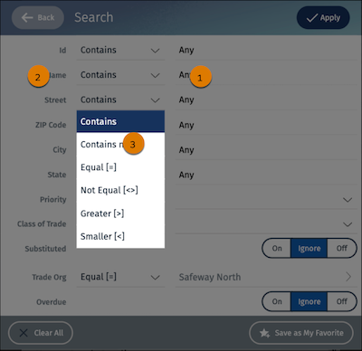
The SelectionBox UI component defines a group of elements that the user can select,
similar to a group of radio buttons or checkboxes.
Required Editions
Available in: Lightning Experience in Professional, Unlimited, and
Enterprise Editions that have Consumer Goods Cloud enabled
Component name: selectionbox
In the SelectionBox component, you can configure:
Font and background color of an input element (1)
Font and background color of labels next to an input element (2)
Font color and background color of expanded selected and unselected flyout items (3)
Icon_DropdownGray.svg represents the down arrow to expand items in the
selection box.
Did this article solve your issue?
Let us know so we can improve!
Loading
Salesforce Help | Article
Cookie Consent Manager
General Information
Required Cookies
Functional Cookies
Advertising Cookies
General Information
We use three kinds of cookies on our websites: required, functional, and advertising. You can choose whether functional and advertising cookies apply. Click on the different cookie categories to find out more about each category and to change the default settings.
Privacy Statement
Required Cookies
Always Active
Required cookies are necessary for basic website functionality. Some examples include: session cookies needed to transmit the website, authentication cookies, and security cookies.
Functional Cookies
Functional cookies enhance functions, performance, and services on the website. Some examples include: cookies used to analyze site traffic, cookies used for market research, and cookies used to display advertising that is not directed to a particular individual.
Advertising Cookies
Advertising cookies track activity across websites in order to understand a viewer’s interests, and direct them specific marketing. Some examples include: cookies used for remarketing, or interest-based advertising.