
You are here:
SyncCard Component
The SyncCard UI component shows the latest sync information.
Required Editions
| Available in: Lightning Experience in Professional, Unlimited, and Enterprise Editions that have Consumer Goods Cloud enabled |
Component name: synccard
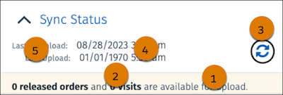
In the SyncCard component, you can configure:
- Font color (1)
- Highlighted font color (2)
- Border, background color, and icon color of the sync icon (3)
- Timestamp font color (4)
- Timestamp label colors (5)
All settings from the Card Container also apply for the Sync Card.
The table lists the images and icons that are available for the SyncCard component.
| Image Name | Description |
|---|---|
| SyncWarning.svg | Icon that indicates a synchronication warning. |
| Ico_Sync_Error.svg | Icon that indicates a synchronization error. |
| Ico_Main_Upload.svg | Icon indicating that data is being uploaded to the Salesforce. |
| Ico_Main_Download.svg | Icon indicating that data is being downloaded from the Salesforce. |
Did this article solve your issue?
Let us know so we can improve!
