
Using Form Styles with Enhanced Landing Pages
You can customize styles on the form component in enhanced landing pages. Make sure that you’re familiar with the relationship between Account Engagement form records and enhanced landing pages before you get started.
Required Editions
| Available in: All Account Engagement Editions |
The most important thing to know is that styles applied on the Account Engagement form record are used everywhere that form appears, even if you edit the styles in the enhanced landing page builder. There are a few ways to apply styles to a form.
- Use the form styles on the Look and Feel section.
- Apply custom code in the Above Form section.
- Use the Style tab on a form component in the enhanced landing page builder.
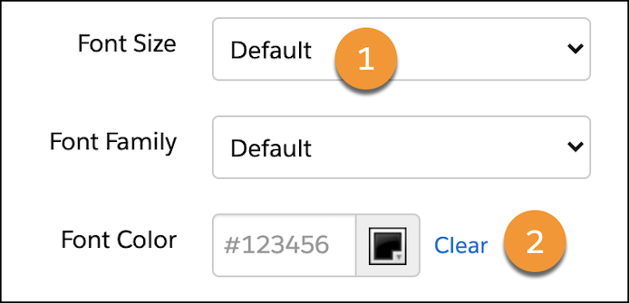
To allow users to edit a form’s styles in the enhanced landing page builder, verify that the form record’s Styles tab shows Default for every item (1). Click Clear to revert to the default font color (2).
To retain original styles on branded forms on enhanced landing pages, protect the form against certain style changes by modifying your custom styles on the Account Engagement form record.
Form Style Properties
Many properties are available on the Form component’s Styles tab.
- Background
- The background color controls the color of the page or container behind your landing page content.
- Form Position
- Form position controls the form’s margins within its container.
- Labels
- Label styles control the label’s position and font details for each of your form’s inputs.
- Inputs
- Input properties apply to text fields, text areas, and dropdowns.
- The properties Background Color, Border Color, and Border Width also apply to checkboxes and radio buttons.
- Dropdown Icon Color controls the down arrow icon inside the dropdown field.
- Focus styles are applied when someone moves to a form field, frequently with a mouse click or the Tab key. Focus and Error styles don’t appear on the canvas but are visible on the published landing page.
- Checkboxes and Radio Buttons
- These styles apply to checkboxes and radio buttons only.
- Alignment options indicate whether boxes or buttons appear horizontally or vertically.
- The Selected State Color controls a checkbox or radio button when someone selects it. This color is used on the button’s border and the icon inside it: the checkmark for checkboxes and the circle for radio buttons.
- Buttons
- Buttons properties apply to the form’s submit button only.
- Corner Radius controls how rounded the corners of your button are.