You are here:
Customize Screen Element and Component Style and Layout
Provide a better experience for the users running your flow by customizing the style and layout of your screens. 
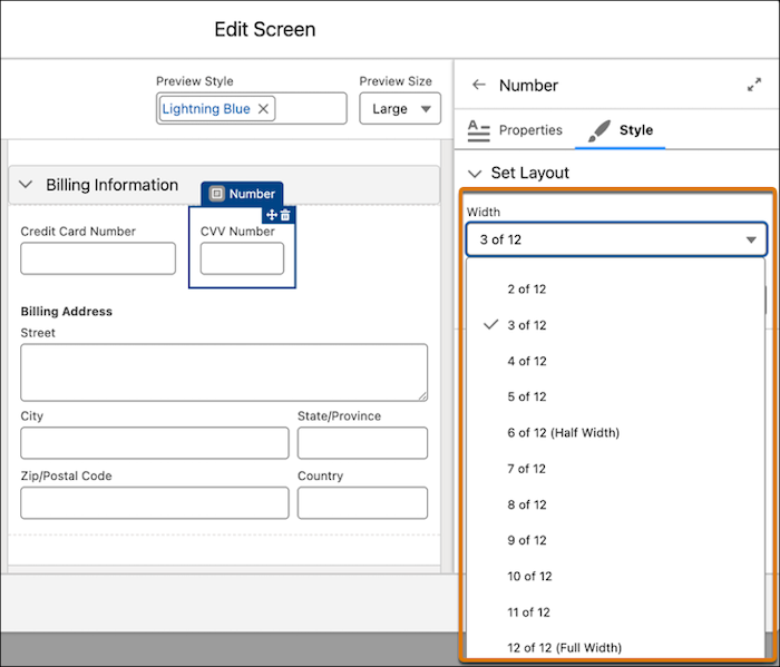
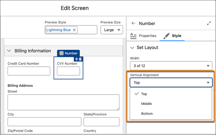
Get the look that you want by changing the style of your entire screen element, or the style of individual components. Make your screen more user-friendly by organizing your screen components into columns by using sections. Also, adjust component width and vertical alignment to control spacing and positioning.
Required Editions
| View supported editions. |
| User Permissions Needed | |
|---|---|
| To open, edit, create, activate or deactivate a flow using all flow types, elements, and features available in Flow Builder, including Einstein and Agentforce for Flow: | Manage Flow |
Style customizations override your org’s or Experience Cloud site’s theme styling. If you enter an invalid value for a style property, the style property is ignored, and the org or Experience Cloud site theme is used.
See Also
Before You Begin
If you don’t have a screen flow, create one.
-
Open the Flows list view.
- From Setup, in the Quick Find box, enter Flows, and then select Flows.
- From the Automation app, select the Flows tab.
- From the Flows tab in any Lightning app, click the actions menu and select Open Flow.
-
Create a screen flow.
- From the Automation app, click New | Screen Automations | Screen Flow.
- From Setup, click New Flow | Screen Automations | Screen Flow.
-
Add a screen element.
-
Click
, and select Screen.
- Enter a label, API name, and description.
-
Click
Customize a Screen Element's Style
Set the style of your entire screen element. For example, add a border around your screen.
-
Click the screen element's header.
The screen element’s properties panel opens.
- Click the Style tab.
- Go to the Set Container Style section.
-
Adjust the properties as needed:
- Background Color: Sets the background color for the body of the screen.
- Border Color: Defines the color of the border around the body of the screen.
- Border Radius: Controls the roundness of the border corners.
- Border Weight: Adjusts the thickness of the border.
Customize a Screen Element Header's Style
Set the style of your screen element's header. For example, change the header font size.
-
Click the screen element's header.
The screen element’s properties panel opens.
- Click the Style tab
- Go to the Set Header Style section.
- step
-
Adjust the properties as needed:
- Text Color: Sets the color of the text within the header.
- Font Size: Defines the size of the text within the header.
Customize a Screen Element Footer's Style
Set the style of your screen element's footer, which includes the navigation buttons. For example, have the button change color when a user clicks it.
-
Click the screen element's header.
The screen element’s properties panel opens.
- Click the Style tab.
- Go to the Set Footer Style section.
-
For each button, set the size and shape of the button and border.
- Border Radius: Controls the roundness of the button corners.
- Border Weight: Adjusts the thickness of the border.
-
For each button's user interaction state, set the colors to use. Interaction states:
- Default: When the user isn't interacting with the button.
- Hover: When the user hovers on the button.
- Active: When the user clicks the button.
Color options:- Background Color: Sets the background color for the button.
- Text Color: Controls the color of the text within the button.
- Border Color: Defines the color of the border around the button.
Change a Component's Style
Customize the appearance of some screen components by adjusting colors, borders, and other visual properties to match your design requirements.
You can customize the styling for these components: Checkbox, Checkbox Group, Currency, Date, Date/Time, Display Text, Number, Long Text Area, Multi-Select Picklist, Password, Picklist, Radio Button, Repeater, Section, and Text.
-
Add a screen component.
-
In the Components list, click a component.
The component properties panel opens.
-
In the Components list, click a component.
- Click the Style tab.
- Go to the Set Styles section.
-
Adjust the properties as needed. The available options depend on the type of
component.
- Background Color: Sets the background color for the component.
- Background Color - Selected: Sets the background color for the component when the user selects it.
- Background Color - Focus: Sets the background color for the component when the user clicks the component or uses the Tab key to move to the component.
- Border Color: Defines the color of the border around the component.
- Border Color - Selected: Defines the color of the border around the component when the user selects it.
- Border Radius: Controls the roundness of the border corners.
- Border Weight: Adjusts the thickness of the border.
- Text Color: Sets the color of text within the component.
- Text Color - Focus: Sets the color of text within the component when the user clicks the component or uses the Tab key to move to the component.
- Text Color - Hover: Sets the color of text within the component when the user hovers on the component.
- Minimum Height: The minimum height of the component’s text box.
- Save your changes.
Organize Screen Components and Fields in Columns by Using Sections
Sections are a great way to organize your components and fields when you want to create a screen layout with one or more columns. You can add up to four columns in a section. The components and fields can occupy as much width as the column they're in allows. You can further adjust the component width and vertical alignment by using the Style tab in the screen properties editor.
-
Add a section component.
-
In the Components list, click Section.
The section component's properties panel opens.
-
In the Components list, click Section.
- Adjust the column width and, optionally, include a header.
- Add screen components to the column.
- If necessary, add more columns.
- Save your changes.
Change the Component Width and Vertical Alignment
A screen has a 12-column layout. The width specifies the number of horizontal grid columns that the screen component or a record field takes up on a screen. For example, a component or field with a width of 8 of 12 columns occupies 66% of the available space in the container. Vertical alignment determines how the component or field is positioned relative to other components or fields on the screen. The default width for components is 12 of 12 (Full Width) and the default vertical alignment is Top.
-
Add a screen component.
-
In the Components list, click a component.
The component properties panel opens.
-
In the Components list, click a component.
- Click the Style tab and go to then go to the Set Layout section.
-
To change the width of the component, from the Width dropdown list, select an
option.
The screen canvas is divided into 12 equal columns. The width of a component is measured by the number of columns that it occupies. For example, if a component's width is set to 3 of 12, it occupies 3 of the 12 columns horizontally or 25% of the available space in the container. The default component width is 12 of 12 (Full Width) or 100% of the available space in the container.
-
To change the vertical alignment of the component, under Vertical Alignment, select
Top, Middle, or
Bottom.
The default vertical alignment is Top.
- Save your changes.

