
You are here:
Action Button Screen Input Component
Use the Action Button component so the running user can trigger a screen action with the click of a button on a screen. The screen action runs an active autolaunched flow, and the results of the autolaunched flow can be shown on the same screen as the button. Using this component means that you need fewer screens so users can complete screen flows more quickly.
Required Editions
| View supported editions. |
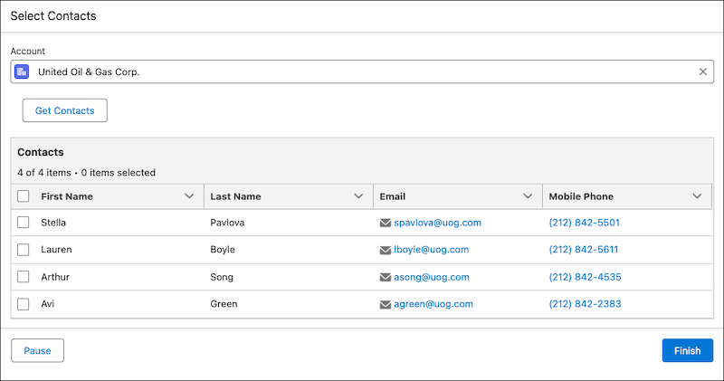
For example, you can make it possible for users to select an account record in a Lookup component, click a button to retrieve the contact records associated with the account record, and then display the contact records in a Data Table component on the same screen.
Configure the Action Button Name
| Attribute | Description |
|---|---|
| API Name | The API name of the component. An API name can include underscores and alphanumeric characters without spaces. It must begin with a letter and can’t end with an underscore. It also can’t have two consecutive underscores. |
| Label | If you select Use Label as the table title, the user-friendly text that appears above the component. |
| Disabled | If set to true, the user can’t modify the value. The default value is false. This attribute accepts a resource with a Boolean value. |
Configure the Action
| Attribute | Description |
|---|---|
| Action | The screen action that launches the autolaunched flow. This is the flow that runs when the user clicks the button rendered by the Action Button component. The autolaunched flow must be active. |
| Label | The user-friendly name for the action associated with the component. This value can be different than the label of the flow that you select as the action. |
| API Name | The API name for the action associated with the component. This value can be different than the API name of the flow that you select as the action. An API name can include underscores and alphanumeric characters without spaces. It must begin with a letter and can’t end with an underscore. It also can’t have two consecutive underscores. |
| Set Input Values | Specify the value of each input field required by the action associated with the component. For example, if you select an autolaunched flow that requires an Account ID as an input, provide the Account ID. Variables that are available for input in the autolaunched flow appear in this area. |
| View Output Values | View the outputs created by the action. To reference an output elsewhere in the flow,
first reference the Results field, for example,
|
Set the Component Visibility
Specify the logic that determines when the flow displays the component.
| Option | Description |
|---|---|
| When to Display Component | Configure when the component is displayed by using conditional logic. You can set the components to:
|
Specify the Behavior of Values on Revisited Screens
Specify what this component does when a user enters a value, navigates to a previous screen, and then returns to the screen with this component.
Specify Another Component’s Behavior with the In Progress Output Attribute
When a user clicks an action button, the In Progress attribute for the associated screen
action is set to true. When the action completes, the In
Progress attribute is set back to false.
Use the In Progress attribute to specify another component’s behavior. For example, use it to
disable a screen component while the action is running. Set the value of the Disabled field on
the component to the In Progress attribute. When In Progress is true the Disabled field is also set to true.
When the action completes and In Progress is set to false,
the disabled field is also set to false.
Considerations
- If a user runs a flow with an Action Button component in a web browser, the outputs of the action associated with the component are available to the browser. Don’t share sensitive information as the output of an Action Button component.
- Autolaunched flows that include Wait elements or subflows with Wait elements aren’t supported as Action Button actions because the flow won’t resume after a Wait element.
- Action Buttons aren’t supported in Repeater components.
- Launching a flow with an asynchronous path isn’t supported.
- If a flow launched from the action button doesn't have fault paths, and an error occurs, a
generic error message shows under the action button. To show a helpful error message to users
instead, add fault paths to the launched flow. On each fault path, set an output variable to
{!$Flow.FaultMessage}. Then, on the flow screen with the action button, add a Display Text component that's conditionally hidden and contains a helpful error message along with the fault message variable. Note Even if a Display Text component content contains an error message, screen readers don’t announce the content as an error message.
 - If an input or output variable in the screen action’s autolaunched flow is a record variable, and you change a field name on the object, the new field name isn’t reflected when you refresh the inputs and outputs.
- If an input or output variable in the screen action’s autolaunched flow is an Apex variable, and you change the structure of the Apex type, those changes aren't reflected when you refresh the inputs and outputs.