
You are here:
Dependent Picklists Screen Input Component
Display picklists in a flow screen in which the options for one picklist depend on the selected value of another picklist. The Dependent Picklists screen component determines which options to display in each picklist by using an existing field dependency in your org. A field dependency connects two picklist fields on the same object.
Required Editions
| View supported editions. |
Configure the Dependent Picklists Component
You can select resources from the flow, such as variables or global constants, or you can manually enter a value.
| Attribute | Description |
|---|---|
| API Name | The API name of the component. An API name can include underscores and alphanumeric characters without spaces. It must begin with a letter and can’t end with an underscore. It also can’t have two consecutive underscores. |
| Disabled | If set to true, the user can’t modify the value. The default value is false. This attribute accepts a resource with a Boolean value. |
| Object API Name | The API name of the object. The picklist fields that you identify in Picklist 1 API Name, Picklist 2 API Name, and Picklist 3 API Name must be associated with this object. This attribute accepts single-value resources. The value is treated as text. |
| Picklist 1 API Name | The API name of the first picklist field. For the specified object, this picklist field must be the controlling field in a field dependency between Picklist 1 and Picklist 2. This attribute accepts single-value resources. The value is treated as text. |
| Picklist 1 Label | The label for the first picklist field. This attribute accepts single-value resources. The value is treated as text. |
| Picklist 1 Required | If set to This attribute accepts single-value Boolean resources. |
| Picklist 1 Value | The default selection for the first picklist field. Configuring this attribute pre-selects an option for the field. This attribute accepts single-value resources. The value is treated as text. |
| Picklist 2 API Name | The API name of the second picklist field. For the specified object, this picklist field must be the dependent field in a field dependency between Picklist 1 and Picklist 2. If you display a third picklist field, Picklist 2 must be the controlling field in a field dependency between Picklist 2 and Picklist 3. This attribute accepts single-value resources. The value is treated as text. |
| Picklist 2 Label | The label for the second picklist field. This attribute accepts single-value resources. That value is treated as text. |
| Picklist 2 Required | If set to This attribute accepts single-value Boolean resources. |
| Picklist 2 Value | The default selection for the second picklist field. Configuring this attribute pre-selects an option for the field. This attribute accepts single-value resources. The value is treated as text. |
| Picklist 3 API Name | The API name of the third picklist field. For the specified object, this picklist field must be the dependent field in a field dependency between Picklist 2 and Picklist 3. This attribute accepts single-value resources. That value is treated as text. |
| Picklist 3 Label | The label for the third picklist field. This attribute accepts single-value resources. The value is treated as text. |
| Picklist 3 Required | If set to This attribute accepts single-value Boolean resources. |
| Picklist 3 Value | The default selection for the third picklist field. Configuring this attribute pre-selects an option for the field. This attribute accepts single-value resources. The value is treated as text. |
Store the Dependent Picklists Component’s Values in the Flow
The flow stores values automatically. If you store values manually, store the attribute’s output value in a variable.
To store values manually, select Manually assign variables (advanced).
All attributes are available to store in flow variables. Most likely, you must store one of these attributes.
| Attribute | Description |
|---|---|
| Picklist 1 Value | What the user selected for the first picklist field. You can store this value in a single-value Text variable or a Text field on a record variable. |
| Picklist 2 Value | What the user selected for the second picklist field. You can store this value in a single-value Text variable or a Text field on a record variable. |
| Picklist 3 Value | What the user selected for the third picklist field. You can store this value in a single-value Text variable or a Text field on a record variable. |
- Navigates to another screen and returns to the component’s screen.
- Pauses the flow then resumes it.
- Navigates to the next screen and triggers an input validation error.
Setting the attribute enables a flow to remember the value. The flow stores the value automatically. If you store values manually, store the attribute’s output value in a variable.
Set the Component Visibility
Specify the logic that determines when the flow displays the component.
| Option | Description |
|---|---|
| When to Display Component | Configure when the component is displayed by using conditional logic. You can set the components to:
|
Validate Input
Provide a formula that evaluates whether what the user entered is valid and the error message to display if invalid.
| Option | Description |
|---|---|
| Error Message | Specify the error message that appears below the component if the user enters an invalid value. |
| Formula | Provide a formula expression that returns a Boolean value. If the formula expression evaluates to true, the input is valid. If the formula expression evaluates to false, the error message appears below the component. If the user leaves the field blank and the field isn’t required, the flow doesn’t perform the validation. If the user leaves the field blank and the field is required, the flow shows the default error message and not your custom error message. |
Specify the Behavior of Values on Revisited Screens
Specify what this component does when a user enters a value, navigates to a previous screen, and then returns to the screen with this component.
For example, in a Dinner Order flow, users select a specific dessert. Each dessert comes in different flavors, and the flavor options change based on the dessert that the user selects.
On the Guest Order custom object, define two picklist fields: Dessert and Flavor. Next, define a field dependency between Dessert and Flavor, where Dessert is the controlling picklist. Identify which Flavor options apply to each Dessert option.
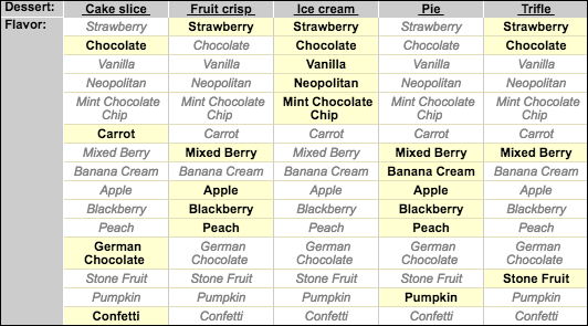
In your flow screen, add a Dependent Picklists screen component. Configure the component with these values.
| Attribute | Value |
|---|---|
| Object API Name | Guest_Order__c |
| Picklist 1 API Name | Dessert__c |
| Picklist 1 Label | Dessert |
| Picklist 2 Value | Flavor__c |
| Picklist 2 Label | Flavor |
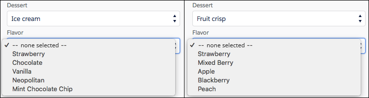
When a user runs the flow, the options for Flavor change based on what’s selected for Dessert.
Considerations
Screen input component values are set to null when they’re hidden by conditional visibility. But hidden picklists in a Dependent Picklists component aren’t set to null unless the entire Dependent Picklists component is hidden.