
You are here:
File Upload Screen Input Component
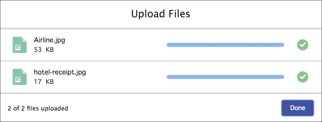
Let users upload files from a flow screen.
Required Editions
Configure the File Upload Component
You can select resources from the flow, such as variables or global constants, or you can manually enter a value.
| Attribute | Description |
|---|---|
| Accepted Formats | Using the format .ext, enter a comma-separated list of the file extensions that the user can upload. This attribute accepts single-value resources. The value is treated as text. |
| Allow Multiple Files | If set to $GlobalConstant.True, the user can upload multiple files. This attribute accepts single-value Boolean resources. |
| API Name | The API name of the component. An API name can include underscores and alphanumeric characters without spaces. It must begin with a letter and can’t end with an underscore. It also can’t have two consecutive underscores. |
| Disabled | If set to $GlobalConstant.True, the component is disabled. This attribute accepts single-value Boolean resources. |
| File Upload Label | Required. Label that appears above the upload button. This attribute accepts single-value resources. The value is treated as text. |
| Hover Text | Tooltip that appears when the user hovers over the component. This attribute accepts single-value resources. The value is treated as text. |
| Related Record ID | Required. ID of the record to associate the files with. If no value is passed, the component is disabled. This attribute accepts single-value resources. The value is treated as text. |
Store the File Upload Component’s Values in the Flow
All attributes are available to store in flow variables, but usually you must store one of these attributes. The values are assigned to the flow variables when the user navigates to the next screen.
| Attribute | Description |
|---|---|
| Content Document IDs | The IDs of the uploaded files. You can store this value in a Text collection variable. |
| Uploaded File Names | The names of the uploaded files. You can store this value in a Text collection variable. |
Set the Component Visibility
Specify the logic that determines when the flow displays the component.
| Option | Description |
|---|---|
| When to Display Component | Configure when the component is displayed by using conditional logic. You can set the components to:
|
Validate Input
Provide a formula that evaluates whether what the user entered is valid and the error message to display if invalid.
| Option | Description |
|---|---|
| Error Message | Specify the error message that appears below the component if the user enters an invalid value. |
| Formula | Provide a formula expression that returns a Boolean value. If the formula expression evaluates to true, the input is valid. If the formula expression evaluates to false, the error message appears below the component. If the user leaves the field blank and the field isn’t required, the flow doesn’t perform the validation. If the user leaves the field blank and the field is required, the flow shows the default error message and not your custom error message. |
Specify the Behavior of Values on Revisited Screens
Specify what this component does when a user enters a value, navigates to a previous screen, and then returns to the screen with this component.
File Upload Limits
By default, you can upload up to 10 files simultaneously, unless Salesforce changed that limit. The org limit for the number of files simultaneously uploaded is 25 files with a minimum of one file. The maximum file size you can upload is 2 GB. In Experience Cloud sites, the file size limits and types allowed follow the settings determined by site file moderation.
Considerations
- If a user doesn’t upload any files, the value of the Content Document
IDs and Uploaded File Names outputs is an empty
collection, represented as
“[]”. If you check the ISBLANK or ISNULL operator, the value is alwaysfalse. - By default, guest user files are blocked from being uploaded. Admins can change the settings to let guest users upload files. From Setup | Salesforce Files | General Settings, and then select Allow site guest users to upload files. This setting is only valid if the Secure guest user record access setting is enabled in the org.
- When guest users upload files, the component returns
ContentVersionIdand notContentDocumentId. - Lightning Out doesn’t support the File Upload component.
- The file upload component isn’t supported on mobile app or browser when used with flows that are accessed through URLs. This restriction doesn’t apply when the file upload component is used in Lightning App Builder or Experience Builder.
- If your flow updates the file name after the files are uploaded, and users run your flow while offline, the file names sometimes don't get updated.
- File Upload Enhanced Screen Input Component (Beta)
Give users the opportunity to upload files from a flow screen. The File Upload Enhanced (beta) flow screen component is similar to the existing File Upload screen component, but it has some key differences. The File Upload Enhanced (beta) screen component can be used in Aura and Lightning Web Runtime (LWR) sites, instead of just Aura sites. Also, you can require that users upload documents before moving on in the flow.