
You are here:
Section Screen Output Component
Organize screen components and record fields to give your users a better experience.
Required Editions
| View supported editions. |
Note This screen component requires Lightning
runtime.
Usage
Use sections to organize screen components and fields to give users context and easier navigation. The Section component contains an optional header and up to four side-by-side columns. Each column can contain multiple components and fields. You can place multiple sections on a screen, each with its own header and number of columns.
Tip Apply conditional visibility rules to a section to affect all
components and fields in that section. Use this method to set visibility rules one time for
a large number of components, even if you want only one column.
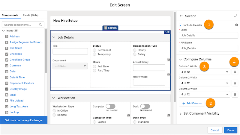
- Headers (1)—Use section headers to create a visual hierarchy to guide your users to the most important items on a screen. All sections with headers are collapsible and open by default each time a user visits the screen. Also, section header labels can be translated.
- Columns (2)—Use columns to organize your screen and save your users from unnecessary scrolling.
- Column Width (3)—When you add or delete a new column, Flow Builder sets the width of all columns in that section to be equal. To change a column’s width, select a width from the predefined options.
- Column Deletion (4)—When you delete a column, all components and fields in that column are deleted.
Tip To center or indent your components and fields, or add padding, include
empty columns on your screen.
Set the Component Visibility
Specify the logic that determines when the flow displays the component.
| Option | Description |
|---|---|
| When to Display Component | Configure when the component is displayed by using conditional logic. You can set the components to:
|
Considerations
- Sections are responsive to the size of the window that’s showing the flow. On small form factor devices, columns are stacked vertically instead. However, it isn’t responsive to the width of Lightning page columns and utility bars. For example, if a Lightning page shows a flow in a sidebar, the width of the entire window determines how the columns appear, even though the sidebar is narrower.
- If a screen contains a Section screen component, the screen ignores the Layout property
when the flow is distributed in Experience Builder, the Lightning App Builder, or the
utility bar. Screens with a Section screen component also ignore the
flowLayoutURL parameter when the flow is distributed via URL.
Did this article solve your issue?
Let us know so we can improve!