
You are here:
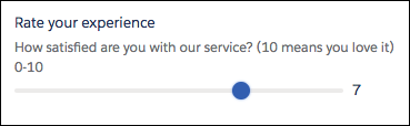
Slider Screen Input Component
Let users visually specify number values from a flow screen.
Required Editions
Configure the Slider Component
You can select resources from the flow, such as variables or global constants, or you can manually enter a value.
| Attribute | Description |
|---|---|
| API Name | The API name of the component. An API name can include underscores and alphanumeric characters without spaces. It must begin with a letter and can’t end with an underscore. It also can’t have two consecutive underscores. |
| Label | This label appears above the slider. This attribute accepts single-value resources. The value is treated as text. |
| Disabled | If set to true, the user can’t modify the value. The default value is false. This attribute accepts a resource with a Boolean value. |
| Range Maximum | The maximum value of the slider range. The default is 100. This parameter accepts single-value Number resources. |
| Range Minimum | The minimum value of the slider range. The default is 0. This parameter accepts Number resources. |
| Slider Size | Controls the size of the slider. The accepted values are x-small, small, medium, or large. This parameter accepts single-value resources of any type. That value is treated as text. |
| Step Size | Divides the slider into a set of steps. The default is 1. For example, for a range of 0–100, set the Step Size to 10 to let the user select every 10th value. Other example step sizes are 0.1 and 5. This parameter accepts single-value Number resources. |
| Value | The default value represented by the slider position. Setting this attribute from the Inputs tab pre-sets the value. This parameter accepts single-value Number resources. |
Store the Slider Component’s Values in the Flow
The flow stores values automatically. If you store values manually, store the attribute’s output value in a variable.
To store values manually, select Manually assign variables (advanced).
All attributes are available to store in flow variables, but Value is the most likely attribute you must store.
To store the value that the user selected, map the Value attribute to a Number flow variable.
- Navigates to another screen and returns to the component’s screen.
- Pauses the flow then resumes it.
- Navigates to the next screen and triggers an input validation error.
Setting the attribute enables a flow to remember the value. The flow stores the value automatically. If you store values manually, store the attribute’s output value in a variable.
Set the Component Visibility
Specify the logic that determines when the flow displays the component.
| Option | Description |
|---|---|
| When to Display Component | Configure when the component is displayed by using conditional logic. You can set the components to:
|
Validate Input
Provide a formula that evaluates whether what the user entered is valid and the error message to display if invalid.
| Option | Description |
|---|---|
| Error Message | Specify the error message that appears below the component if the user enters an invalid value. |
| Formula | Provide a formula expression that returns a Boolean value. If the formula expression evaluates to true, the input is valid. If the formula expression evaluates to false, the error message appears below the component. If the user leaves the field blank and the field isn’t required, the flow doesn’t perform the validation. If the user leaves the field blank and the field is required, the flow shows the default error message and not your custom error message. |
Specify the Behavior of Values on Revisited Screens
Specify what this component does when a user enters a value, navigates to a previous screen, and then returns to the screen with this component.