You are here:
Pipeline Inspection Charts
With Pipeline Inspection, you can view Pipeline Changes metrics on a waterfall chart. If you have access to Revenue Intelligence, you can also see recent changes to Forecast Category metrics on a flow chart.
Required Editions
| View supported editions. |
To access charts in Pipeline Inspection, go to the Chart tab. To see the waterfall chart, select Pipeline Changes in the Metrics dropdown menu. To see the flow chart, select Forecast Category. The metrics and charts you can see depend on the settings enabled.
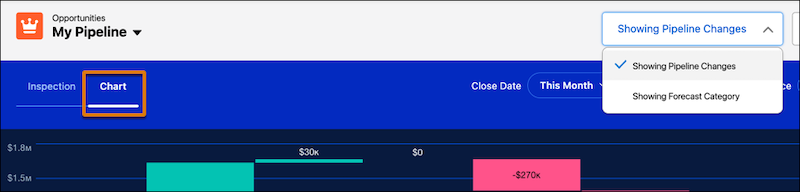
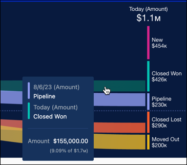
Waterfall Chart
The waterfall chart shows pipeline changes such as opportunities created, increases and decreases in your pipeline, and won and lost amounts. It also shows amounts for opportunities moved in and out of the period. Specify the opportunities to view using the filters for close date and user, and then the time period to show.
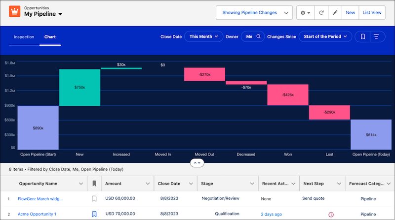
The chart data shows the net change to the pipeline over the selected period. The fields used to summarize your data are the same as the fields used for the flow chart, and are based on the fields your admin configured.
The metrics names, such as New, Increased, and Won, in the pipeline changes metrics group shown in the waterfall chart are specified by Salesforce and can’t be changed.
Flow Chart
The flow chart shows the change in opportunity forecast categories according to your filter criteria. To focus on specific opportunities, use the filters for close date and user, and then specify the time period.
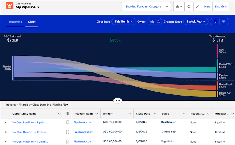
The chart shows pipeline changes starting from the date that you select to the present day. To highlight the changes related to that forecast category, click a band in the chart. The list below the chart also updates to show opportunities related to your selection.
The data shown in the chart is for individual forecast categories. Select from amount, currency, or number fields to summarize metrics in Pipeline Inspection and the flow chart, based on what your Salesforce admin configured. For example, use a currency field to see data for annual recurring revenue, or use a number field to view product quantities.
The forecast categories are defined by Salesforce, and sometimes they don’t correspond precisely to the labels of the forecast categories that you use. Your admin can customize the labels.