
You are here:
Branding Elements Guide for Enhanced Chat
Use branding tokens to match the look of your chat window to your website. Choose colors and fonts, and upload logos and avatars without any engineering effort.
Required Editions
| View supported editions. | |
 This article applies to:
|
Enhanced In-App Chat and Enhanced Web Chat channels |
 This article doesn’t apply to:
|
Enhanced WhatsApp, Standard and Enhanced Facebook Messenger, Standard and Enhanced SMS, Enhanced Apple Messages for Business, Enhanced LINE, and Bring Your Own Channel |
| User Permissions Needed | |
|---|---|
| To set up Omni-Channel Flow and Messaging: | Customize Application |
| To modify permission sets and profiles: | Manage Profiles and Permission Sets |
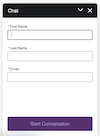
Customize Colors, Fonts, Images, and Window Size
Make your selections on the Embedded Service Deployment Settings page. Learn more about the selections that you can make further down in this help topic.
- From Setup, in the Quick Find box, enter Deployments, and select Embedded Service Deployments.
- To the right of your deployment, click the downward arrow, and select View. Click Select Branding.
- Make your selections. See information about colors, fonts and images further down in this help topic.
- Save your changes.
- When you return to the Embedded Service Deployment Settings landing page, click Publish.
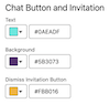
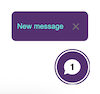
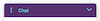
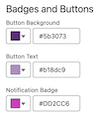
Color Guide
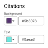
To select a color, click the dropdown and scroll through the color picker or enter a hex code into the # field. Save your changes and republish your deployment.
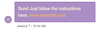
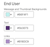
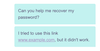
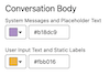
| Colors | Elements | Example |
|---|---|---|
 |
|
 |
|
 |
|
 |
|
 |
 |
|
 |
 |
|
 |
 |
|
 |
 |
|
  |
 |
|
 |
Font Guide
Use any of these pre-defined fonts: Arial, Salesforce Sans, Georgia, Palatino Linotype, Times New Roman, Arial Black, Comic Sans MS, Impact, Lucinda Sans Unicode, Tacoma, Trebuchet MS, Veranda, Courier New, Lucinda Console.
To use a custom font instead, first upload it as a Static Resource. Then select Custom Font from the Font dropdown menu. In the Custom Font Family Name field that appears, enter the name of the static resource.
In the Font Size field, select small, medium or large. Here’s an example of a Chat header in Comic Sans in the three font sizes:
| Size | Example |
|---|---|
| Small | 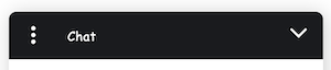 |
| Medium | 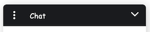 |
| Large | 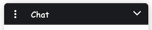 |
After you customize your fonts, save your changes and republish your deployment.
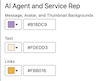
Image Guide
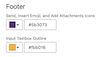
Use an image hosting service, such as Github, to convert an image to a URL. Then add your URL to a field in the Images section. Save your changes and republish your deployment.
| Image | Example |
|---|---|
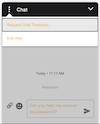
| Service Rep | Appears to the left of a rep-initiated text message bubble. |
| Bot and AI Agent | Appears to the left of a bot or AI-agent-initiated text message bubble. |
| Logo | Appears in the chat header. |
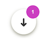
| Chat Button | Appears in the Chat Button. |