
You are here:
Get to Know the Messaging Component Builder
The Messaging Component Builder is your workshop where you can customize and preview all types of messaging components. Learn where and how to get things done in the Builder.
Required Editions
| View supported editions. | |
 This article applies to:
|
Enhanced In-App Chat, Enhanced Web Chat v1, Enhanced Web Chat v2, Enhanced WhatsApp, Enhanced Facebook Messenger, Enhanced Apple Messages for Business, Enhanced LINE, and Bring Your Own Channel |
 This article doesn’t apply to:
|
Standard Facebook Messenger, and Standard and Enhanced SMS channels |
The Builder opens when you perform either of these actions on the Messaging Components page in Setup.
- You create a messaging component.
- You click the name of a messaging component.
Let’s look at a messaging component in the Builder.
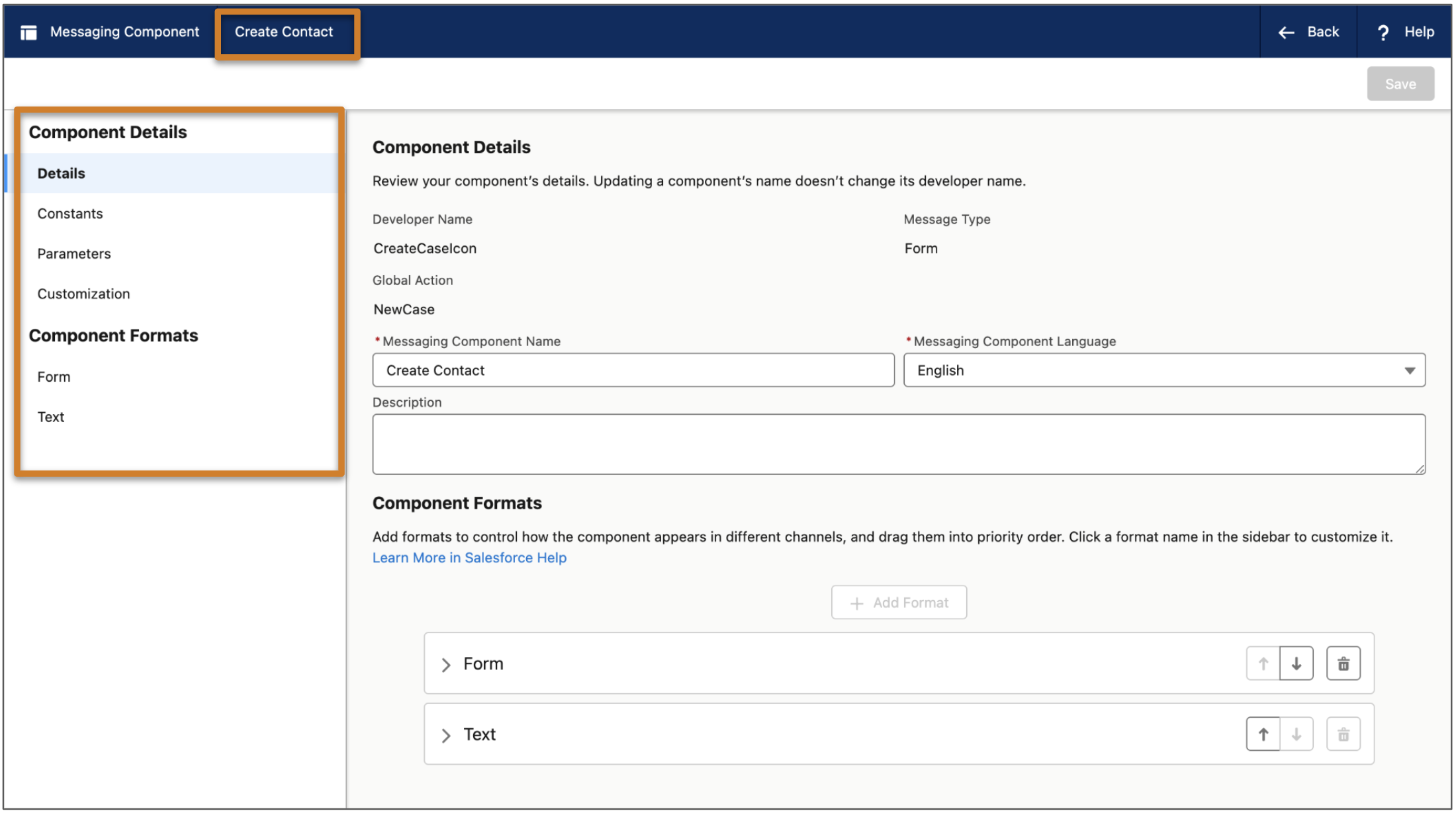
The component name appears in the header bar. The tabs in the left-hand navigation menu each contain settings that control the appearance and behavior of your messaging component.
| Tab Name | Description | Tasks Completed on this Tab |
|---|---|---|
| Details | Manage a component’s details such as its name, developer name, description, type, and language. Depending on the component type, the Details tab also shows other settings such as the associated global action. |
|
| Constants | Manage standard and custom constants that you can reference in your component’s properties. The text and images that you provide when creating your component are all saved as standard constants. You can also add custom constants. For example, to show an image in the component link sent to customers, add the image as a custom constant and then reference it in a component property. |
|
| Parameters | Manage standard and custom parameters that you can reference in your component’s properties. In some types of components, standard parameters are added automatically. For example, time selectors include a standard parameter that represents the time slots shown in the component. You can also add up to 5 custom parameters per component, such as a RecordId parameter that lists a product name. |
|
| Customization | This tab appears only for form components. |
|
| Payment Provider | This tab appears only for payment components. | View the payment provider associated with your messaging component. |
| Authentication Provider | This tab appears only for authentication components. | View the authentication provider associated with your messaging component. |
| Component Formats | Manage the formats that the component is available in. The Text (plain text) format is added by default, but all components offer additional formats that you can add to control its appearance and behavior. When you add a format to the component, it appears as a tab in the Component Formats section. | Click a format tab to complete these tasks.
|
Did this article solve your issue?
Let us know so we can improve!