You are here:
Treemap Charts
Use treemaps to visualize hierarchical quantitative data, where containing rectangles designate relationship using color, and "leaf" rectangles represent quantity using area.
Create a Treemap Chart
Treemap charts are especially useful for visualizing groupings that are difficult to organize well using other types of charts.
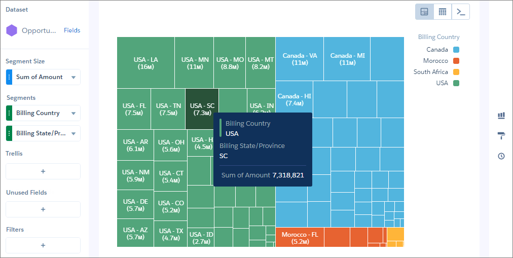
For example, you can show the number of opportunities by state or province in each country in a way that reveals top markets.
-
In the lens, click
 and then select the Treemap chart
type.
and then select the Treemap chart
type.
- In the Segment Size field, add a measure, such as total opportunity amount.
-
In the Segments field, add one or more dimensions to analyze the measure by. For
example, select Billing Country and Billing
State/Province.
In the treemap chart, each color represents a country, as indicated in the legend. Each rectangle represents a state or province in a country. The high-value states and provinces are easy to spot. Using tooltips, you can view details for any rectangle representing a state.
-
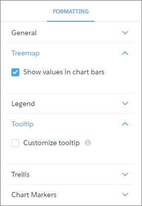
To change the chart display, click
 and set the chart properties in the Formatting panel.