
You are here:
Omnistudio Flexcards
Build industry-specific UI components and applications on the Salesforce platform by creating Omnistudio Flexcards in a visual editor. Show Salesforce object information with clickable actions that adapt to the context and type of data, helping your team handle tasks more efficiently. Flexcards are built with the Lightning Component framework.
- Working with Flexcards
Create and manage Flexcards in the designer in the Omnistudio standard runtime. The designer provides the standard components for building user interfaces within Salesforce. Create Flexcards in fewer steps. With the designer, Flexcards activation is instant. - Open a Flexcard in a Canvas Instead of the Record Page Detail
Omnistudio provides an intuitive canvas to easily set up Flexcards. If canvas view isn't available when you open a Flexcard, update the default Lightning record page for the Omni UI Card object. For example, the default record page is sometimes different after you migrate from the custom object data model to the standard object data model. - Create a Flexcard
Create a Flexcard by specifying a unique name and author. Optionally, save the Flexcard as a child card to embed it in other Flexcards. In the designer for a managed package, you can also configure its data sources and test parameters. - Configure Flexcard Settings
Specify your Flexcard’s behavior with the setup options. For example, add or update a data source, create an event listener, or add session variables. - Add Elements to a Flexcard
Build your card by dragging elements into a state on the canvas. Add data fields, display, and input elements to your Flexcard. Show data generated dynamically from the Flexcard’s data source, or add static information. Rearrange, clone, delete, and adjust the widths of your elements as needed. Style an element and configure its properties in the Flexcard designer. - Set Up Actions on a Flexcard
Configure actions that users can complete on Flexcards to improve the self-service experience, and save time on manual tasks. Add actions to supported elements or add an action element to a Flexcard, and then configure the action settings. For example, you want to have a button that opens a URL for additional information. To do so, add an action to an existing image or add an action element for which you select an image. You can also set up sequential actions and configure each action’s trigger. - Display Data on Flexcards Based on Conditions
Determine whether to apply conditions to individual Flexcard elements, to the entire Flexcard, or to both. Use states to control what’s available to users at the Flexcard level. For a more granular configuration, apply conditions to specific elements, fields, events, and more. For example, to show an alert icon for escalated cases, apply conditions to that icon. To show different Flexcards based on the payment status of an insurance account, create states for each status. - Style a Flexcard
Configure the look and feel of a Flexcard by styling individual elements, fields inside elements, and entire states. Configure backgrounds, text, and borders; adjust dimensions and element spacing; apply classes and inline styles; make your element responsive; and more. - Preview and Debug a Flexcard
Preview a Flexcard's appearance and test its functionality before you publish it to a Lightning page or to a page in an Experience Builder Aura site. Review how the Flexcard looks on multiple devices and test the functionality of interactive elements such as actions. Debug the Flexcard's data output, events, actions, and more. - Activate and Publish a Flexcard
After you confirm that the Flexcard is ready, activate it. After activation, add the Flexcard to a Lightning page or to a page in an Experience Builder site. - Export and Import Flexcards
Import or export Flexcards to use them in another org, such as when you create them in a sandbox or to use sample data packs that Salesforce provides. When exporting or importing data packs for Flexcards, if you encounter Apex limit errors such as heap or CPU limits, reduce the size of the data pack by unselecting dependencies during the export process. Additionally, break the data pack into multiple smaller data packs. As a best practice, we recommend including no more than 10 elements in each data pack. - Flexcards Context Variables
To provide context to data sources, actions, and other components, add global and local context variables to a Flexcard. All variables are case-sensitive. - Flexcards Omni Interaction Access Configuration
In Omnistudio, limit access to data sources and update cache settings for the Omni UI Card object (Flexcard) across your org. Enable and disable data source types for an org, profile, or user level. Disable caching on the Platform Cache for all Flexcards. Enable Flexcards to cache asynchronously without waiting for the full caching process to finish.
Flexcard Designer
Starting with Winter '25, create and manage Flexcards in the new designer included in Omnistudio standard runtime. The new designer provides the standard components for building user interfaces within Salesforce. It doesn’t require any package installation and is available with the Salesforce platform after the permissions are enabled. These designers are available to all new customers of Omnistudio. The existing designer on the managed package remains unchanged.
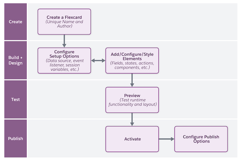
Flexcard Workflow
Starting with Winter '25, use this workflow to create, configure, and publish Flexcards in the new designer included in Omnistudio standard runtime.
-
Create a Flexcard with a unique combination of name and author.
See Create a Flexcard.
- Configure the behavior, visual elements, and interactions that the Flexcard offers to your users. For example, configure settings, add fields for input data, navigation elements to open links, specify the elements’ responsiveness, and more. If needed, modify the style elements such as background and size to provide a customized experience to your users.
- Preview the Flexcard, test its look and feel, and resolve issues as needed.
- After you confirm that the Flexcard is ready, activate it. Then, add the Flexcard as a standard component to a target page, such as an app page or community page.
Flexcard Workflow in the Designer on a Managed Package
Use this workflow to create, configure, and publish Flexcards in the designer on a managed package.
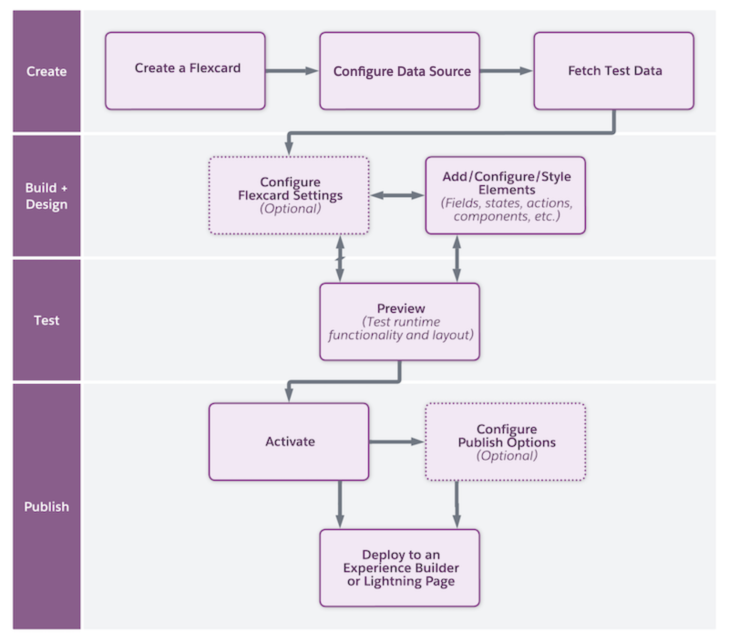
- Create a Flexcard with a unique combination of name and author and, if needed, configuring the data source type and testing data retrieval.
- Configure the visual elements and interactions that the Flexcard offers to your users. For example, add fields for input data, navigation elements to open links, specify the elements’ responsiveness, and more. If needed, style elements such as for the background or the size to provide a customized experience for your users.
- Preview the Flexcard, test its look and feel, and resolve issues as needed.
- Publish and deploy the Flexcard. After you confirm that the Flexcard is ready, activate it. Then, publish that component to a Lightning page, an Experience Cloud page, or an external site, depending on your Omnistudio version.