
You are here:
Style a Flexcard
Configure the look and feel of a Flexcard by styling individual elements, fields inside elements, and entire states. Configure backgrounds, text, and borders; adjust dimensions and element spacing; apply classes and inline styles; make your element responsive; and more.
Save the style of an element and reuse it on multiple elements. Create custom classes by using a code editor available when you build a Flexcard, and use those classes right away. Add classes to fields inside supported elements, such as the label and value of a text element. Further personalize the user experience by conditionally applying styles in response to a data field’s value.
- From the App Launcher, find and select Flexcards.
- Expand a Flexcard and select a version.
- If needed, deactivate the Flexcard for editing the Flexcard.
- On the Style tab, select a custom style that you saved, or configure style settings as needed.
-
To save your settings for reuse, under Custom Style, click
 and then select Save As.
- Add Conditional Styles to a Flexcard Element
Show the most relevant information to your users by conditionally applying styles to a Flexcard element. Change style features such as text color, background image, and responsiveness when a condition based on the value of a data field is met. For example, add a red border around a billing Flexcard when the bill status is past due. - Configure Flexcard Element Dimensions
Set the dimensions of the Flexcard according to your company or institution’s style. Set the height properties of Flexcard elements by using CSS values. Turn on responsiveness so that the width adjusts dynamically to the page’s visible area. For example, expand the width of the fields for a contact’s first and last names to the full page width on smaller devices. And for better user experience, limit the width to 50% on larger devices such as laptops and desktops. - Create Custom CSS Classes for a Flexcard
Expand preconfigured style options by creating custom CSS classes in a code editor when you set up your Flexcard. Omnistudio saves the CSS classes in a Salesforce attachment each time you save the Flexcard. After you activate the Flexcard, Omnistudio adds a CSS file to the generated Lightning web component package. The CSS file is available to other Flexcard elements or to supported fields inside elements. - Apply Custom CSS to a Flexcard
Apply CSS classes from style sheets such as the global Salesforce Lightning Design System (SLDS) and Newport. Or, apply classes that you create when building your Flexcard. - Overwrite Global SLDS or Newport Styles
Apply your own branding by overwriting a Flexcard’s global SLDS styles. For example, if your Flexcard requires a specific appearance across multiple components, create custom SLDS styles and load them to your Flexcard as a static resource. For minor style changes on elements, we recommend that you use the settings from the Style tab.
Add Conditional Styles to a Flexcard Element
Show the most relevant information to your users by conditionally applying styles to a Flexcard element. Change style features such as text color, background image, and responsiveness when a condition based on the value of a data field is met. For example, add a red border around a billing Flexcard when the bill status is past due.
- Select an element on the Flexcard.
- On the Style tab, click Add Conditional Style.
- Enter a conditional style name different from any other conditional style name for the same element.
-
Enter the information about the conditions to apply.
See Set Up Conditions to a Flexcard Element on how to configure conditions.
- Save your changes.
-
Your new condition appears below the Default.
Omnistudio applies the conditional style and adds a Default section to the Style tab, which includes the styles applied when the defined conditions aren’t met.
- To compare the element’s appearance before and after the conditions are met, turn on the toggle next to the conditional style name.
Configure Flexcard Element Dimensions
Set the dimensions of the Flexcard according to your company or institution’s style. Set the height properties of Flexcard elements by using CSS values. Turn on responsiveness so that the width adjusts dynamically to the page’s visible area. For example, expand the width of the fields for a contact’s first and last names to the full page width on smaller devices. And for better user experience, limit the width to 50% on larger devices such as laptops and desktops.
- Select an element on the Flexcard.
- On the Style tab, to set a default fixed width relative to the viewport, adjust the slider or drag the border of the element on the canvas.
-
If needed, turn on Responsive, and then enter the width for
each viewport.
When you make the element responsive, Omnistudio adjusts the element’s width to the smallest viewport breakpoint for use on mobile devices as the new default.
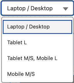
- If needed, test the element’s responsiveness by selecting different devices from the viewport picklist on the canvas.
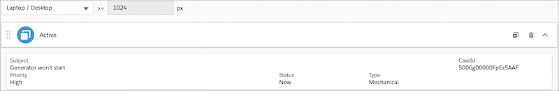
For a given account, you want to show the Subject and CaseId field elements next to each other in the medium and large viewports, and stacked in the small and smaller viewports.
Set the Subject element’s dimensions to these settings:
-
Responsive: On
-
Large and medium sliders: 10
-
Small and smaller sliders: 12
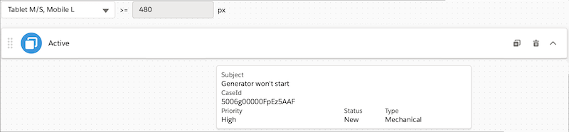
Set the CaseId element’s dimensions to these settings:
-
Responsive: On
-
Large and medium sliders: 2
-
Small and smaller sliders: 12
Create Custom CSS Classes for a Flexcard
Expand preconfigured style options by creating custom CSS classes in a code editor when you set up your Flexcard. Omnistudio saves the CSS classes in a Salesforce attachment each time you save the Flexcard. After you activate the Flexcard, Omnistudio adds a CSS file to the generated Lightning web component package. The CSS file is available to other Flexcard elements or to supported fields inside elements.
Apply Custom CSS to a Flexcard
Apply CSS classes from style sheets such as the global Salesforce Lightning Design System (SLDS) and Newport. Or, apply classes that you create when building your Flexcard.
- Select an element on the Flexcard.
- On the Style tab, under Custom CSS, enter CSS class names as needed.
-
To apply a custom class to an element, in the Properties panel, enter a CSS class
as an additional or extra class.
Omnistudio supports custom classes for icons, datatables, images, and toggles.
You have a data table that displays account cases grouped by case type.
- To alternate background colors for body rows and set a different background color
for the group heading:
- Create these custom CSS classes:
alt-table-rowsfor the datatable elementalt-bg-group-wrapperfor the group heading
.alt-table-rows .tableRow:nth-child(even) { background:#cccccc; } .alt-table-rows .tableRow:nth-child(odd) { background:#ebebeb; } .alt-table-rows .alt-bg-group-wrapper.tableRow { background-color: #000000; color: #ffffff; } .branded-header { font-variant: small-caps; border-top: 1px dotted #8d1818; border-bottom: 1 px dotted #8d1818; padding: 1rem; color: #999999; } - On the Style tab, in Custom Class, enter
alt-table-rows. - In Properties, enter
alt-bg-group-wrapperas the additional or extra class.
- Create these custom CSS classes:
Overwrite Global SLDS or Newport Styles
Apply your own branding by overwriting a Flexcard’s global SLDS styles. For example, if your Flexcard requires a specific appearance across multiple components, create custom SLDS styles and load them to your Flexcard as a static resource. For minor style changes on elements, we recommend that you use the settings from the Style tab.
Loading custom Newport styles directly on the Flexcard overwrites custom global Newport styles.
-
Get global styles for your Flexcard theme:
- SLDS: See Lightning Design System Downloads.
- Newport: See Apply Global Branding to Omniscripts.
- Customize styles as needed.
- Upload the custom styles from a zipped file as a static resource.
- From Setup, expand the Styling Options section, and enter the static resource name.