
You are here:
Annotate Data Points with Tooltips and Markers
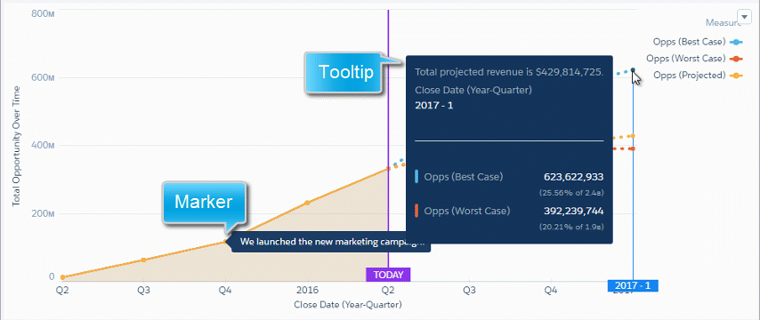
Create your own tooltips and markers in charts to show details about data points. Create a tooltip to specify which details appear when you hover over any data point. To annotate a specific data point, add a marker and, to draw more attention, make it blink.
The tooltips and markers appear when you hover over the data point.
- Edit the dashboard and select the chart widget.
-
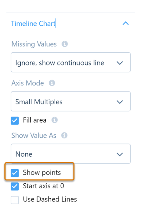
To make it easier for users to locate data points on the line, select Show
points in the chart’s section of the widget properties.
-
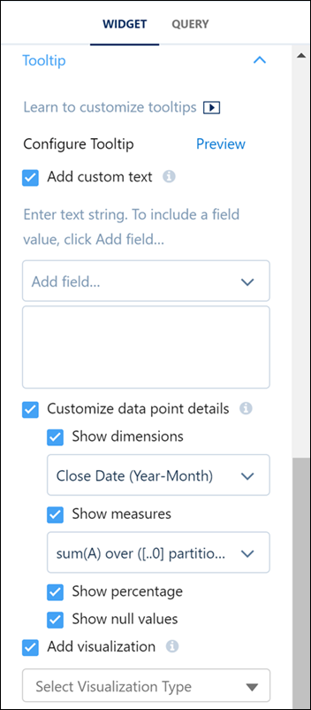
To configure the tooltip text, data point details, and visualizations, expand the Tooltip
section of the widget properties.
-
Specify these tooltip details.
Property Description Add custom text Specify your own text. To insert the value of a field in the text, click Add field. If manually entering a field, reference the field by its alias (not label) and enclose the alias in square brackets. Customize data point details To show measures or dimensions in the tooltip, enable this option. Show dimensions Show the values of all selected dimensions. Show measures Show the values of all selected measures. Show percentage If you show measures, enable this option to show each measure’s percentage of the total. Show null values Show null values in the tooltips. Show title tooltip Show or hide tooltip for the number widget. Add visualization To add a chart, table, or a component that houses multiple widgets to the tooltip, enable this option. For a chart or table visualization, update its query to create the tooltip you want. Alternatively, to include a component visualization, select an existing dashboard component or create one, and then select it as your tooltip visualization. By default, for chart and table tooltip visualization types, the initial selections and filters on the visualization match the ones in the associated chart widget. And, when you hover over a chart’s grouping, that grouping is applied as a filter on the tooltip. Visualization size Set the width and height of the tooltip visualization in pixels. - To add a marker for a data point, expand the Chart Markers section in the widget properties, and then click Edit Chart Markers.
-
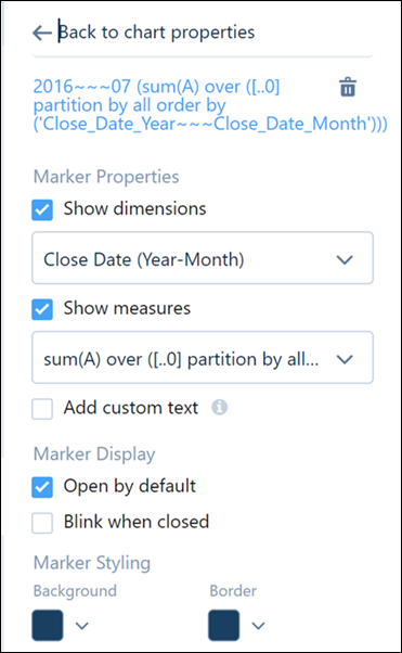
Select a data point in the chart where you want to add a marker.
-
Enter the following marker details.
Property Description Show dimensions Show the values of all selected dimensions. Show measures Show the values of all selected measures. Add custom text Specify your own text. To insert the value of a field in the text, click Add field. If manually entering a field, reference the field by its alias (not label) and enclose the alias in square brackets. Open by default Opens the marker and shows its text, by default. Otherwise, the dashboard viewer must click the marker to view the text. Blink when closed Makes the marker blink when it’s closed. Background Background color of the marker. Border Border color of the marker. - Preview the changes.
- Save the dashboard.
- Highlight Focus in Custom Tooltips
When using custom tooltips that incorporate charts, it can be difficult to identify which element has focus. Implementing a clear visual indicator for focus within these chart-inclusive tooltips is essential to improve user experience, ensure accessibility, and facilitate seamless data exploration.
Did this article solve your issue?
Let us know so we can improve!