
You are here:
Handle Missing Values in Line Charts
Charts can display gaps to highlight missing data. Or charts can ignore the missing data and show a continuous line that connects the data points. For periods of missing data in timeline charts, you can make cumulative lines horizontal to indicate that no change occurs.
To configure how a chart handles missing data, set one of the following options in the Missing Value chart property.
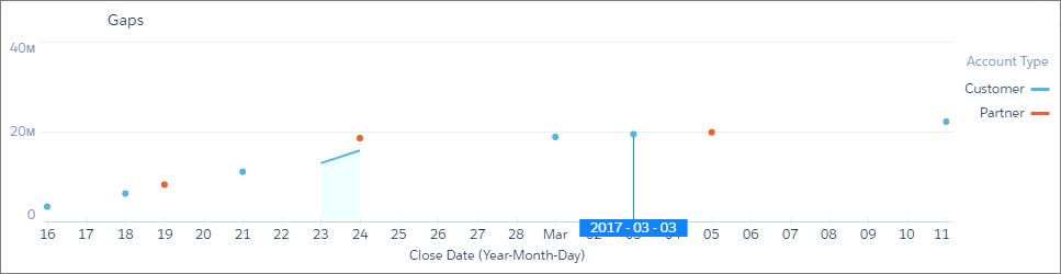
- Show as gaps
- The graph connects contiguous data points and shows gaps whenever data is missing. In the
following example, there’s a separate graph for customer and partner account types.
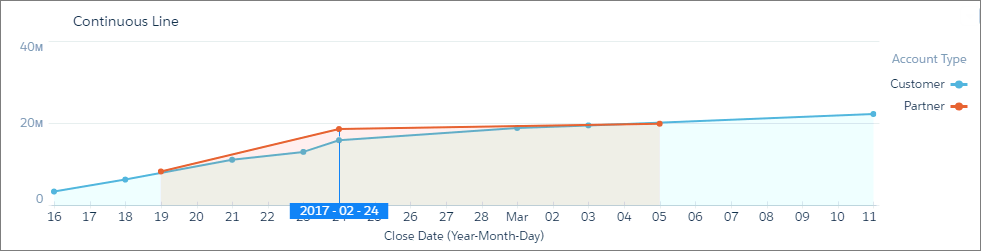
- Ignore, show continuous line
- The graph connects all data points, glossing over missing data. The graph starts at the
first data point and ends at the last for each grouping.
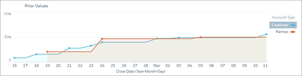
- Use prior values
- Uses the value prior to the missing data point to indicate no change. Use this option for charts that show cumulative values, such as timeline.
- Let’s look at an example. Because no deals closed between February 20 and 23, the
cumulative value doesn’t change for the partner line. To show no change, the chart uses the
same value from the previous data point on February 19. This chart is more accurate than the
previous graph, which is misleading because it shows an upward trend during this same time
period.
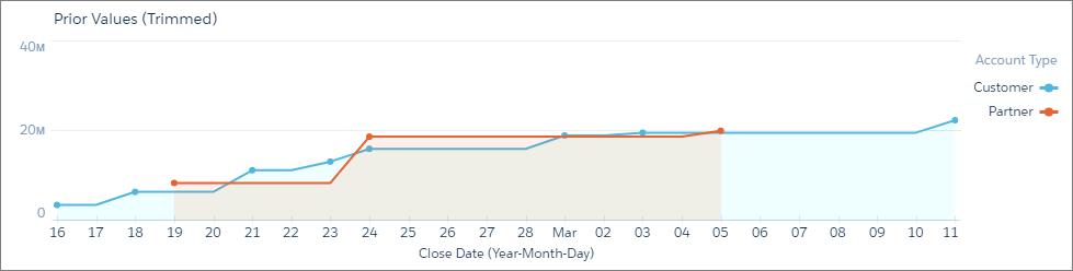
- Use prior values (trimmed)
- The graph ends at the last data point. For instance, looking at the following example,
this graph is the same as the Use Prior Values graph, except that it’s truncated on the right
because there’s no data after March 5.
Did this article solve your issue?
Let us know so we can improve!