
You are here:
Bubble Map Charts
Use a bubble map chart to visually indicate measure values in specified geographical areas.
Create a Bubble Map Chart
CRM Analytics bubble-map charts use the same maps available to map charts, giving you another choice representing measure values on the map.
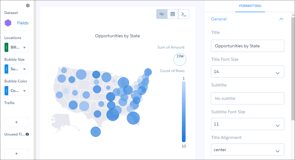
For example, you can use bubbles instead of color saturation alone to indicate the number of opportunities in the pipeline for each state in the United States.
-
In the lens, click
 and then select the Bubble Map chart
type.
and then select the Bubble Map chart
type.
-
Click
 and
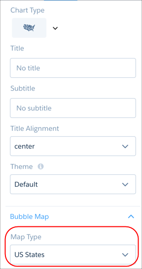
choose the type of map in the Map Type field. For example, to analyze measures by state,
choose US States.
and
choose the type of map in the Map Type field. For example, to analyze measures by state,
choose US States.
- In the Locations field, add the dataset field that contains the locations. For example, select Billing State/Province if the map type is US States.
- In the Bubble Size field, add the measure that determines the bubble size.
- In the Bubble Color field, add the measure that determines the bubble color.
-
Set the chart properties in the Formatting panel to make other adjustments, such as
entering the chart title.
Did this article solve your issue?
Let us know so we can improve!
