You are here:
Bullet Charts
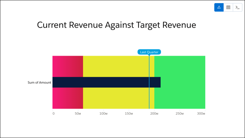
Bullet charts are perfect for comparing metrics against quantitative benchmarks and references, like current revenue with target revenue.
Create a Bullet Chart
Measure current revenue against target revenue and compare it with last quarter's revenue with a bullet chart.
You've got a dataset with opportunity information. From that dataset, you can measure current revenue by finding the sum of the amount field. With a bullet chart, you can then measure current revenue against qualitative values, like target revenue.
The background bar represents target revenue, divided into three sections that represent qualitative performance: red for bad, yellow for good, and green for great. The black bar (also known as a bullet) shows the current revenue. The blue reference line marks last quarter's revenue.
-
In the lens, click
 and then select the Bullet chart
type.
and then select the Bullet chart
type.
- In the Value field, add the measure that you want to analyze, like sum of amount.
-
To customize the bullet chart, click
 and set the chart
properties in the Formatting panel.
and set the chart
properties in the Formatting panel.
In this current revenue by target revenue example, set a target revenue, band colors, and a reference line.
First, set target revenue. Expand Range Values and set Max to your target revenue. For example, $300,000,000.00.
Let's make the bar and bullet a bit bigger. Expand Bullet and set Range weight to 200 and Bar weight to 40.
To add last quarter's revenue, click + Reference Line, set value to last quarter's revenue (for example, $190,000,000.00), and set Label to Last Quarter.
Set bins in Conditional Formatting to create band colors on the background bar to create bands that represent qualitative performance: red for bad, yellow for good, and green for great. The black bar (also known as a bullet) shows the current revenue.
The bullet chart now makes it easy to see current revenue against target revenue.