You are here:
Combo Charts
Use a combo chart to display at least two related series of data, such as discrete grouped values as vertical bars overlaid with a line chart representing an average value.
Create a Combo Chart
Use a combo chart to compare two measures by the same dimension. For example, when comparing deal sizes across industries, use a combo chart to analyze the total amount and the number of deals for each industry.
-
In the lens, click
 and then select the Combo chart
type.
and then select the Combo chart
type.
- In the X-Axis field, add the dimension to analyze the measures by. For example, select Industry.
- In the Y-Axis field, add at least two measures.
-
To change the chart display, click
 and set the chart properties in the Formatting panel.
For example, set the axis mode to specify whether both measures appear on the same axis.
and set the chart properties in the Formatting panel.
For example, set the axis mode to specify whether both measures appear on the same axis.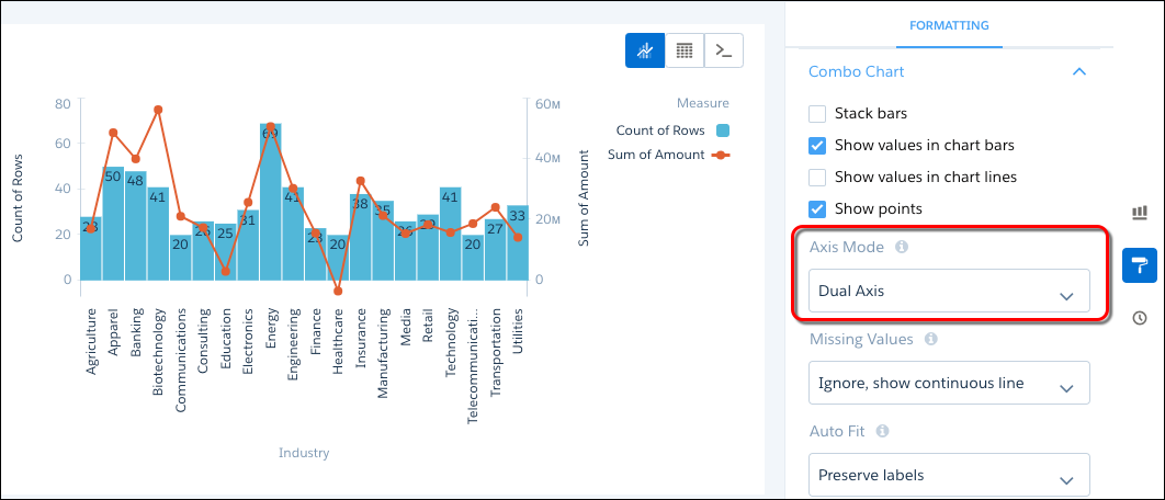
Create a Combo Chart with Stacked Bars
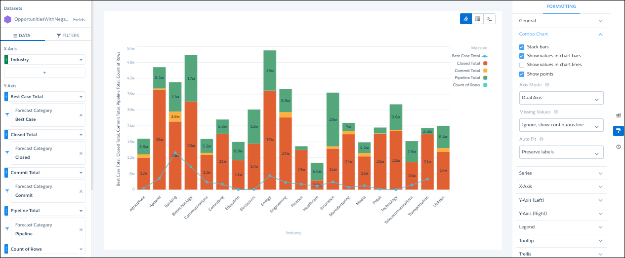
In a combo chart, you can change the bar to a stacked bar to show and compare parts of a whole. For example, add a combo chart that analyzes opportunities by industry. Use the line to show total number of opportunities and the bar to show total opportunity amount. You can then divide each bar by forecast type to show the contribution of each type to the total amount. Let’s learn how to build this example.
-
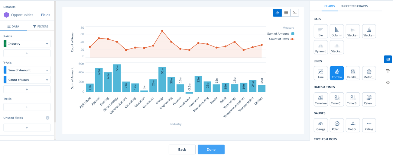
In the dashboard, create a combo chart that shows total opportunity amount as a bar and
count of rows as a line, grouped by industry.
-
Click
 , and then click
  .
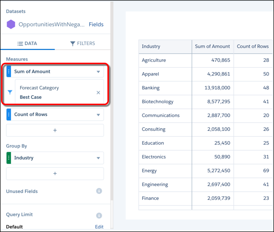
We switched to the compare table so that we can add multiple Sum of Amount measures, each with their own filter. Let’s create a Sum of Amount measure for each forecast category: Best Case, Closed, Commit, and Pipeline. Let’s start by filtering the existing Sum of Amount measure by the Best Case forecast category.
.
We switched to the compare table so that we can add multiple Sum of Amount measures, each with their own filter. Let’s create a Sum of Amount measure for each forecast category: Best Case, Closed, Commit, and Pipeline. Let’s start by filtering the existing Sum of Amount measure by the Best Case forecast category. -
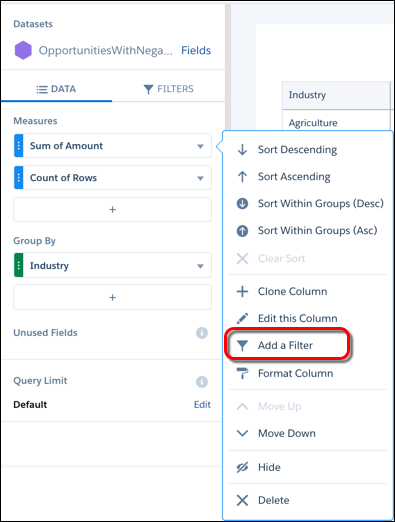
To filter the sum by Best Case category, click the dropdown next to Sum of Amount, and
select Add a Filter.
-
Select , and then click Add.
This filter applies only to this measure.
-
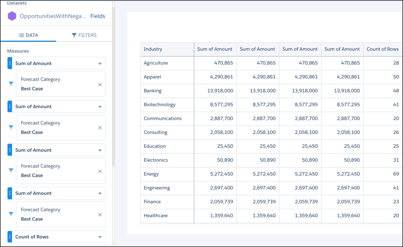
To create three more instances of the Sum of Amount measure, click the dropdown arrow
next to Sum of Amount, and select Clone Column. Repeat this step
two more times so that you have four Sum of Amount measures.
You now have four of the same Sum of Amount measures with the same filter.
-
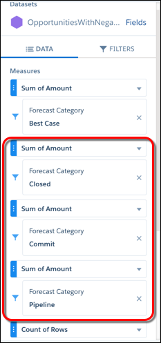
For second, third, and fourth Sum of Amount measures, change the Forecast Category
filter to Closed, Commit, and
Pipeline, respectively.
-
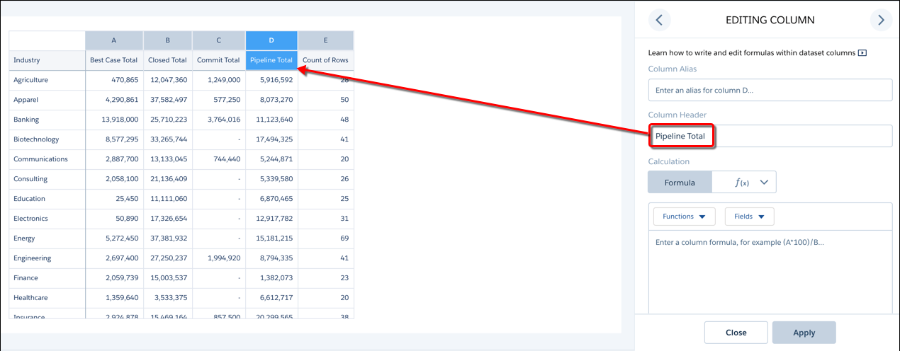
To make the measure labels more descriptive, click the dropdown next to the top Sum of
Amount measure, and select Edit this Column. Change the column
header to “Best Case Total.” Use a similar label for each of the remaining Sum of Amount
measures.
-
Show the widget properties by clicking .
- In the widget properties, expand the Series section, and then click Customize series.
-
To show all Total measures as bars, select each Total measure in the Measure field and
then Bar in the Show As field.
Leave the Count of Rows measure showing as a line.
 Note You can also choose Dot in the Show As field to create a bullet chart.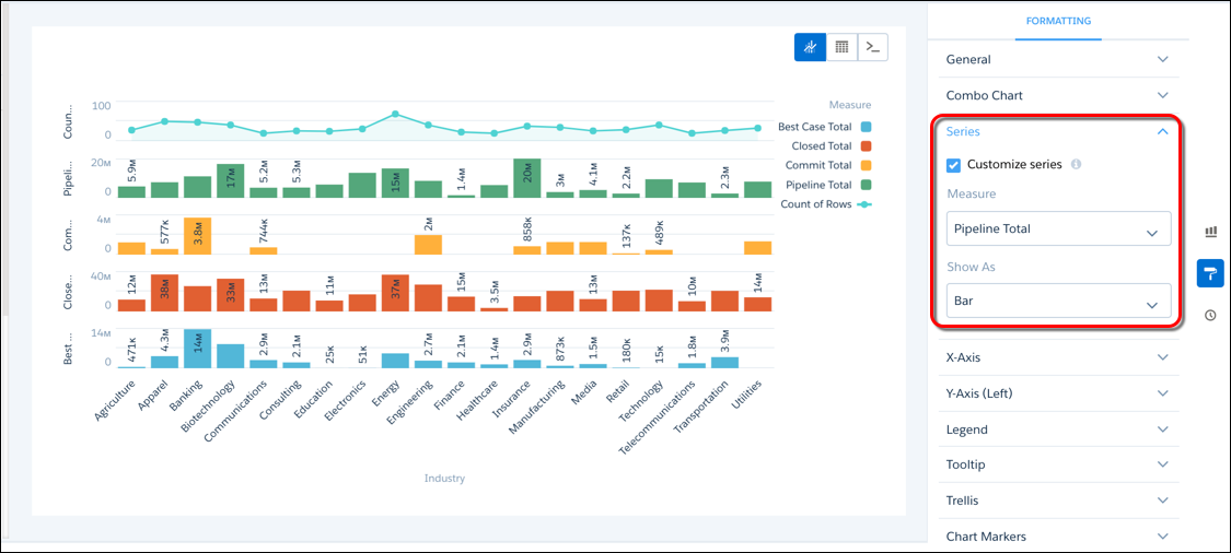
-
Under the Combo Chart section, change the Axis Mode to Dual
Axis, and select Stack bars to stack all the bars for
each industry.
Note The Stack bars option is available when Axis Mode is set to Single Axis or Dual Axis, not Small Multiples. Also, when you set Axis Mode to Dual Axis, the first measure appears on the left axis. If the first measure shows as a bar and you stack bars, all bar measures appear on the left axis. Similarly, if the first measure shows as a line and you stack bars, the line measure appears on the left axis and the bar measures appear on the right.