
You are here:
Donut Charts
Use a donut chart when you have a grouping and want to show not only the proportion of a single value for each group member against the total, but also the total amount itself. If you remove the donut's center by selecting 0% from the Center Size menu, this visualization is commonly referred to as a pie chart.
Create a Donut Chart
Donut charts are useful visualizations when comparing a measure across a few categories, which makes the chart readable.
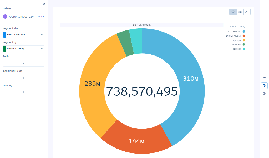
For example, showing opportunities that cover a limited number of product lines can be visualized effectively using a donut chart.
-
In the lens, click
 and then select the Donut chart
type.
and then select the Donut chart
type.
- In the Segment Size field, add the measure that determines the size of each segment. For example, select the measure that shows the total opportunity amount.
-
In the Segment By field, add the dimension to group the data by. For example, select
Product Family.
-
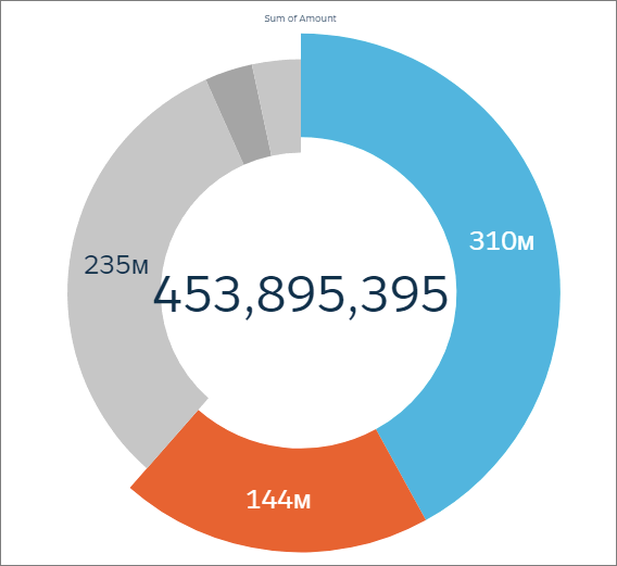
To highlight slices, click individual them.
The total in the center changes to reflect the total of the selected slices.
-
To change the chart display, click
 and set the chart properties in the Formatting panel.
For example, select Custom Text from the Center Value menu, then enter custom text in the Custom Text field.
and set the chart properties in the Formatting panel.
For example, select Custom Text from the Center Value menu, then enter custom text in the Custom Text field.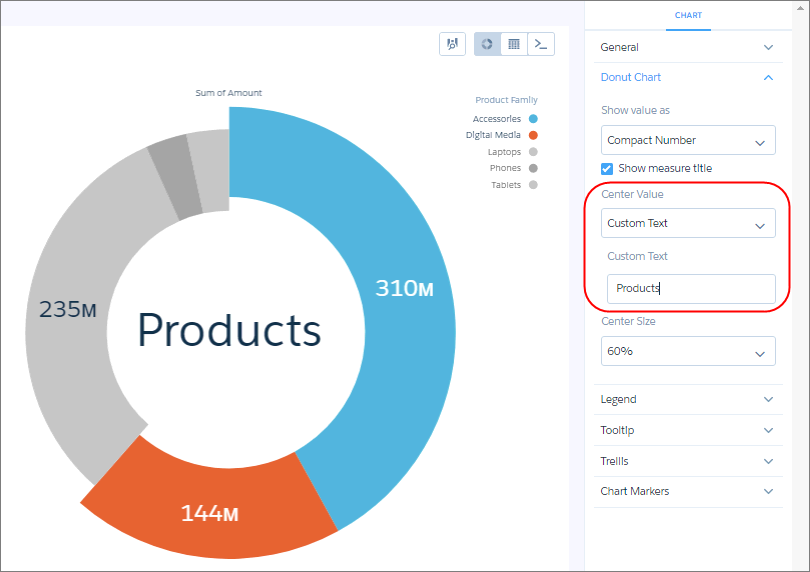
Did this article solve your issue?
Let us know so we can improve!