
You are here:
Dot Plot Charts
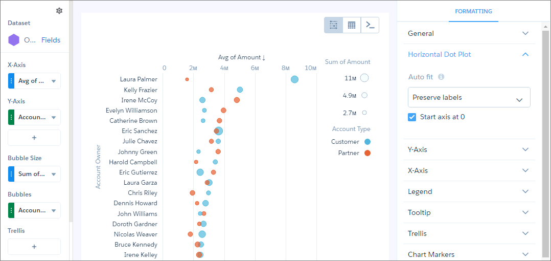
Horizontal and vertical dot plots use the size and coloring of bubbles to display multiple dimensions and measures. Use dot plots to visualize related data to compare performance or locate unusual values.
Create a Horizontal Dot Plot
Create a horizontal dot plot chart to analyze one or two measures across one or more dimensions.
For example, you can create a horizontal dot plot that shows the number of opportunities for each account owner and record type.
-
In the lens, click
 and then select the Horizontal Dot Plot
chart type.
and then select the Horizontal Dot Plot
chart type.
- In the X-Axis field, add the measure that you want to analyze. For example, select count of rows.
- In the Y-Axis field, add at least one dimension that you want to analyze the measure by. For example, select Account Owner.
- In the Bubble Size field, add the measure that determines the bubble size, such as sum of amount.
-
In the Bubbles field, add dimension that determines the different types of bubbles to show.
For example, select Account Type to show bubbles for each record
type.
-
To change the chart display, click
 and set the chart properties in the Formatting panel.
Did this article solve your issue?
Let us know so we can improve!