
You are here:
Funnel Charts
Use a funnel chart to visualize sequential data that can be broken up into stages, such as a sales cycle.
Create a Funnel Chart
Use a funnel chart to compare a measure throughout a process.
For example, you can use this chart to compare the opportunity amounts through different pipeline stages.
-
In the lens, click
 and then select the Funnel chart
type.
and then select the Funnel chart
type.
- In the Segment Size field, add the measure that determines the size of each segment. For example, select the measure that shows the total opportunity amount.
-
In the Segments field, add the dimension to group the data by. For example, select
Stage.
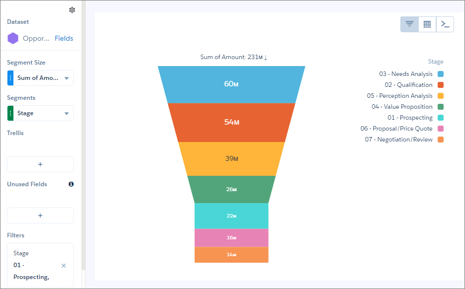
 Note This funnel chart also has a filter that includes only open pipeline.
 -
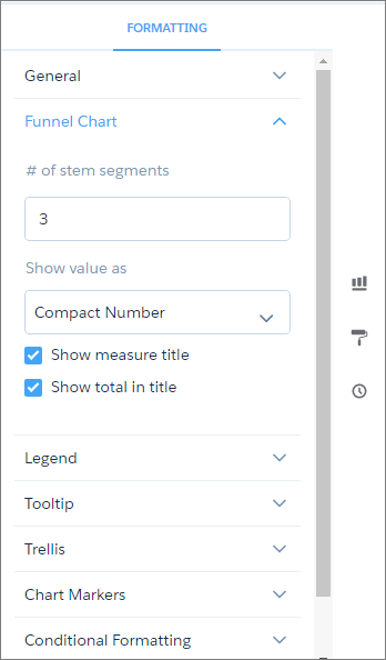
To change the chart display, click
 and set the chart properties in the Formatting panel.
Did this article solve your issue?
Let us know so we can improve!