
You are here:
Gauge Charts
Use gauge charts to track progress along a single measure, such as how much revenue has been realized versus the target.
Create a Gauge Chart
If you've set goals for, as an example, average value for each account manager, gauge charts are a good choice for showing how close you are to that goal.
You've got a dataset with account information. Now you want to present it in a chart that shows how close each account is in reaching the associated goal. Each gauge chart can display one value per account manager, and highlight value ranges.
-
In the lens, click
 and then select the Polar Gauge (round)
chart type.
and then select the Polar Gauge (round)
chart type.
A gauge (angular) and flat gauge (linear) are also available.
- In the Value field, add the measure that you want to analyze, like average opportunity amount.
-
To compare the measure across every member of a category, like every account owner, add
the dimension in the Trellis field.
A separate gauge appears for each value of the selected dimension.
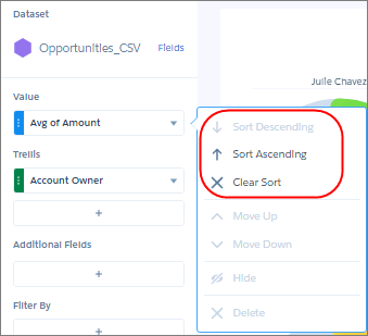
-
To rank the performance based on the measure, sort the measure in ascending or
descending order. Default sort order is alphabetical order.
-
To change the chart display, click
 and set the chart properties in the Formatting panel.
For example, set the Trellis Type field to Wrap so the chart can be viewed all at once, without having to scroll. Also, set the bins in Conditional Formatting to create band colors. The band makes it easy to see how close managers are to hitting their goal. The band color makes it easy to spot which managers are performing well and which can use some help.
and set the chart properties in the Formatting panel.
For example, set the Trellis Type field to Wrap so the chart can be viewed all at once, without having to scroll. Also, set the bins in Conditional Formatting to create band colors. The band makes it easy to see how close managers are to hitting their goal. The band color makes it easy to spot which managers are performing well and which can use some help.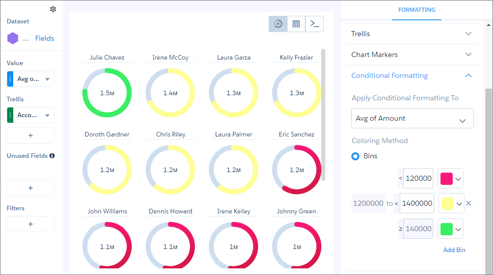
The breakpoints set the range values where the color bands transition. In this example, the maximum (goal) specified in the Range Values section of the widget properties is $2 million. If account managers hit at least $1.4 million, they’re in the green . If they hit between $1.2 and $1.4 million, they’re in the yellow. Otherwise, they’re in the red.