
You are here:
Geo Map Charts
Geo maps allow you to visualize data that contains geographical coordinates (latitude and longitude). Using coordinates allows you to place visual data elements more precisely on map charts.
Create a Geo Map Chart
A dataset with geographical location data, such as U.S. states, can be overlaid on a U.S. map. The bubbles representing a measure appear centered on the state areas. If the locations are tied to particular areas in those states, coordinates can be used to locate the bubbles more accurately.
For example, with airline data tied to particular airports, use airport latitude and longitude coordinates to visualize the data at each airport's actual location. The dataset could look like the following:
   Airport,Year,Quarter,lat,lng,flights,passengers
   JFK,2014,1,40.639751,-73.778925,120000,67276
   SFO,2014,1,37.618972,-122.374889,30000,7383
   ORD,2014,1,41.978603,-87.904842,50000,90908
   HNL,2014,1,21.318681,-157.922428,10000,5262
   ATL,2014,1,33.640411,-84.419853,217089,24044724
   DFW,2014,1,32.89748,-97.040443,169955,15888600
   DEN,2014,1,39.849312,-104.673828,141381,13368128
   SEA,2014,1,47.443546,-122.301659,84283,10585134
   SLC,2014,1,40.758701,-111.876183,81238,5285402
   PHX,2014,1,33.457439,-111.727386,107615,10533665
   JFK,2014,2,40.639751,-73.778925,170000,77276
   SFO,2014,2,37.618972,-122.374889,40000,8383
   ORD,2014,2,41.978603,-87.904842,50000,100908
   HNL,2014,2,21.318681,-157.922428,11000,6262
   ATL,2014,2,33.640411,-84.419853,227089,34044724
   DFW,2014,2,32.89748,-97.040443,170955,25888600
   DEN,2014,2,39.849312,-104.673828,151381,23368128
   SEA,2014,2,47.443546,-122.301659,85283,20585134
   SLC,2014,2,40.758701,-111.876183,82238,6285402
   PHX,2014,2,33.457439,-111.727386,117615,11533665
   JFK,2014,3,40.639751,-73.778925,210000,87276
   SFO,2014,3,37.618972,-122.374889,50000,9383
   ORD,2014,3,41.978603,-87.904842,50000,90908
   HNL,2014,3,21.318681,-157.922428,12000,7262
   ATL,2014,3,33.640411,-84.419853,237089,35044724
   DFW,2014,3,32.89748,-97.040443,180955,26888600
   DEN,2014,3,39.849312,-104.673828,161381,24368128
   SEA,2014,3,47.443546,-122.301659,95283,22585134
   SLC,2014,3,40.758701,-111.876183,92238,6585402
   PHX,2014,3,33.457439,-111.727386,127615,13533665
   JFK,2014,4,40.639751,-73.778925,220000,117276
   SFO,2014,4,37.618972,-122.374889,60000,7000
   ORD,2014,4,41.978603,-87.904842,50000,90908
   HNL,2014,4,21.318681,-157.922428,13000,8262
   ATL,2014,4,33.640411,-84.419853,247089,36044724
   DFW,2014,4,32.89748,-97.040443,190955,27888600
   DEN,2014,4,39.849312,-104.673828,171381,25368128
   ...
-
In the lens, click
 and then select the Geo Map chart
type.
and then select the Geo Map chart
type.
-
To select the map type in the chart properties, click
 .
The map type depends on the region that you want to show in the map. For example, if your flights are only in the Unitied States, select US States.
.
The map type depends on the region that you want to show in the map. For example, if your flights are only in the Unitied States, select US States.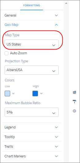
- In the Locations field, select the location field that determines where to add bubbles. For example, select the Airport field.
-
In the Latitude and Longitude field, add two measures: the first contains average latitude
coordinates and the second contains average longitude coordinates.
 Tip If you’re adding measures in a SAQL query, add the latitude and longitude measures first, and then any other measures.
 - In the Bubble Size field, add a measure that determines the bubble size, such as sum of flights.
-
In the Bubble Color field, add a measure that determines the color, such as sum of
passengers.
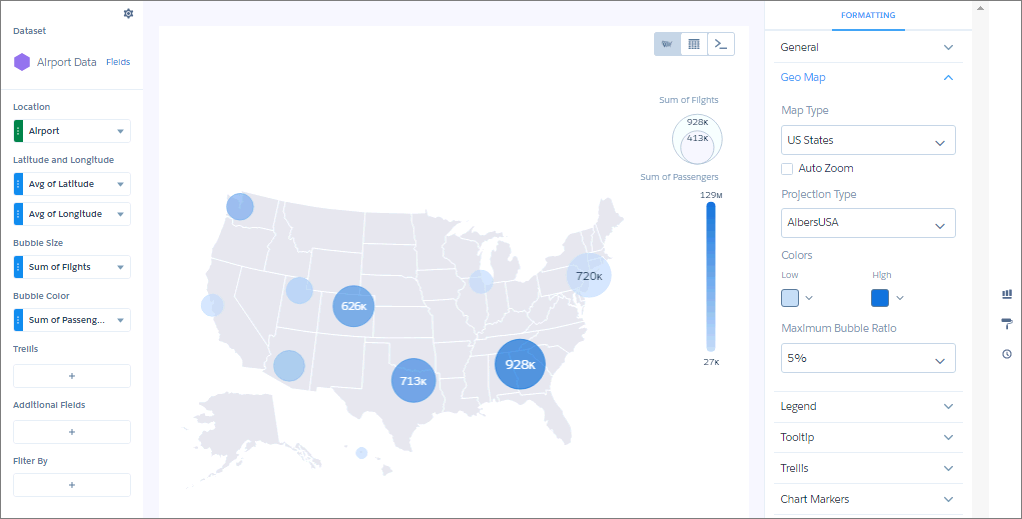
- To make additional changes, such as setting the colors of the geo map chart bubbles, set the chart properties in the Formatting panel.
Did this article solve your issue?
Let us know so we can improve!